Normal Distribution – An Intuitive Introduction Without Math
I will try to keep this article free from equations and mouthful jargon — as much as possible. I, however, need you to at least have the following capabilities:
- Able to interpret simple graphs.
- Elementary-level knowledge in probability. You at least understand that there is a 50% probability for the head if I toss a coin.
- Integral calculus and quantum physics (kidding!)
Why Normal Distribution
An intuitive way to understand something is to investigate why it is needed. Let’s do it for normal distribution (also called, Gaussian Distribution).
Say you have a funny habit. Every day you toss a coin 100 times. It is “normal” to expect that you will get head 50 times — or close to 50 times most of the day. Rarely, there are good days for head — you might get around 55 times, and very rarely above 65 times.
Now, you want to quantify this “rarity”. So, you start keeping track of how many times you got the head every day.
Number of heads every day in a year
Below are the data after a year (365 days) — the first one is the number of heads you got on the first day, and the last one is the number of heads you got on the last day. You don’t need to check all the numbers below, but it is easy to spot that most of them are around 50.
56, 47, 54, 50, 57, 51, 57, 48, 54, 62, 42, 51, 37, 42, 50, 37, 59, 48, 46, 51, 61, 47, 46, 48, 63, 55, 50, 50, 43, 46, 56, 49, 50, 54, 52, 47, 51, 59, 61, 53, 44, 53, 59, 58, 54, 54, 50, 49, 51, 46, 43, 51, 49, 54, 46, 44, 41, 51, 51, 49, 64, 46, 46, 46, 52, 48, 57, 49, 42, 46, 55, 50, 52, 51, 47, 53, 50, 48, 58, 43, 60, 49, 46, 42, 53, 45, 57, 48, 52, 47, 47, 47, 42, 57, 60, 49, 48, 50, 51, 47, 48, 52, 47, 45, 51, 55, 51, 45, 46, 46, 40, 52, 57, 48, 51, 48, 44, 46, 41, 59, 60, 46, 44, 36, 48, 52, 49, 49, 49, 51, 41, 49, 51, 51, 42, 51, 45, 54, 50, 48, 49, 43, 52, 53, 52, 53, 48, 37, 53, 54, 41, 48, 52, 46, 47, 57, 50, 49, 46, 57, 67, 50, 54, 48, 50, 60, 43, 49, 57, 57, 45, 55, 57, 52, 46, 48, 49, 51, 45, 48, 44, 48, 55, 51, 59, 52, 50, 55, 51, 46, 48, 51, 46, 50, 49, 50, 47, 51, 43, 46, 48, 56, 47, 57, 44, 54, 52, 55, 46, 49, 53, 40, 54, 54, 49, 50, 53, 41, 55, 50, 42, 58, 47, 53, 55, 45, 52, 61, 50, 49, 48, 51, 50, 56, 44, 47, 45, 48, 63, 43, 52, 55, 46, 48, 52, 49, 56, 62, 57, 54, 47, 51, 52, 43, 45, 57, 51, 46, 42, 52, 57, 54, 48, 54, 51, 49, 51, 42, 52, 50, 52, 61, 61, 44, 45, 48, 49, 48, 46, 47, 57, 44, 44, 47, 52, 47, 42, 48, 51, 58, 36, 57, 53, 49, 52, 50, 52, 56, 44, 56, 46, 42, 46, 43, 56, 49, 44, 38, 46, 52, 49, 58, 51, 49, 48, 52, 57, 43, 48, 40, 52, 54, 40, 54, 45, 49, 41, 57, 50, 52, 43, 54, 49, 45, 44, 53, 49, 43, 51, 50, 56, 45, 46, 47, 41, 52, 59, 52, 50, 48, 58, 52, 51, 55, 49, 41, 38, 57, 56, 41, 54, 44, 47, 60, 44
Visualize Better with Histogram
Let’s plot a histogram from the data above:
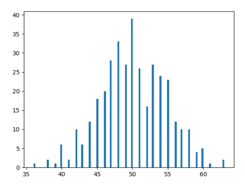
Aha! Doesn’t it already look like the image you have been seeing on the internet when you have been googling “Normal Distribution”? We are almost there!
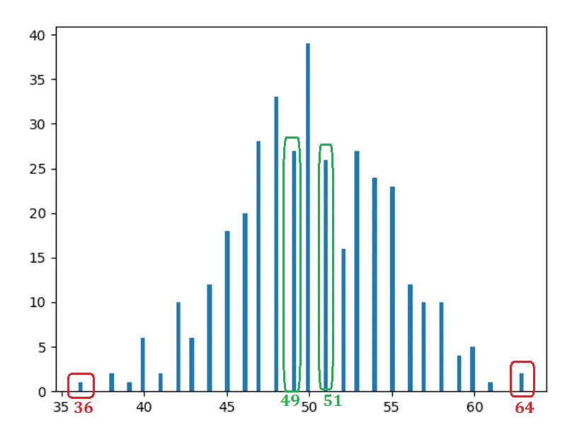
So, if you don’t understand histograms – we have just plotted here number of days we got a particular count for head. For example, we got head 36 times on 2 particular days in the year (check on the data above if you don’t believe me), that is why there is a bar of height 2 unit on the horizontal point at 36 (the red rectangle at the left in the image below).
Observations
- Pretty obvious and expected — 50 heads occurred most of the times.
- The farther we go from the center (50), the occurrence is mostly decreasing.
- Bars at the same distance take similar shapes. For example, if you move one unit to the left (49) or right (51) — occurrences are similar — 30 and 31 respectively (the green rectangles). If you move 14 units left (36) or right (64), occurrences are similar again — 2 and 1 respectively (red rectangles).
10 years data
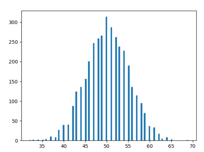
Now let’s fast forward a bit — and plot 10 years’ data.
1000 years data
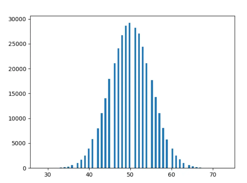
Okay — last one. Let’s plot 1000 years’ data.
Observations
- The more we experiment, the smoother are the shapes.
- The more we experiment, the more the bars are following the observations above (i.e. bars at a similar distance are taking more closer shapes).
Where is the goddamn normal distribution
Okay — too much background — now let’s get to the point.
Let’s see the answer suggested by Google:

A few things in this definition:
Random Variable: Simply put — a random variable is a set of possible values of a random experiment like a coin toss. In our example, the possible value of our experiment is Head or Tail.
Bell-Shaped: Did you notice that our histogram is taking a bell shape?
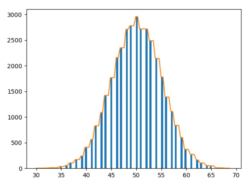
Symmetrical: Bars at the same distance have similar shapes — isn’t it symmetrical?
So, the normal distribution represents the distribution of outcomes for events like coin toss — where the distribution tends to maintain a few properties, including the symmetry and bell shape.
What phenomena other than coin toss follow normal distribution?
Some cool examples here.
- Height in population — more people fall into the average height group. It is rare to find any extremely tall or extremely short people. And the chances of finding extremely tall and extremely short are almost equal.
- Rolling a dice
- Shoe size
- IQ
- And a lot other …
Do these phenomena strictly follow normal distribution?
The simple answer is no. Although, as we saw above — the more you experiment, the more the data will follow normal distribution properties. But there is no assurance that some unlikely event won’t occur anyway.
Are all probability distributions in the universe normal distribution?
No. There are many phenomena that are determined by some other kind of distribution.
- The probability of a given number of customers arriving, phone calls, accidents, sports events, and floods follow Poisson Distribution.
- For business sales, 20% of a company’s customers are responsible for 80% of the sales. (Pareto Distribution)
- Traffic patterns in a city — Exponential Distribution
- Random selection of members for a team from a population of girls and boys — Hypergeometric Distribution
And many more …
I produced the list above by just googling “real life example” with some distributions listed here — not that I understand all of them. 😉
Is there a reason why some natural phenomena tend to follow normal distribution
Yes — quoting my favorite explanation:
The usual explanation is given by another name for the normal distribution, which is the “error distribution”. The idea is that errors are generally random, so that they are as likely to go in one direction as in the other. For example, the marksman is as likely to shoot a bit to the left, as a bit to the right, or a bit high as a bit low. Thus, a graph of how far the shots are from the bullseye will reflect this random tendency, and be symmetrical around the mean. Similarly, with height and intelligence — many genes (perhaps thousands) contribute to these outcomes, as do a great number of environmental factors, such as nutrition, illnesses, low income and so forth.
Parameters of normal distribution
If you got an intuition of the discussion so far — you are already the winner. Mission accomplished. The rest of the article is a bonus.
All the normal distribution graphs you see are different in shape. Some of them are flatter than others. Some of them have good heights. All these shapes are controlled by only 2 parameters:
Mean
Mean is defined by average. It defines the height of the bell. For the coin toss example, the mean is close to 50, which is the top location in the graph.
Standard Deviation
Since I promise this article will be free from equations, I am not giving its mathematical representation here. But it is not that hard anyway. Standard deviation is a metric to represent how diverse the data are.
For example, the standard deviation of age in childcare will be lower than the standard deviation of age in the soccer fan club, since age gap between the youngest and oldest group should be much higher in the soccer fan club.
Standard deviation determines the width of the curve. A small standard deviation produces a steep curve, and a bigger standard deviation produces a flatter curve.
You read a lot. We like that
Want to take your online business to the next level? Get the tips and insights that matter.

