Ecommerce UX: 7 Easy Tips to Boost Your Store’s Conversion
Did you know that, on average, 97 out of 100 potential customers leave your website without making a purchase? There are various reasons why this is happening, but more often than not, it’s due to a general poor customer experience (UX) using the website.
UX is a multi-faceted ever, evolving field. And this rapidly changing field requires users to keep up with the latest trends and techniques in order to ensure a seamless experience online. After all, this is what an end-user expects from an ecommerce site.
Let’s dive a little further towards some proven ecommerce UX tips.
What is ecommerce UX?
Ecommerce UX, or ecommerce user experience, refers to the overall experience of a person using an online platform or website to shop for and purchase products or services. This includes all of the interactions a customer has with the website, from browsing and searching for products to adding items to a shopping cart to entering payment information and completing the transaction.
When great UX results in an ecommerce website that is as profitable as possible with the proper layout, text, brand, visual design and interaction, poor UX results in the exact opposite. So regardless of what type of business your run, if you own an e-shop, it’s high time you elevate your ecommerce UX to the next level because great UX leads to conversions.
What does UX have to do with conversions?
Almost everything.
If someone has had a negative or frustrating experience visiting and navigating your website, they are highly unlikely to buy anything, let alone browse through your products.
From poor product images to long sign-up forms, there are countless ways that your website could be failing from a UX perspective that lead to reduced conversions and/or enquiries.
In 2016, 88% of online businesses suffered a lower than expected conversion rate. The reason is simple. For every $92 spent acquiring customers, only $1 was spent to convert them. Some in the industry believe that this is due to the fact that UX is not getting the attention it deserves when it should be the main focus when building and marketing a website.
Effective ecommerce UX tips to boost conversions
So how can you improve the ecommerce user experience and increase conversions for your online store? Some aspects of UX are more directly related to conversions than others.
Here are our top 7 picks to help you out:
1. Highlight your value proposition
Suppose you want to buy a gift for your friend. Unless you go straight to Amazon (which is what 44% of people do), you’re probably going to do a Google search and take your pick of the many websites that come up.
Let’s assume that all of them have similar products within a reasonable price range. Then how do you decide which website to buy from?
By looking at their value propositions, of course.
A value proposition consists of a few lines of text that explain why prospective customers should buy products from you (as opposed to your competitors) and how it will benefit them. It’s the first thing that visitors should see when they enter your website.
The stats show that you have only 5 to 30 seconds to get the attention of a new visitor. According to an article published in the Harvard Business Review, an attention-grabbing value proposition should do one of these four things:
- Mention that you sell something the customers must have.
- Offer the best quality-to-price ratio.
- State that your products are the best in their class.
- Establish that you sell high-end luxury items.
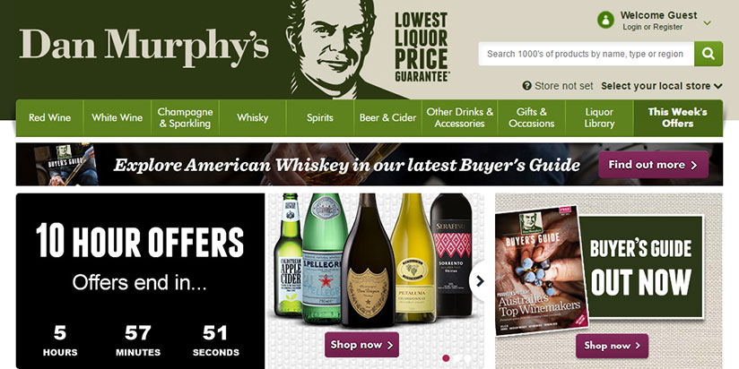
The online store of Australian liquor chain Dan Murphy’s, for example, has a very simple value proposition: Lowest Liquor Price Guarantee.
However, remember that a value proposition is different from a slogan or catchphrase. For example, “Global trade starts here” (Alibaba) is not a good example of a value proposition. It’s just a tagline.
A good value proposition often includes more than one point. Australian gift and gadget supplier Yellow Octopus provides us with another great example.
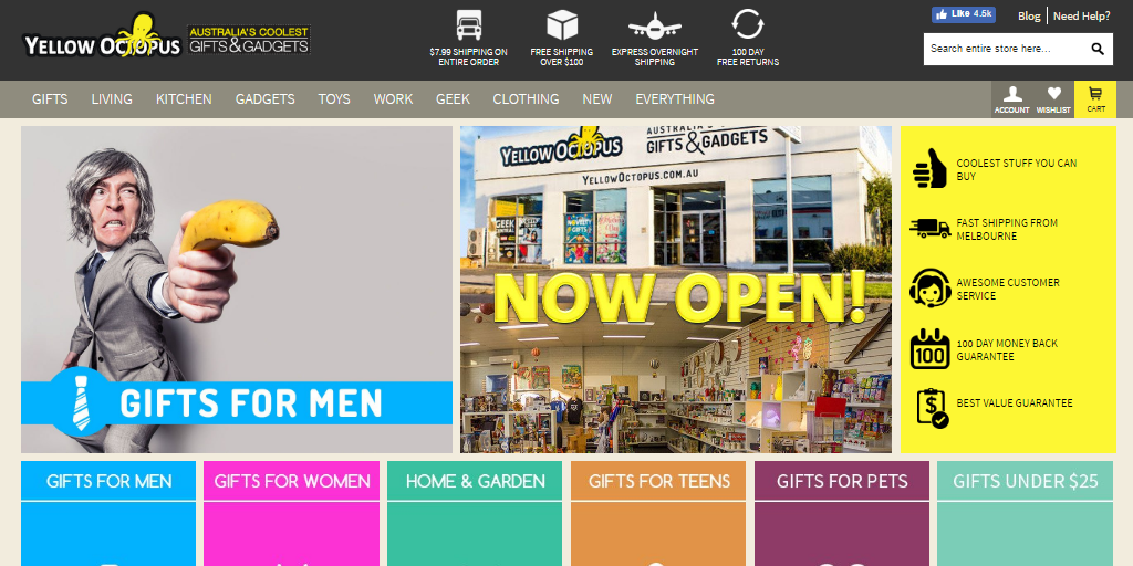
Notice that they have used the right-hand column to highlight 5 key reasons why the customers should be buying from them.
The value proposition should be placed in a prominent position on your landing page so that potential customers notice it straight away.
2. Mention risk reducers
Every page on your ecommerce website should mention two or three good risk reducers, words or icons that ensure a lower risk of purchase and earn the customer’s trust. Examples may include free shipping, hassle-free return, lowest price guarantee, secure payment, etc.
There are three ideal places to display this information:
- At the top of each page.
- Right beside the Add to Cart button.
- At the sidebar of the checkout page.
Milk makeup mentions the risk reducers at the top of its website. Their free shipping and free return offer provide users will peace of mind to go ahead and make a purchase.

Often it’s the case that risk reducers will overlap with value propositions. After all, risk reducers are also a reason why a prospective customer would buy from you.
Don’t forget to provide a link to your return policy as well as shipping details and charges on every product page. Econsultency reports that 68.4% of customers want to know the delivery timescale and charges before buying a product. Also, if you are selling at a high volume, keep in mind that providing free shipping is a great conversion booster.
Notice how Ezibuy places three risk reducers beside their Add to bag button. They also mention the availability of home delivery and a link to their return policy just below this.
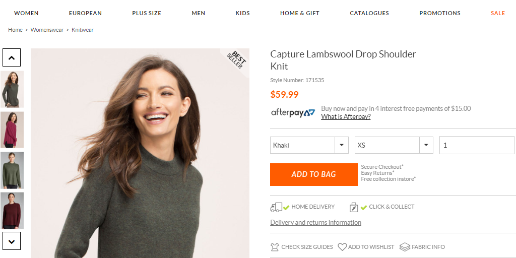
You may also consider mentioning risk reducers on the checkout page.
It’s often advised to keep the checkout process as distraction-free as possible, but this is worth testing out for yourself. If you find that having a more cluttered checkout page with information such as risk reducers increases cart abandonment, you can always remove them.
On average, ecommerce websites have a cart abandon rate of 69.23%. You may find that reminding potential customers about free delivery or your lowest price promise here can lower this rate.
The most important component of these risk reducers is payment security. 13% of the consumers abandon the cart because they don’t trust the ecommerce site with their credit card information.
The best way to assure your consumers about the legitimacy of your business is to use trust badges. According to a recent study by Baymard Institute, the three most easily recognisable trust badges are Norton, Google TS, and BBB.
There are two places where you should display these trust badges:
- At the footer of every page.
- Near the credit card field of the payment page.
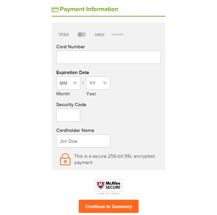
Online grocery shop Peapod has a good example of a secured payment page. They not only include a McAfee Secure badge to assure their customers but also mentions that their payment information is encrypted.
3. Present your products in the right way
Many online stores seem to neglect product presentation. You heard it here; first, a simple image with a product description is not enough!
When customers visit a physical store, they obviously get up close and personal with a product, getting a much better sense of its quality. According to a Forrester/UPS study, 55.1% of people claim that this is a big factor in why they prefer physical stores over online shops.
You can overcome this barrier by providing more information and images.
Here are some more details on how to make that work:
(a) Product image
This one goes without saying; always use high-quality product images on your ecommerce site.
Remember, a high-quality image isn’t just an image that has a high resolution. Your images should present your products in a beautiful, enticing way.
It’s essential to provide more than one image for your products, and some websites have even started to feature dynamic 360-degree images. At the very least, you should include a number of images taken from all angles.
For some products, it may be a good idea to add some images by zooming in on particular parts. This is especially true for products with fine details that a customer might wish to examine.
Another nifty feature that you can add to your product image is hover-zoom. As you might have guessed, this provides users with an enlarged view of the product when they hover the mouse over a certain part of the image.
A great way to attract customers is to use contextual images. For example, if you sell shirts, you can include an image of a person wearing a shirt in a casual setting. That can help the customers get a sense of how the product may look on them.
(b) Product video
Product videos can increase conversions for almost all types of ecommerce websites. According to Animato, 96% of consumers find videos helpful for making purchasing decisions, and 73% of consumers are more likely to buy a product after they watch a video explaining its features.
Keep the following things in mind when making a product video:
- Make sure your videos are professional, with proper lighting and good angles.
- The voice of the narrator, provided there is one, matters. Test if a male voice or a female voice is more suitable for your product type.
- The videos should show the products from every angle.
- Demonstrate the basic features of your products in the videos. If applicable, also consider including product-related how-to tutorials.
(c) Product copy
Along with properly representing the product visually, you also need a great copy to go with it. In a physical shop, a potential customer can talk with a sales representative to learn more about a product. In the online setting, it’s your content that takes on this responsibility.
A lot of websites use bullet points to display the key facts about their products, which is a great way to give a brief overview that the user can quickly glance at and get a sense of the product. But it’s also important to give the customers a more detailed description.
The best strategy is to prepare two versions of the copy for each product.
The shorter version should give brief answers to these three questions:
- Who is the product for?
- What does the product do?
- Why is it a great choice?
You should place this info beside the product image. A short line of text can also have bullet points mentioning the main features and benefits. According to a study by Conversion XL, bulleted text works very well for tech products.
The longer version should address the following:
- Include as much relevant information as possible about the product. After reading the long version, customers shouldn’t have any major questions unanswered.
- As well as the basic product features, it should emphasise why the product is helpful. A personal tone will be more effective here than an advertising one. Explain why you would recommend the product by focusing on its benefits.
- If applicable, include a comparison table. Suppose you have three similar products; at the end of the product description, you can show a comparison of their main features.
4. Have a persistent shopping cart
According to eMarketer, 56% of potential customers use the shopping cart to save items for later purchases. You can save your customer’s cart choices by using persistent cookies. Unlike short-time cookies, persistent cookies will remain on the user’s device even after they leave your website. So, upon return, they can easily pick up where they left off.
Customers often leave your website to check your competitors, compare products, and look for the best possible deal. They may get frustrated if they find their shopping cart is empty upon return, having to go through the process all over again.
People often use multiple devices to research and purchase products. Persistent cookies can make the process seamless by retaining cart information across devices.
To make the persistent cart more effective, consider the following:
- Oftentimes people set their browsers to delete cookies upon exit. Let your visitors know that you’re using persistent cookies to store their shopping carts. Alternatively, you can store the cart information on your server. But for a small to the mid-sized ecommerce site, that might not be a practical option.
- Set the expiration date of your persistent cookies to at least seven days. Many sites will store user carts for as long as a month! Storing information for a longer period increases the chance of a sale.
- Send automated reminder emails to the users containing links to their carts if they don’t come back within a week. In many cases, customers get distracted and simply forget about buying a particular product and where they found it. A lot of them are likely to come back and make the purchases after they get the reminder email.
5. Use of clear CTAs
A call-to-action is one interactive element that can help you persuade your customers to take a certain action that presents a conversion for your site, such as making a purchase. By clearly indicating what the next step is for the user, it helps to improve the user experience by making it easy for them to understand what they need to do. This can lead to a better overall user experience and increase satisfaction with the website.
Some best practices for using CTA in ecommerce UX include:
- Make the CTA button prominent and easy to find. The button should be remarkably displayed and stand out from the rest of the page.
- Use actionable and persuasive language. The language used in the CTA should clearly indicate the desired action and motivate the user to take it. Examples of good CTA language include “Sign In Now,” “Add to Cart,” and “Discover More.”
- Test different versions of the CTA to see which one performs best. This can be done through A/B testing, where two versions of the CTA are compared to see which one leads to more conversions.
- Use a contrasting colour for the CTA button. The CTA button should be a different colour than the rest of the page to make it stand out and draw the user’s attention.
- Consider the user’s location on the page when placing the CTA. The CTA button should be placed in a location that makes sense for the user’s current location on the page. For example, if they are reading product information, the CTA button should be nearby.
Check how EventBookings offers customers a CTA like “Create Event” that stands out and creates a sense of urgency to take action.

6. Ensure mobile friendliness
With the increasing usage of smartphones and tablets, it is becoming crucial for websites to be able to adapt to different screen sizes and resolutions in order to provide an optimal user experience. And for ecommerce sites, if you want to raise the number of people visiting your site, there is no other way. No wonder it’s crucial to make sure that your website is responsive to mobile devices.
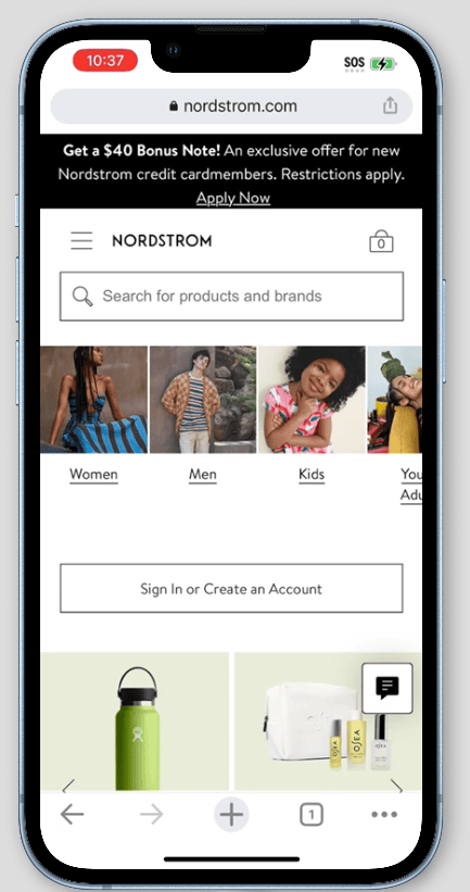
There are several ways to make your website responsive. This can include making sure that the layout and design of the site adjust to fit the size of the screen and that buttons and links are easy to tap with a finger. You can add many design elements to make it easier for users to browse items. Such as, you can make the website search box prominent at the top of the page, as there aren’t many navigation options on the phone.
Here is an example of Nordstrom’s website.
Understand your users to optimise search result relevance and incorporate autocomplete. Also, ensure your web pages load quickly, as an estimated 40% of online shoppers tend to abandon a site that takes more seconds to load. When found overwhelming to draft a mobile-friendly ecommerce site, contact a professional ecommerce website developer or use a website builder that has these features built-in.
7. Go for a driven navigation design
The more accessible your navigation experience is, the more you can empower your users to interact. There are many design patterns to pick when optimising the user experience. Effective navigation design in ecommerce typically involves the use of clear and intuitive menus, breadcrumb trails, search functionality, and filters that allow users to narrow down product listings based on multiple criteria like colour, size, price etc.
You can start by putting your feature products front and centre on your home page. Try to put menus where users expect to find them. For instance, when users are looking for products on net-a-porter.com, the menus with enough visual weight are prominently displayed and feature items accompanying visuals are clearly visible.
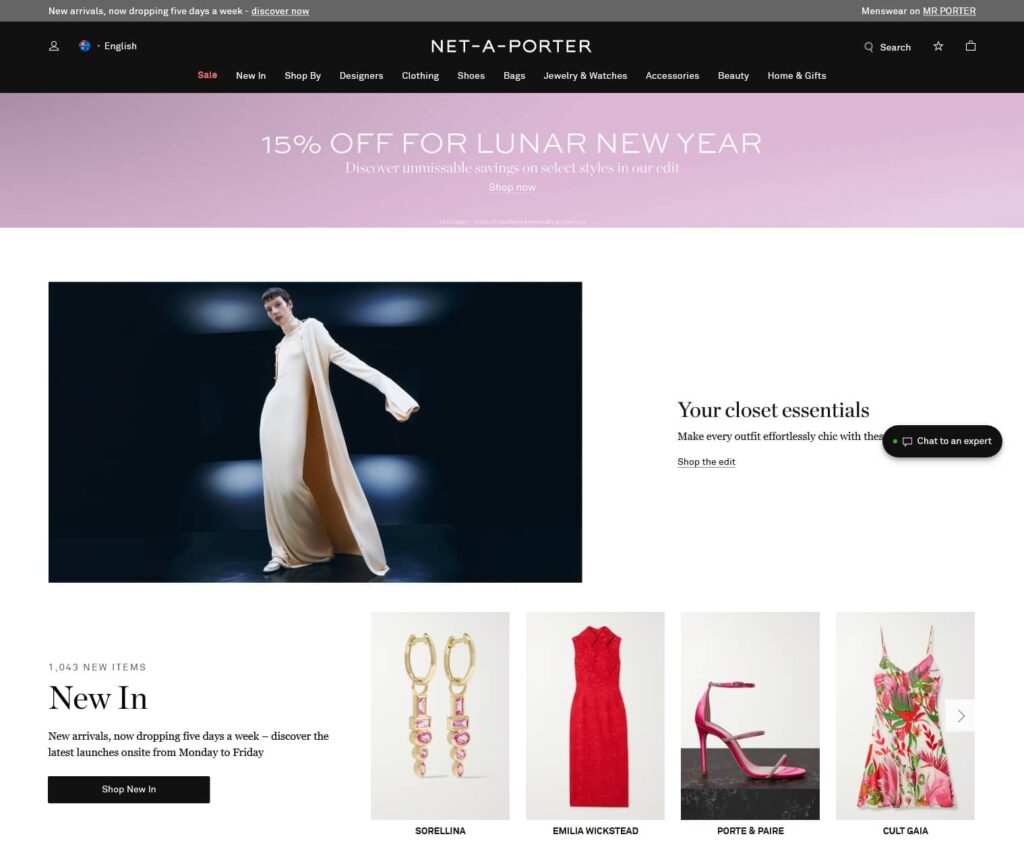
Also, apply a location indicator on the navigation to help users indicate which section they are in and simplify the navigation bar for the mobile site. Use meaningful labels and explain what the user is going to find on a page. For example, when you read “bags” and “jewellery and watches”, they seem more meaningful and less ambiguous than labels like “other appliances”.
Conclusion
These were our seven ecommerce UX tips that can help you increase the conversion rate of your ecommerce site. Which of these tips have you found the most useful? Do you have any special UX tip that has worked very well for you?
Designing your ecommerce site for more conversions is a huge task, but it has a big payoff. So whether you are just about to start with your ecommerce site or planning to improve your current one, taking notes from the mentioned tips and tricks can definitely improve your site’s conversion rate.
You read a lot. We like that
Want to take your online business to the next level? Get the tips and insights that matter.
