12 Examples of Best Gift Website Design
On any occasion, be it Mother’s Day, Valentine’s Day, a wedding, an anniversary, or a birthday, buying gifts online is always convenient for anyone. After all, one can access many gift options without even moving a single inch from one’s couch.
However, with many entrepreneurs entering into the gift-selling e-business, if you are interested in gifting business and planning to make a gift website, you must know the ways to impress and convert your visitors.
Suppose, when we draft some basic principles for crafting a gift website, it must include
- Designing a consistent, structured menu.
- Using high-quality visuals.
- Ensuring clarity of the offerings.
- Keeping the personalised gift option open and more.
To get more ideas on how to build a gift website, let’s move on to some of the best-performing gifting websites and discover the wonderful features you should embed in your gift websites with amazing inspiration.
List of 10 Captivating Gift Website Designs
Here are 10 unique gift websites you can get started with that showcase diverse strategies employed across the particular industry.
1. Etsy
Website: https://www.etsy.com/
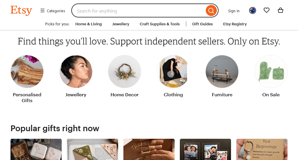
The site itself is pretty clear, with enough white space, and what makes its design noteworthy is the well-organised product photos, CTAs, and text. The clear navigation from the top menus is definitely what makes shopping easy, and the centrally positioned search bar adds a touch of sophistication.
The interesting Popular gift right now section is ready to grab visitors’ attention as soon as they land on the site as it features different sorts of items from different categories.
2. Minted
Website: https://www.minted.com/
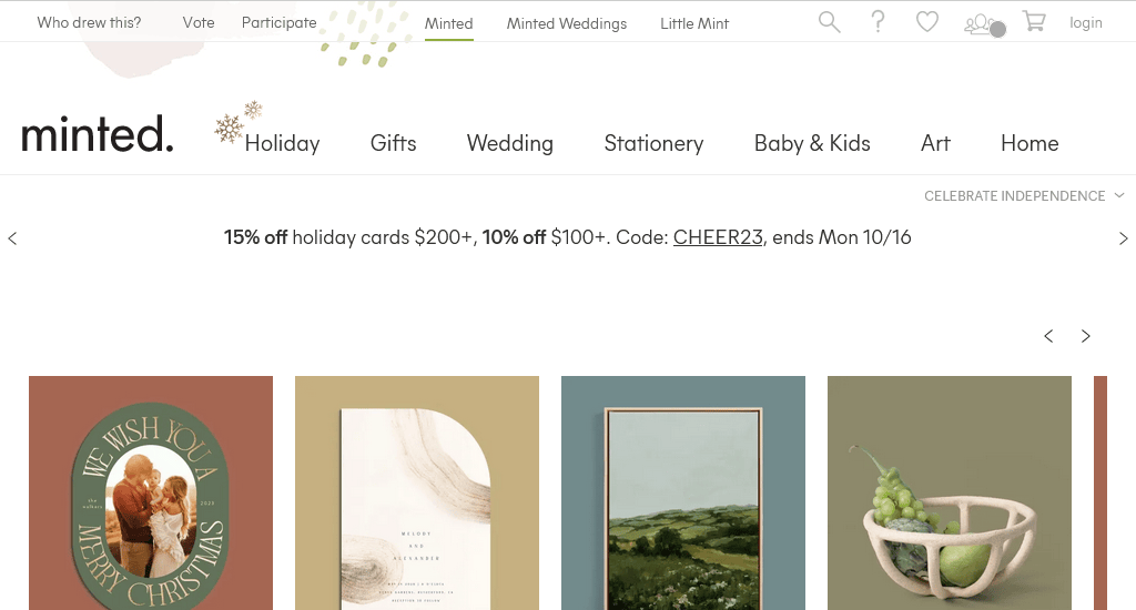
Minted is another go-to gifting website for any sort of occasion. The site seems minimal yet chic, offering a design that’s both sleek and easy on the eyes. The outstanding product photography is one of its biggest strengths.
A pop-up discount form comes up while visiting the site, offering 20% off on the first order. The drop-down navigation menu covers all the categories, from Holidays to gifts to weddings to Babies and kids.
3. Shutterfly
Website: https://www.shutterfly.com/
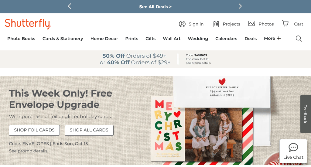
The site allows you to personalise any photo book effortlessly. Types of best-selling photo books are displayed in the negative space, adding a touch of dynamism to the presentation with a subtle movement effect upon hovering.
Clicking on a product opens up the individual product details page that covers size, shape, price, review rate, product details, shipping information and more.
4. Knack
Website: https://knackshops.com/
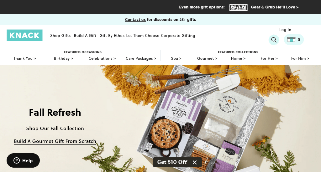
Clear navigation from the top menu bar and the use of modern, fresh colours in their website colour scheme, which is similar to their packaging colour, definitely make browsing the site way more fun.
Two underlined CTAs- Shop our fall collection and Build a gourmet gift from scratch, featured in the hero section, immediately catches the visitor’s eye. As they scroll down, they can shop bestsellers by price or by categories alongside discovering the gift collections.
5. Sugarwish
Website: https://sugarwish.com/
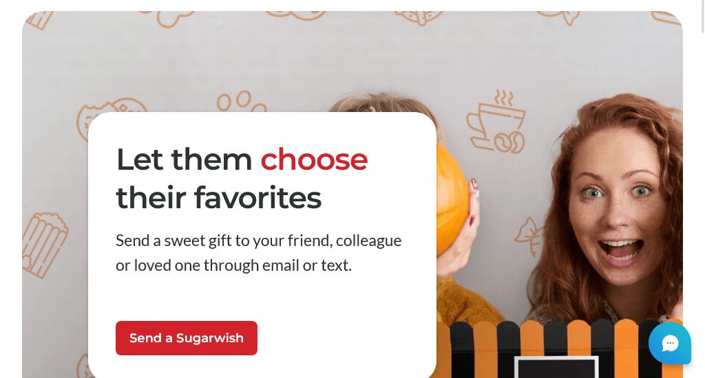
The eye-catching and attention-grabbing photographic images of the products with different colour packaging showcased in the In the Spotlight section effortlessly get visitors in the mood to buy. Hovering over each product opens up the magnifying effect that gives greater details.
As you scroll through the bottom of the homepage, you will find a lot of reviews, and in the footer section, it uses recognisable social media icons to allow visitors to peruse their recent social posts on those platforms.
6. Redbubble
Website: https://www.redbubble.com/
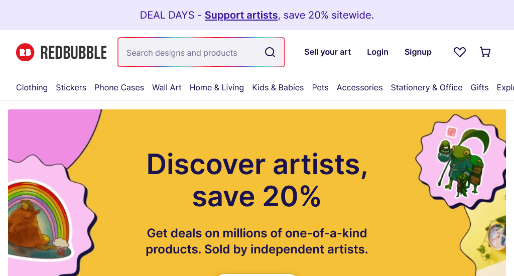
The Featured Products section keeps more eyes on it as it offers the best of multiple gift categories, from stickers to bags to t-shirts. The homepage also features design options and featured artists that customers can pick to get their chosen designs printed on their picked items.
A great feature that catches everyone’s eye is the high definitive search bar at the very top of the home page.
7. Greetabl
Website: https://greetabl.com/
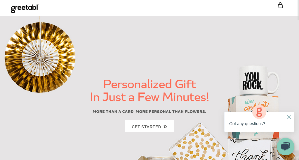
The full-screen hero image is eye-grabbing and perfectly demonstrates what makes the brand unique. The CTA button in the centre of the hero section invites visitors to get started.
The sticky navigation bar features everything needed. On the left, you can check out the shops or create a gift, and on the right, you can log in to your account, read the blogs, or check your bag.
8. Hardtofind
Website: https://www.hardtofind.com.au/
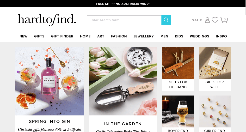
The site clearly emphasises why Hardtofind is the right place to choose special gifts for any kind of occasion. The hover-sensitive navigation menu brings out drop-down menus, which makes shopping easy for customers.
The grid layout design turns all the available gifting categories into simple visual stories for clients. One unique feature this site includes on the homepage is the mention of tips on how to win the tricky gifting game.
9. Uncommon Goods
Website: https://www.uncommongoods.com/
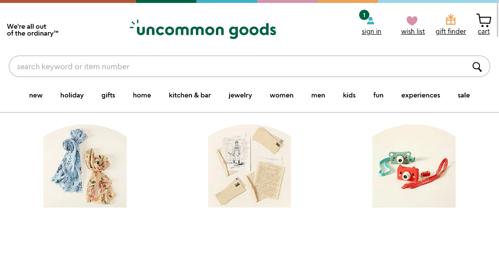
The strength of Sleeper’s website lies in its simplicity, which makes it easy to follow. The font and layout are straightforward, avoiding unnecessary complexity. Uncommon Goods makes sure that its product photos are the element that stands out throughout the homepage.
10. Yellow Octopus
Website: https://www.yellowoctopus.com.au/
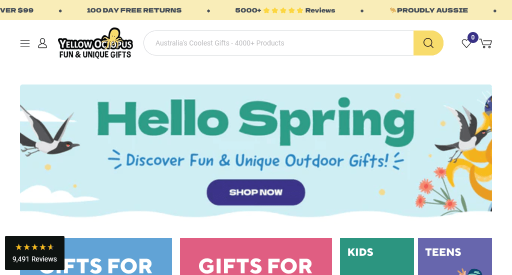
The website’s design serves as a stellar illustration of effectively employing a carousel banner at the very top of the homepage to showcase enticing deals, offers and a number of customer review ratings. This event creates a sense of urgency among the prospects as well.
The website used the grid format to display the different types of gits available- Gifts for him, Gifts for her, Gadgets, Birthday, Kids, Teens and more. Not only does it make it easier to browse, but it helps to highlight the products as well.
11. Mouth
Website: https://www.mouth.com/
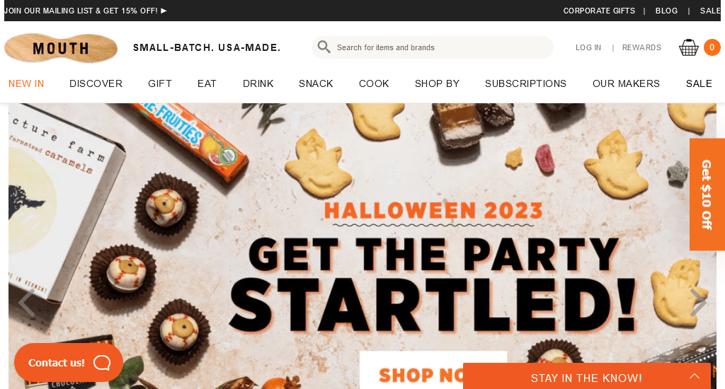
The liberal use of white space to showcase the bunch of products they offer is definitely a good strategy. The design is uncluttered. It is easy for visitors to scroll through the selection of best-selling gifts as a simple click on a specific product seamlessly redirects them to a comprehensive product description.
12. Zazzle
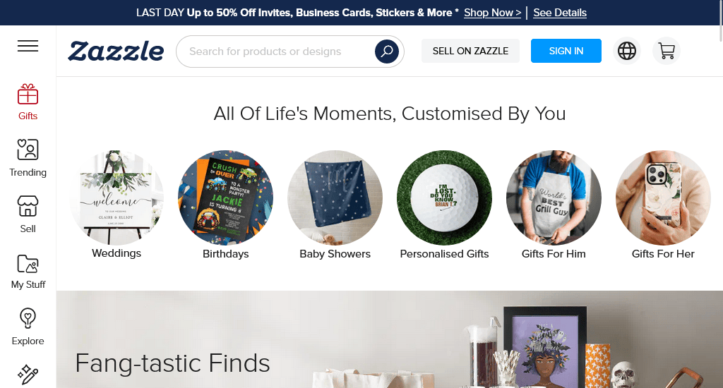
Website: https://www.zazzle.com.au/
The hero section is more extensive to cater for customers who already know what they need, covering product categories ranging from baby showers to personalised gifts to gifts for him.
The hamburger menu that is positioned centred at the top of the homepage reveals the big menu over clicking. Also, the sidebar features several sections, including Gifts, Trending, Sell, My Stuff, Explore, and more.
Wrapping up
So, if you are in need of a model demonstrating how to design your website for unique gifts, the website examples listed above can definitely help to inspire your own, as the featured websites strike a remarkable harmony between creativity and usability. Get ideas for specific details or features and start planning the perfect website design today.
You read a lot. We like that
Want to take your online business to the next level? Get the tips and insights that matter.

