
15 Examples of Excellent Medical and Healthcare Website Design
The success of hospitals and healthcare providers depends on the quality of their service. But in an age where most of us look up information online before making almost any decision, a well-designed healthcare website is no less important.
Most of the people visit a hospital website to get information. So these sites must be very user-friendly, easy to navigate and extremely well-organised with pleasing aesthetics.
Based on these criteria, we’ve listed some of the best medical and healthcare websites, mostly from Australia. Any website for a doctor’s clinic or a hospital can follow the good parts of these sites.
Let’s take a look:
1. The Royal Melbourne Hospital
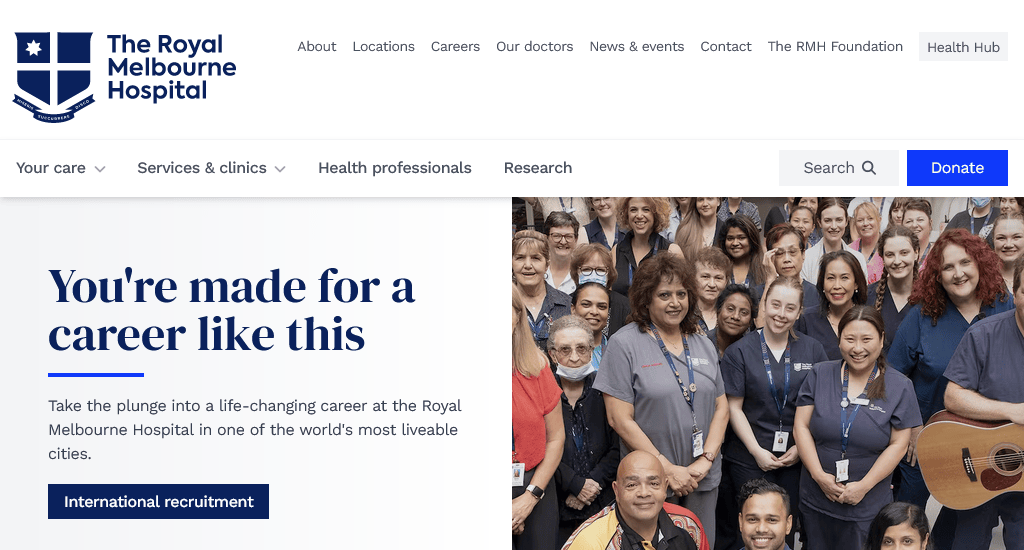
The website of the Royal Melbourne Hospital combines traditional website design with usability best practices. The result is a regal and trustworthy look that goes well with their storied history of 170 years.
They present all the information that a patient or general visitor might need in great detail. The navigation bar consists of drop-down menus. Also, the search box and donate button are displayed at the top right with a perfect visual presentation. This makes their homepage very actionable and encourages the visitors to interact with the site.
Website: https://www.thermh.org.au/
2. Beyond
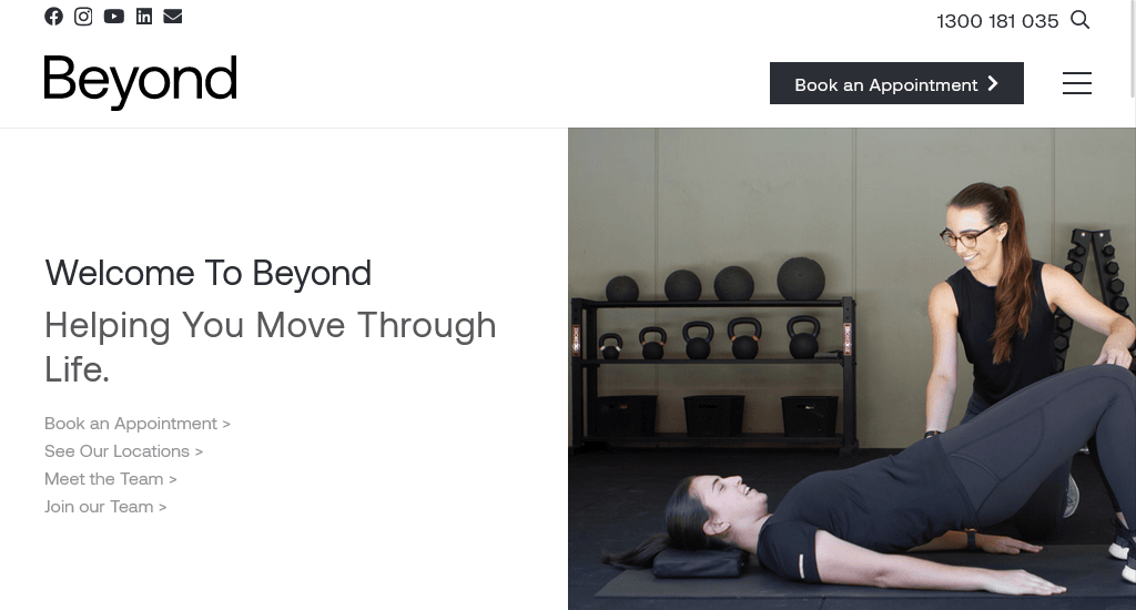
The first thing that pops up in your mind when viewing this site is how uplifting the design is. High-quality positive imagery is used throughout the site to send a positive message. The hero section allows the user to carry out their purpose easily, be it to book an appointment, search for locations or, meet or join the team, simply by clicking any of the featured section that provides direct links.
The top bar has a search box and contact details. A hamburger menu button is placed at the top right beside the Book an appointment CTA button. Overall, a combination of soothing colour schemes and friendly images makes it one of the best medical websites in Australia.
Website: https://www.movebeyond.com.au/
3. The Alfred
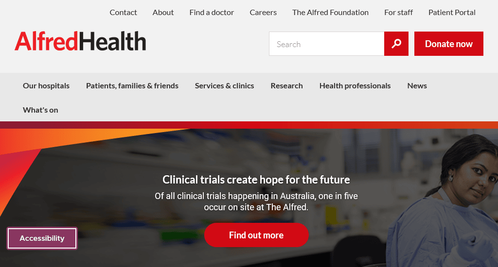
The modern design of The Alfred focuses on highlighting the positive impact of their physicians and researchers. Their homepage shows many powerful images of medical professionals helping their patients.
Positive and active images are used throughout the site while presenting all the necessary information. Thanks to a balanced use of text content and visuals, it never feels cluttered. They maintain a specific colour theme and design style in all their pages, giving the site a unified brand voice.
Website: https://www.alfredhealth.org.au/
4. Northern Health
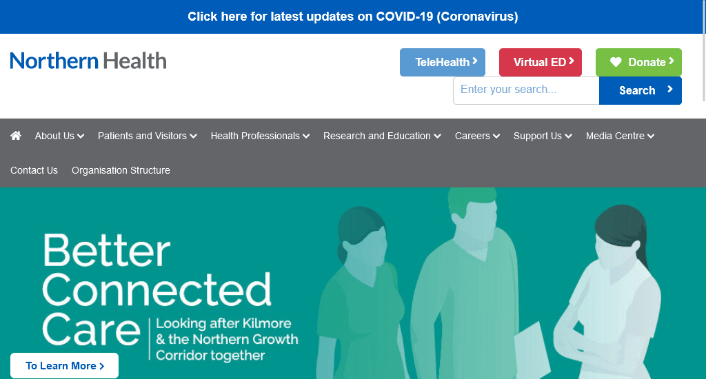
This hospital website utilises the ‘feel-good’ aspect of human perception. Like their logo of a lotus, the homepage gives off a sense of serenity thanks to its beautiful use of white space.
The same quality is maintained throughout the site. Visitors are able to collect their necessary information easily and quickly. Hovering the mouse pointer on the menu bar brings out a detailed drop-down. There’s also a search bar and call-to-actions like TeleHealth, Virtual ED and Donate.
Website: https://www.nh.org.au/
5. Greensborough Road Surgery
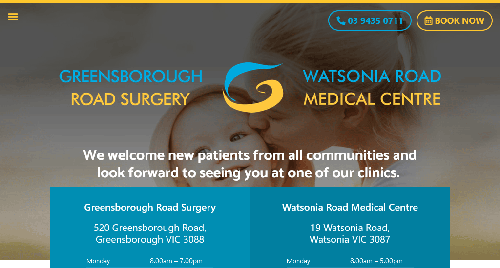
Simple, yet effective. The website of Greensborough Road Surgery shows that you don’t always need a complex medical website design to be the best.
Their site offers quick and easy navigation, precise information and welcoming imagery on every page. Two highlighted call-to-actions, Book now and Call us, make it easy to book a schedule and contact the clinic. These ease the visitors’ worries. The site is very mobile friendly and provides an excellent user experience.
Website: https://www.grs.net.au/
6. Huntingdale Dental Clinic
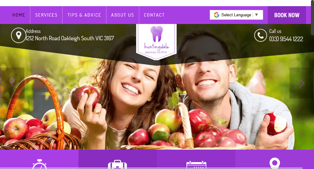
The website for Huntingdale uses a compact design and jumps right into the fray. A visitor can find all the basic information at the bottom of the homepage carousel.
Their strength lies in the excellent use of call-to-actions throughout the site. The homepage displays a quick and simple appointment form beside their working hours.
Website: https://www.huntingdaledc.com.au/
7. The Royal Women’s Hospital
Their website, from top to bottom, aims to appeal to women, even the colours. The banner displays positive images and messages on motherhood.
The female-friendly design comes with an organised presentation of services and facilities to quickly provide what most people seek. The navigation bar sections – health information, Patients & visitors, and Health professionals, are perfect to let a new visitor find out more about them. There is also a comprehensive support page to help women who have faced violence.
Website: https://www.thewomens.org.au/
8. Macquarie University Hospital
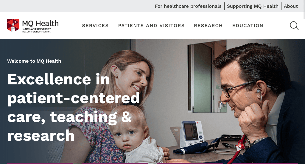
One of the unique websites among the healthcare providers. The menu on the top provides quick access to several parts of the page. They provide precise information regarding their services, patients and visitors, research and education.
The site design lets visitors quickly access the health professionals, services, conditions and treatments, and hospital e-admission facilities. Also, the website uses several full-width images to break the page into different sections with appropriate call-to-action buttons.
Website: https://www.mqhealth.org.au/
9. Lifecare
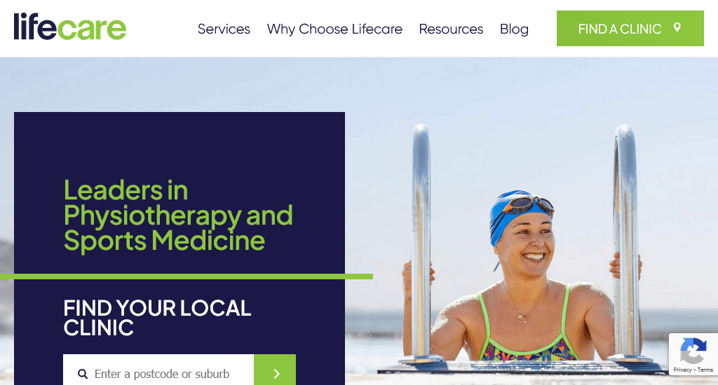
The fact that Lifecare has branches all over Australia is quickly highlighted on their website. It is the first thing people see. But it also works as a strong call to action. Visitors are encouraged to find a location nearby and book an appointment.
The website uses impactful images that show the happy faces of the patients receiving physical therapies at Lifecare. The right choice of design elements and colours gives this site a soothing aura. The sticky navigation bar remains fixed in place even while seamlessly scrolling through the content and comes with sections like Services, Why Choose Lifecare, Resources and Blog.
Website: https://www.lifecare.com.au/
10. NYC Health+ Hospital
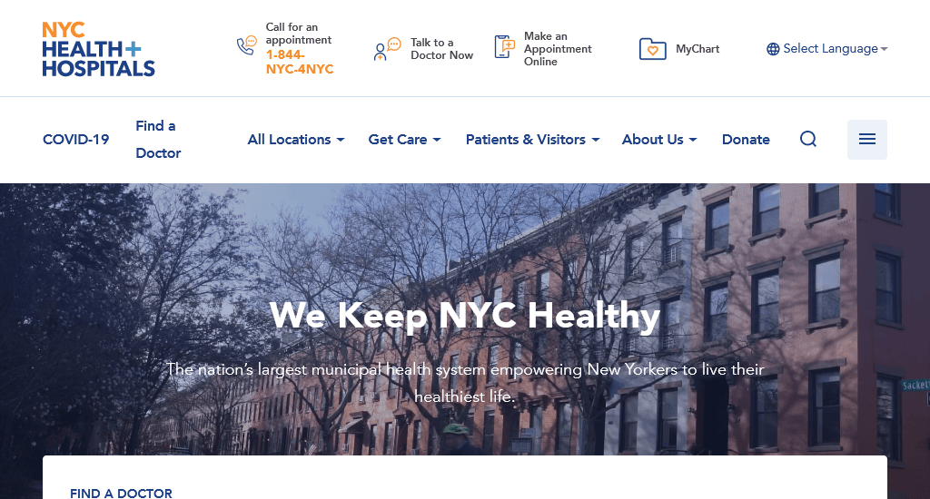
The website of the NYC Health+ Hospital is colourful, positive and easy to use. From the homepage to the Contact us, every page will bring a smile to your face.
The website uses amazing, heart-warming images to highlight their great attitude. They also showcase their social media activities and encourage visitors to engage with them. A strong focus on diversity and capability instantly clicks with the visitors. People are able to quickly find which doctor can help them, how and when to reach them, as well as their speciality.
Website: https://www.nychealthandhospitals.org/
11. Olathe Health
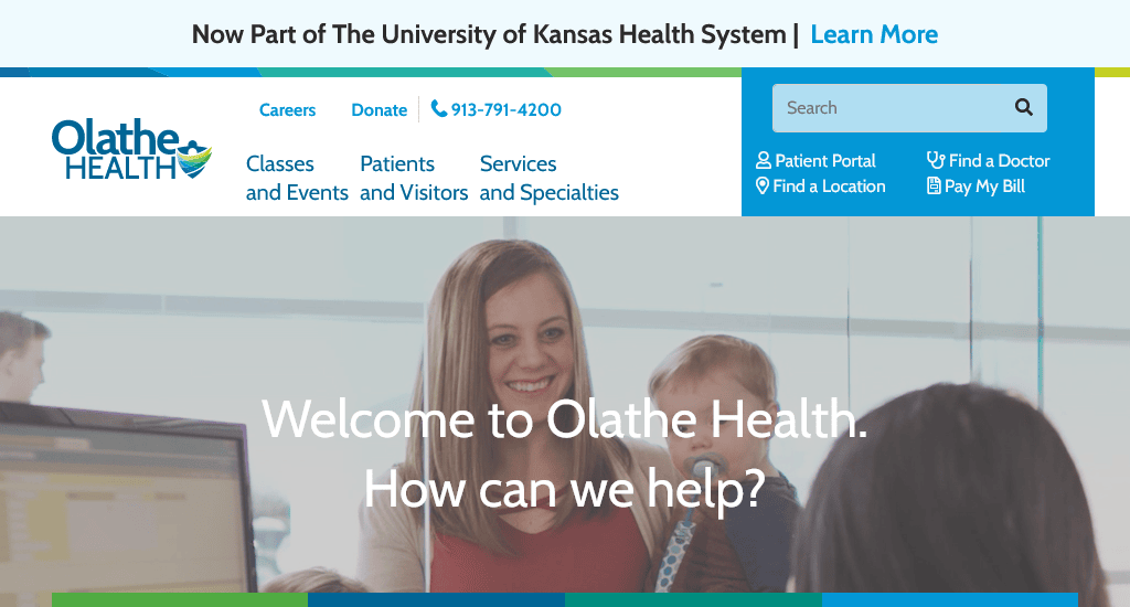
Olathe Health has a website that reflects competence and value delivery effectively.
On their website, finding a location, getting details of a doctor, accessing portals, and bill payments are all accessible in the above-the-fold region. Their phone number is clearly visible in the navigation bar at the top. This button is interactive, so visitors can place a call directly from their website.
The banner section plays videos, which show people who seem satisfied with their service. Such videos would help engage their site visitors. One of the best qualities of their website is it is clutter-free. It effectively highlights the desired actions they would like their visitors to take. As a result, convert a significant portion of their monthly visitors.
Website: https://www.olathehealth.org/
12. Peter MacCallum Cancer Centre
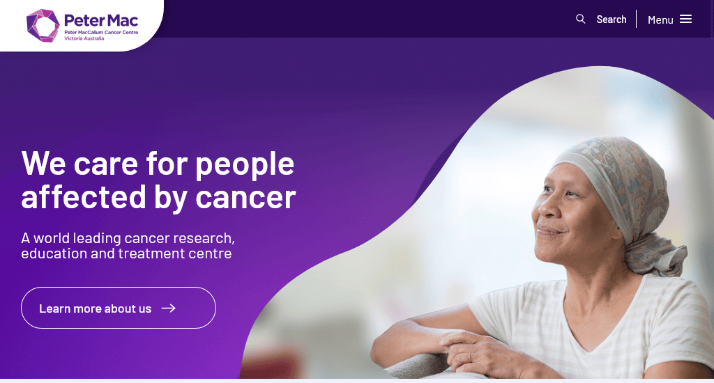
Dynamic homepage banner, powerful images, uncluttered design and amazing background – these are what got this site a place on our list. The design is further reinforced with the use of impactful words in the banners.
The website’s high-quality background complements the content and colour scheme on every page. Everything is presented in great detail to ensure the visitors get the information they are looking for.
Website: https://www.petermac.org/
13. Royal Adelaide Hospital
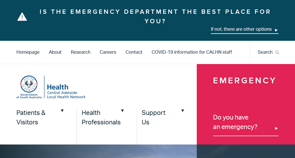
The Royal Adelaide Hospital website takes a slightly different approach in their choice of imagery. Instead of a friendly and welcoming feel, they opted to go for a sophisticated look. Their designs, content structure, and images all convey the same message – You are in capable hands.
Their homepage prioritizes engagement over other things. Quick links with necessary information and emergency contacts are highlighted at the bottom right.
Website: https://www.rah.sa.gov.au/
14. St. Andrew’s Hospital
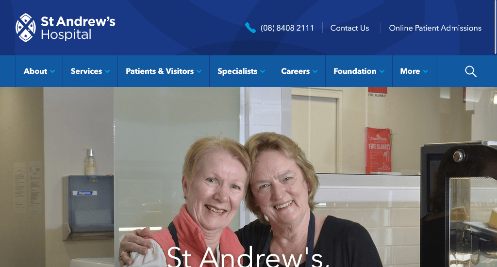
Always in motion, always active to take utmost care of their patients. That is the motto of St. Andrew’s Hospital, and that is the message their website represents. Every image on different pages highlights their dedication to providing quality health services.
It is not a large website, but it is big enough to provide the necessary information. The homepage starts with an image that covers edge-to-edge screen space and includes a well-organised footer section. The colour scheme is bright and welcoming. Simple and quick navigation means you’ll be able to find what you are looking for with ease.
Website: https://www.stand.org.au/
15. The Royal Children’s Hospital Foundation

This entry in our list isn’t technically a medical service provider, but they are an organisation that is dedicated to improving children’s health. The foundation works diligently to research new medicine, offer education, and transform healthcare for children.
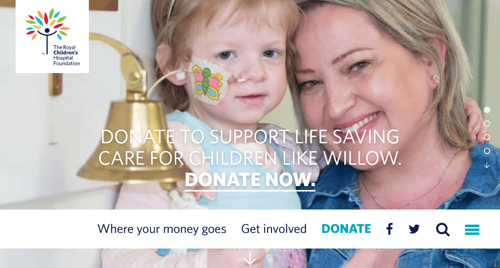
The website’s homepage is using a looping video banner to showcase the positive impact of the foundation. With powerful words and happy faces of the children, it is tough not to feel emotional. It’s colourful, uplifting and wholesome.
Website: https://www.rchfoundation.org.au/
Conclusion
A lot of private hospitals have passable and uninformative websites. Here, a greatly made site will set you apart. Unlike other business that uses social media to create hype, as healthcare providers, you need a website that will help people in distress.
Each of the healthcare websites mentioned here focuses on user-friendliness and has the appropriate design philosophy that makes them the best medical and hospital websites in Australia. If you are in the health service, these should be considered great examples for your own website.
Do you need a website for your medical centre? Have a look at our medical website design packages.
You read a lot. We like that
Want to take your online business to the next level? Get the tips and insights that matter.


