The 15 Best Restaurant Websites for Design Inspiration
The best restaurant websites have one thing in common: beautiful presentation. An attractive design with excellent imagery can bring you many customers. Usability is important. But it’s the mouth-watering visuals that make these sites great.
The visual presentation should not distract your visitors from getting key information, however. Your locations, menu items and opening hours should be easily accessible.
Below we have listed some of our favourite restaurant websites for you to use as design inspiration.
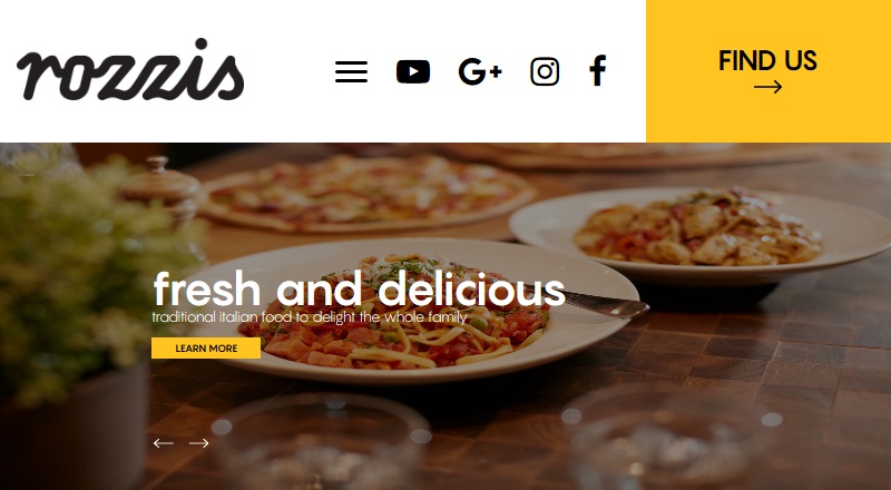
Check out our recently launched project – rozzis.com.au . Rozzis is an excellent example of a restaurant website with a focus on visuals.
Your restaurant website could have the following components
With the majority of customers visiting a restaurant’s website prior to dining in or taking out and preferring to use the website or app for food delivery, you have already understood why you need to care about the restaurant’s website design.
But despite the significant emphasis placed on the need for websites with dependable features, a considerable number of restaurants find themselves lacking in websites that adequately cater to their specific requirements.
So, here’s a quick rundown of the key components you should work on to ensure your restaurant website is as effective as possible.
- Online ordering and reservation system.
- Menu with descriptions and pricing.
- Social media accounts.
- Contact details.
- Customer reviews and testimonials.
- Special offers and promotions.
- Direction or map to the location.
- Photo Gallery.
- Frequently asked question page.
1. Bresca
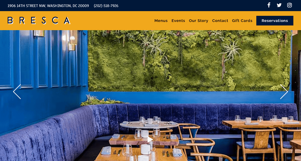
If you are looking for a standard restaurant website design example, take this one. Bresca mentions their address and phone number right at the top. Then comes a well-organised menu bar from where you can access every important page, like menus, events, contact details, etc. Scrolling down, you’ll find great visuals with neatly presented information. You can reserve a table by clicking the Reservation button in the top right corner, which is a very convenient feature for potential customers.
Site address: https://www.brescadc.com/
2. Sono
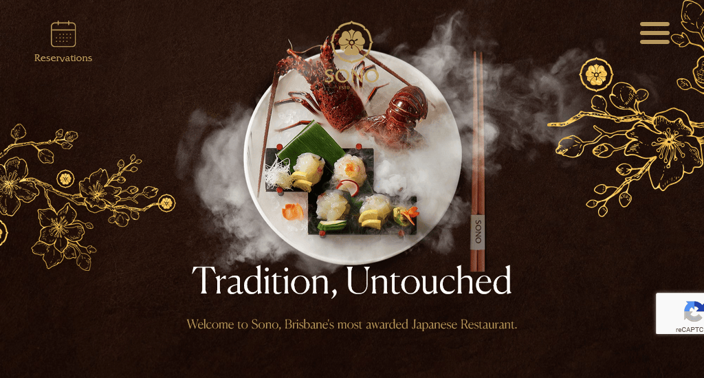
Sono Australia has an elegant single-page website with relevant images and call-to-actions in each section. The menu on the top gives you quick access to different parts of the page. They provide precise information regarding their address, trading hours and parking facilities. There’s also an inquiry form in case you have any general questions. Overall, the site is very well-designed and user-friendly.
Site address: http://sonorestaurant.com.au/
3. JB Restaurant
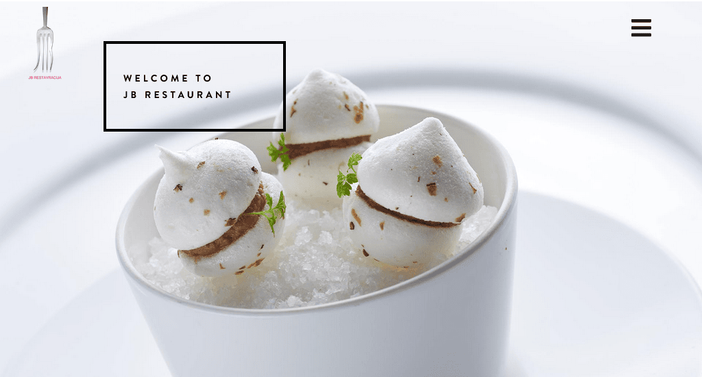
The strategically placed Reservations button is optimised to prompt visitors to book a table. It evokes the upscale atmosphere that guests can expect from a visit to JB Restaurant. The photography shows crisp clarity, complemented by tasteful font selections, while the minimalist colour palette maintains a subtle elegance. As a whole, the website promises an exceptional experience for all its customers.
Site address: https://jb-slo.com/
4. Colonia Verde
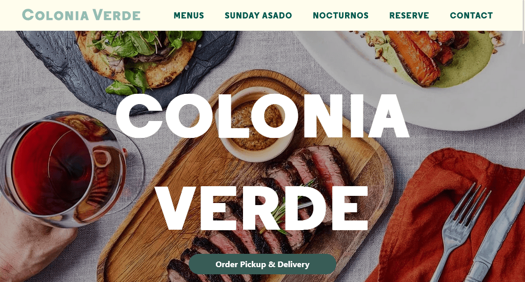
Colonia Verde has an unconventional website. The hero scene features a captivating, full-width image accompanied by the brand logo. The sticky header, complete with the logo, reservation button, and off-canvas menu, remains accessible throughout. In addition, the harmonious blend of imagery and short description creates an immersive user experience that leaves a lasting impression.
Site address: https://www.coloniaverdenyc.com/
5. Restaurante Baobab
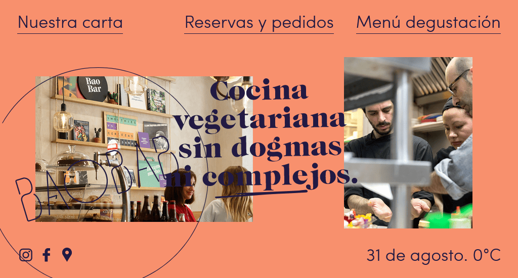
This is a good example of a vibrant and colourful restaurant website. The website’s design is a stunning display of innovation, featuring cool and subtle animation. The minimalist homepage offers direct access points to their letter, testing menus and reservation and order options. The content is also masterfully presented, incorporating various vibrant and dynamic colours that enhance its overall appeal.
Site address: https://www.restaurantebaobab.com/
6. Protein
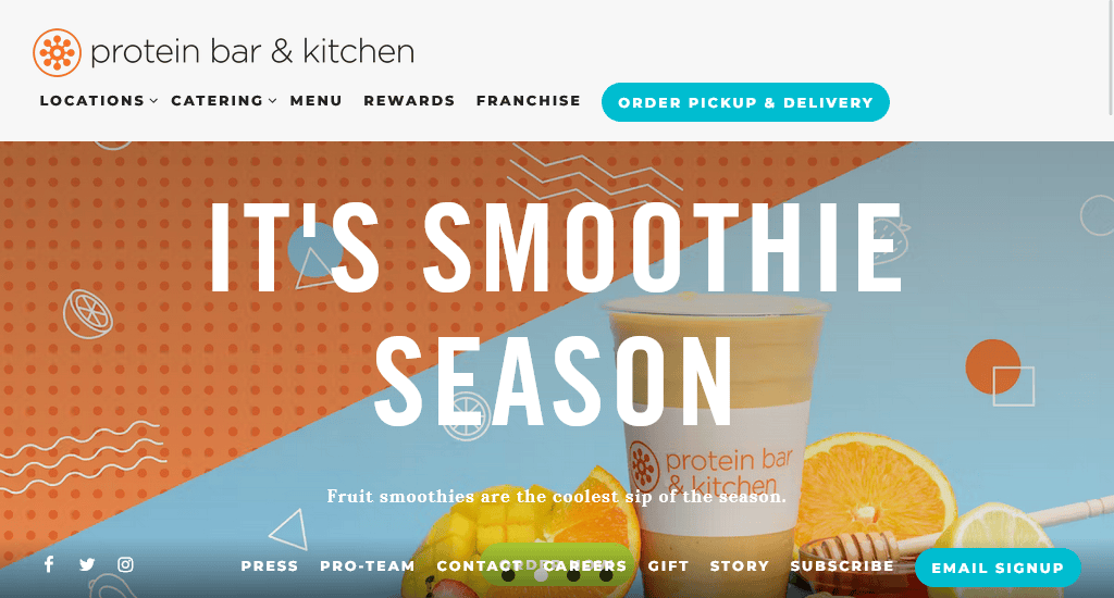
Here’s another vibrant and colourful restaurant website. Protein Bar & Kitchen operates in multiple locations and takes online orders, as seen in their navigation bar. The homepage uses a carousel of images along with some parallax effects. The visuals used throughout the site follow a well-chosen colour palette.
Site address: https://www.theproteinbar.com/
7. Quay
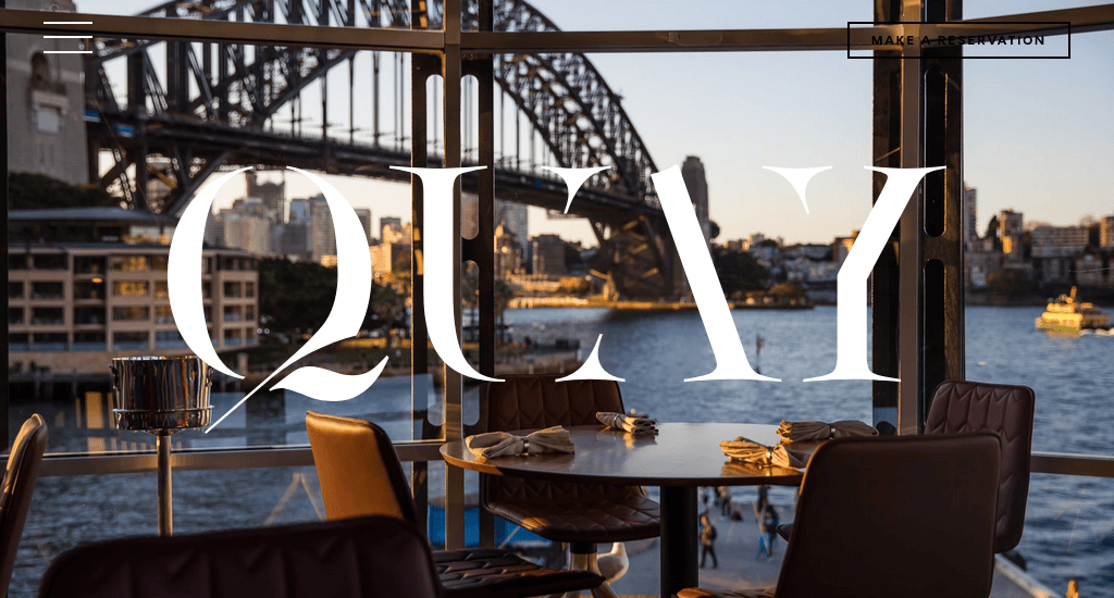
Quay is one of Australia’s most awarded restaurants, and they have an excellent website to match their reputation. The combination of stunning images and ample use of whitespace gives this site an elegant look. There’s an in-built reservation system, which is accessible from the top right corner. The hamburger menu on the left is nicely organised. Quay’s site works perfectly on mobile devices.
Site address: https://www.quay.com.au/
8. Quince
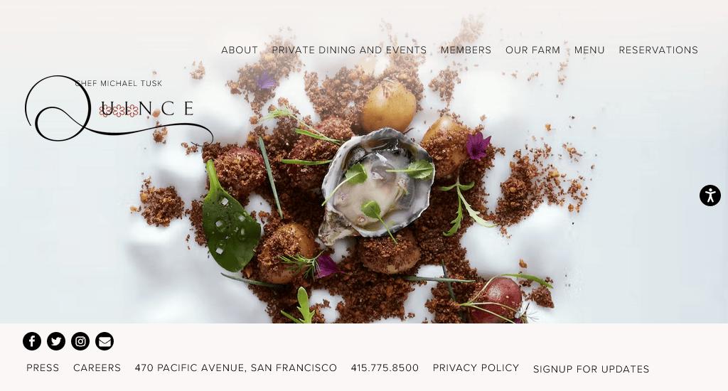
Quince provides an excellent example of how you should design a restaurant website. The minimalist main page offers quick access to their menus, private dining, team and reservation options. Clicking on the Welcome button gives you all the necessary information, like a location map, opening hours and accolades. All the pages contain full-width, vibrant images of both the food and the restaurant interior.
Site address: https://www.quincerestaurant.com/
9. Easy
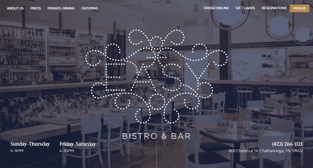
Easy Bistro & Bar uses a slideshow of images on their homepage. The opening hours, contact information and address are there at the bottom. There is a Reservation button on the top left and a menu button on the top right. Clicking on the menu button opens full-page navigation from where you can check their food menu private dining options, know more about the chef and get links to their social media accounts.
Site address: https://www.easybistro.com/
10. Pastaria
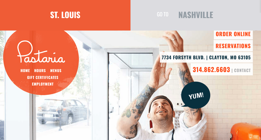
Pastaria operates in two locations, and their site lets you quickly select between the two from the top bar. The site is very well-organised and has a clean look. There’s a round sticky navigation that stays in place as you scroll down the site.
Site address: https://eatpastaria.com/stlouis/
11. Ilili
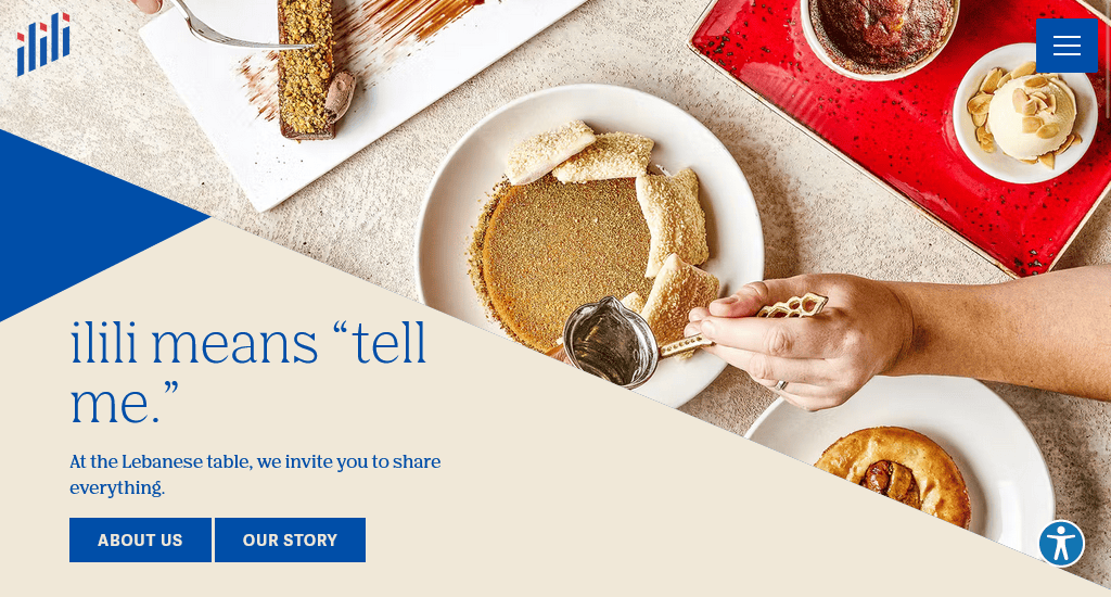
This is another great example of a standard restaurant website design. Ilili uses inviting images on its homepage that showcase both its food and interior. The navigation bar gives quick access to their location, menu, catering options, etc. You can also order online or reserve seats right from there.
Site address: https://www.ililirestaurants.com/
12. Au Cheval
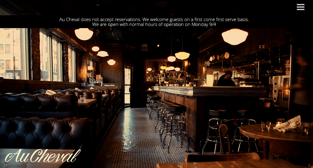
Au Cheval’s site is all about visuals. The site contains stunning full-screen images. Scrolling down through these images will surely get you motivated to give their restaurant a try. The site design makes important information easily accessible via the top-right menu icon. If you want to build your restaurant’s site focusing only on images, Au Cheval is an excellent example of how to do that.
Site address: https://auchevaldiner.com/chicago/
13. Fox
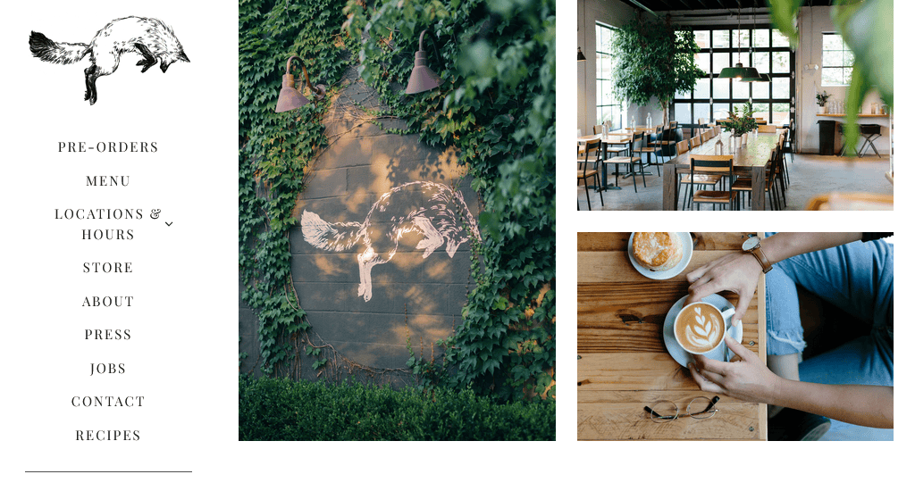
Fox In The Snow Cafe uses a right-side navigation bar and many images on its homepage. A selection of their Instagram posts is arranged in square-sized grids, which is a nice way to show that they have an active presence on social media.
Site address: https://www.foxinthesnow.com/
14. 4 Rivers
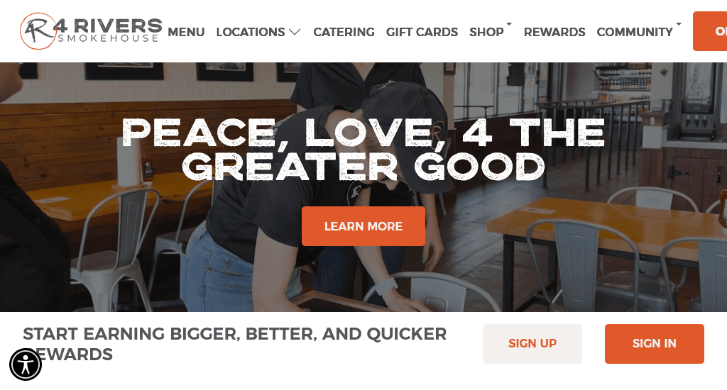
4 Rivers Smokehouse uses video on its homepage to grab the viewer’s attention. The website uses several full-width images to break the page into different sections with appropriate call-to-action buttons.
Site address: https://www.4rsmokehouse.com/
15. Moxhe
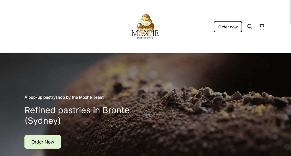
We have seen several sites using multiple full-screen images on their home page. This seafood restaurant in Australia stands out by using a full-screen video background at first. The rest of their homepage images zoom out as you scroll down the page. The sticky navbar on top makes it easy to access their menu, contact information, booking form and social media accounts.
Site address: https://www.moxhe.com.au/
Conclusion
As you browse through these websites, you’ll realise there are several common design patterns that are repeatedly used by different sites. It might seem quite hard to be unique among the thousands of restaurant sites on the web, but it’s not absolutely necessary to be different from all of them.
What matters the most is to be able to attract customers through beautiful visuals and by providing an excellent user experience. In a broader sense, these two qualities set quality websites apart from mediocre ones.
You read a lot. We like that
Want to take your online business to the next level? Get the tips and insights that matter.

