15 Best Church Websites for Design Inspiration
Church websites play a key role in building up church communities. Most new visitors will take a look at a church’s website before entering the building. Regular churchgoers will certainly appreciate a well-designed, informative online presence for your ministry.
The primary goal of a church website is to provide information to its visitors. That means easy navigation and a well-organised site structure are crucial here. Some other essential goals are collecting donations, recruiting volunteers, and informing people about church events.
Elements of a great church website
- A welcoming homepage design with large images and videos
- Easy navigation with a clear information architecture
- Real photos of the church community and congregation
- A mobile-friendly UI with clear calls to action
- Self-manageable backend. So that you can easily update announcements and add media by yourself
Choosing the right visuals and layout is extremely important in church website design. Some church sites go for lively, inviting visuals. On the other hand, some focus on a calm and simplistic look.
How should your church website look like? To help you decide, we have listed 15 of the best church websites below for your design inspiration.
What are the best church websites?
Here are some of the top church websites that we have seen in 2023. Obviously, this isn’t an exhaustive list, but these will give you a good idea of design trends and best practices.
1. First Church
Site: https://www.firstchurch.com/
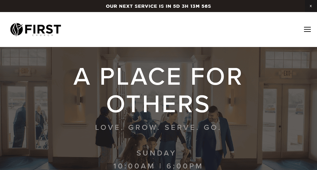
The First Church has an excellent homepage. There’s a well-organised navigation bar at the top, which stays in place as you scroll down. They make great use of different call-to-action buttons such as – Watch Live Sunday, I’m new, Learn more, etc.
The top menu offers direct access to key pages, while some points expand into drop-down menus. The other pages of the site are also very informative and user-friendly. For example, take a look at their I’m new page. It clearly mentions First Church’s service times and terms. There’s also a section that talks about their kids’ program.
The designers of this church website really thought about what their visitors were looking for and made it very easy to find this information. The combination of great UX with a clean design and functionality makes it one of the best church websites that we’ve seen.
2. The Village Church
Site: https://www.thevillagechurch.net/
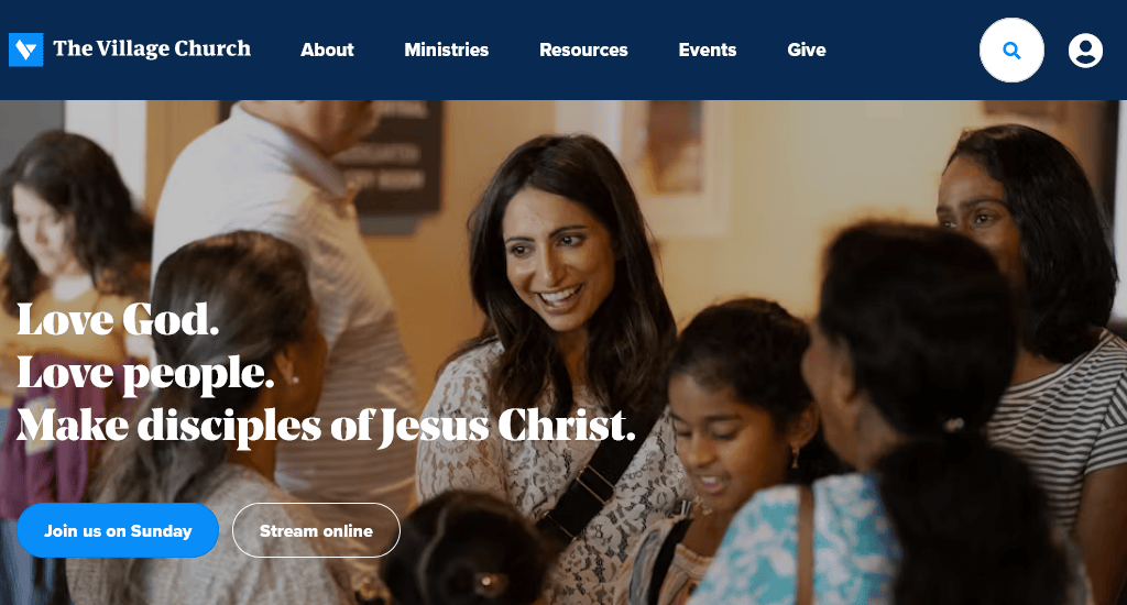
The Village Church chose to focus on real-life images and a consistent colour scheme for its online presence. They have a beautifully designed website with a clean and modern look. The Join Us on Sunday and Stream online button in the banner image is in button format, helping it to draw attention.
The logical and clear navigation bar comes with five top-level links and no dropdowns. The colour combinations, perfect use of whitespace, and lively images make it one of the most beautiful church websites that you’ll come across.
3. Remnant Church
Site: https://www.remnantrva.com/

Remnant Church’s website uses full-screen videos on the homepage, showcasing the church’s regular activities. The well-chosen clips give a friendly, warm vibe. The site encourages people to visit the church premises and join the community groups. The banner page includes the I’m new! Call-to-action button for people who are new to the church.
The rest of the homepage is very clean and simple, with clear instructions on how to join the Sunday gatherings. Remnant also has an online portal where registered members can log in. Their About Us page includes happy family photos of the pastors.
4. Fuel Church
Site: https://www.fuel.church/
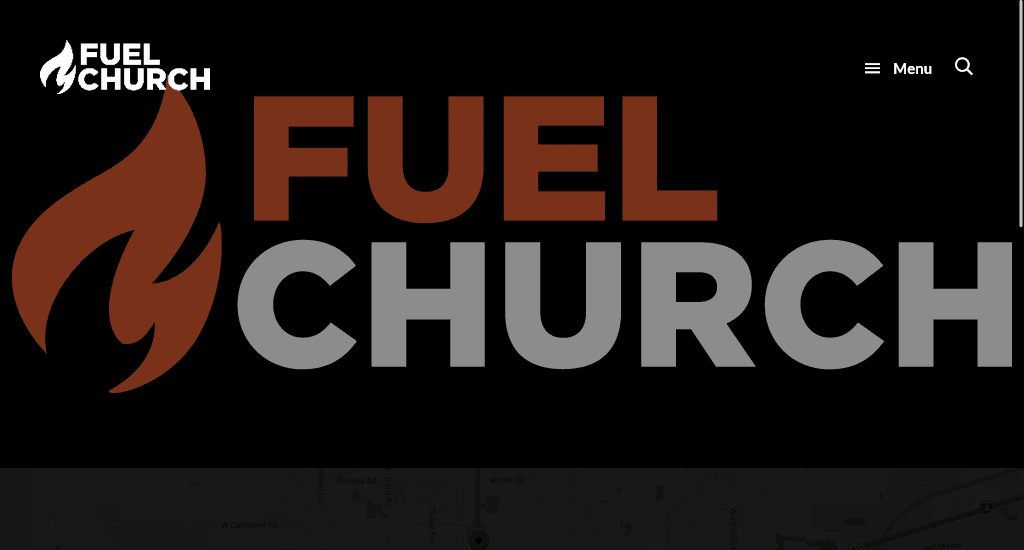
This is one of the cooler church websites out there. The church’s location is clearly listed just below the featured image on the homepage, with the Google map as a backdrop. The site navigation is excellent.
A few of the links in the navigation menu open a drop-down with all of the church’s information. Fuel Church doesn’t use many real church activity images but provides numerous ways for its visitors to engage.
5. Hope Centre
Site: https://www.hopecentre.com/

Hope Centre is an 80-year-old church operating from six different locations across Australia. This is a mobile-focused church website. The site is divided into multiple parallel sections. The top section contains a banner image, and the rest contain various important pieces of information (like locations, prayer, connect) or links to other pages.
The navigation menu covers everything, including missions, connect, resources, events and alpha. At the top right centre of the navigation menu, the focused Give button easily grabs the attention of people who are interested in donations.
Hope Centre is a good example if you are looking for mobile-focused church website ideas. Despite the unconventional design, the site is very user-friendly.
6. Rockville Church of Christ
Site: https://rockvillechurchofchrist.com/
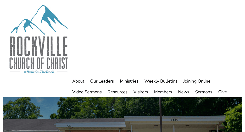
Small church websites are often poorly designed. Rockville Church is an exception. This site is very simple, but it has all the essential features that a small church might need. The homepage offers a carousel of images of the church and other activities and offerings, followed by the news, recent sermons and upcoming event information.
Scrolling down, visitors will get to see the Sunday worship schedule. The location and meeting times are explicitly mentioned. The integration of Google Maps and a carousel of upcoming events are two useful additions.
7. Judson Memorial Church
Site: https://www.judson.org/
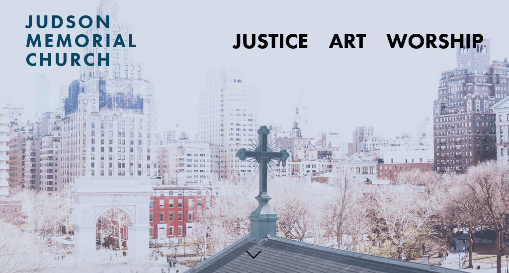
A church’s web design doesn’t usually follow a bold visual style, but Judson is an exception to this rule. Big fonts, colourful navigation icons and the use of typography as a visual medium make this church website a bit different from the rest. The site is attractive, user-friendly, and easy to navigate. We think the designers have done a great job with the visuals.
8. River Valley Church
Site: https://rivervalley.org/
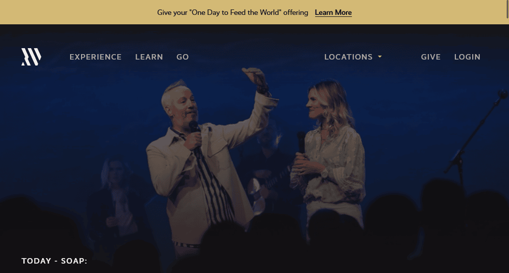
River Valley Church’s website could secure a place in any top church websites list. The welcoming background video clips showcasing the life-giving, positive church culture and activities make this site an ideal example for any church’s website designer. Keeping a decent amount of content on the site, they’ve broken down the navigation menu into a few key sections, with a drop-down menu for easy navigation.
9. Hill City
Site: https://www.hillcityrva.com/
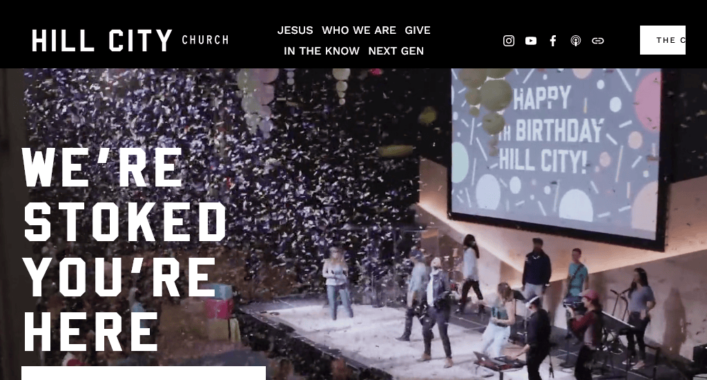
Great church websites should be welcoming and inviting. So, what could be better than a church website that begins with a video of fun-loving, jolly people? That’s exactly what Hill City Church does. Any visitor will stop and spend a few moments looking at this video.
The rest of the site is quite simple but well-organised. Consider Hill City a good example if you want your church site to have vibrant video content.
10. Trinity Hills Church
Site: https://www.trinityhills.church/
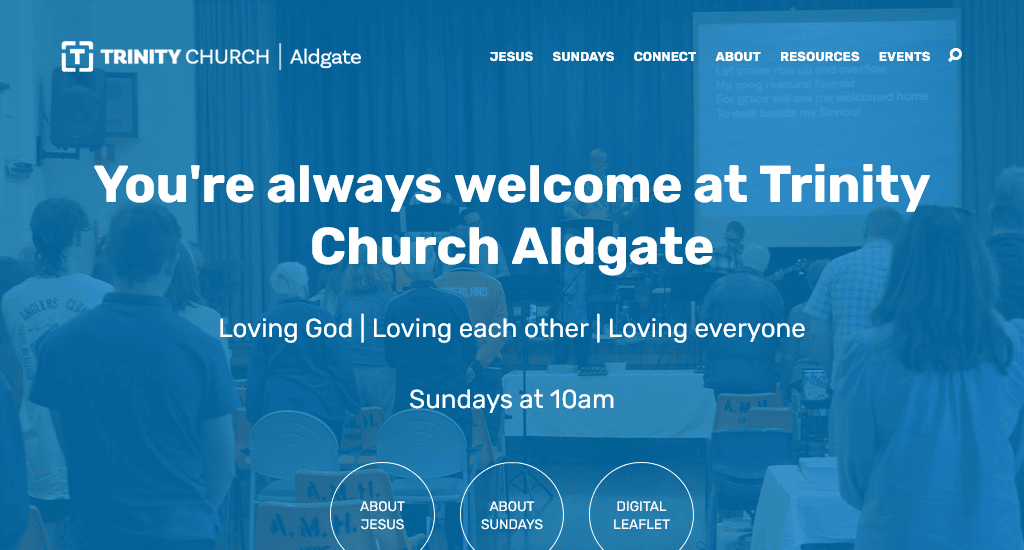
Some modern church websites tend to divert from the usual design style. Trinity Church uses parallel scrolling and stylized imagery to make its site stand out. The sticky nav bar with search functionality is quite user-friendly. The footer of every page has an integrated Google map giving anyone directions to their church from any place.
11. Summit Church
Site: https://summitchurch.com/
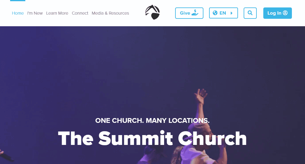
In the navigation menu, they have chosen to display I’m new, Learn more, Connect, Media and Resources while making the entire bar hover-sensitive. So, when the mouse is moved to the top region of the site, it opens up, revealing its contents.
The homepage uses a grid-based arrangement where each box focuses on a particular call to action. The banner image includes a simple headline, a search field to discover church locations and a calendar to see upcoming events.
Also, the New Here section includes details of the questions that a new visitor would have while attending the church for the first time. Links to their social media accounts are placed in the footer.
12. Irving Bible Church
Site: https://www.irvingbible.org/
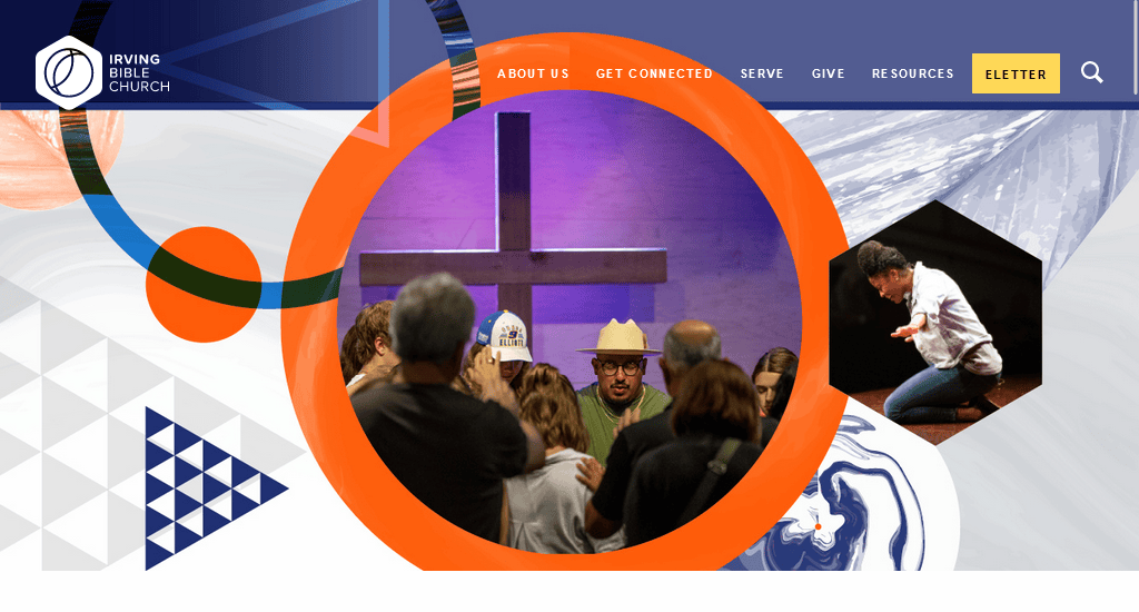
Along with the beautiful banner image, the Irving Bible Church has a very well-organised navigation bar. They also have an active blog where you can filter the articles by topic. Design-wise, the site uses lots of large images and clear calls to action.
13. Terra Nova Church
Site: https://terranovachurch.org/
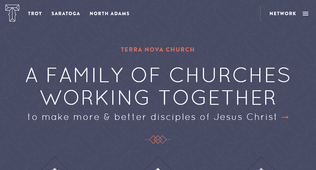
Terra Nova is one of those modern, creative church websites that don’t follow the usual design trend. The site is just stunning. Its design style and colour theme are consistent across all pages. The navigation bar is pretty simple, while the Network link opens up a mega menu with options that help visitors and attendees to be informed.
The latest details of Troy, Saratoga and North Adams are easily accessible from the homepage. Hovering the mouse on the specific section features a visit button that draws the viewer’s eye.
14. Trinity London
Site: https://www.trinitylondon.org/
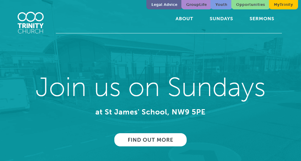
This one is another example site that diverts from the standard church website templates. The design is based on colourful grids, which give the site a very simple yet modern look. The church location and Contact Us form are placed right at the footer. Though the site doesn’t have many pages, each page has just enough information for the visitors.
15. Radiant Church
Site: https://www.radiant.church/
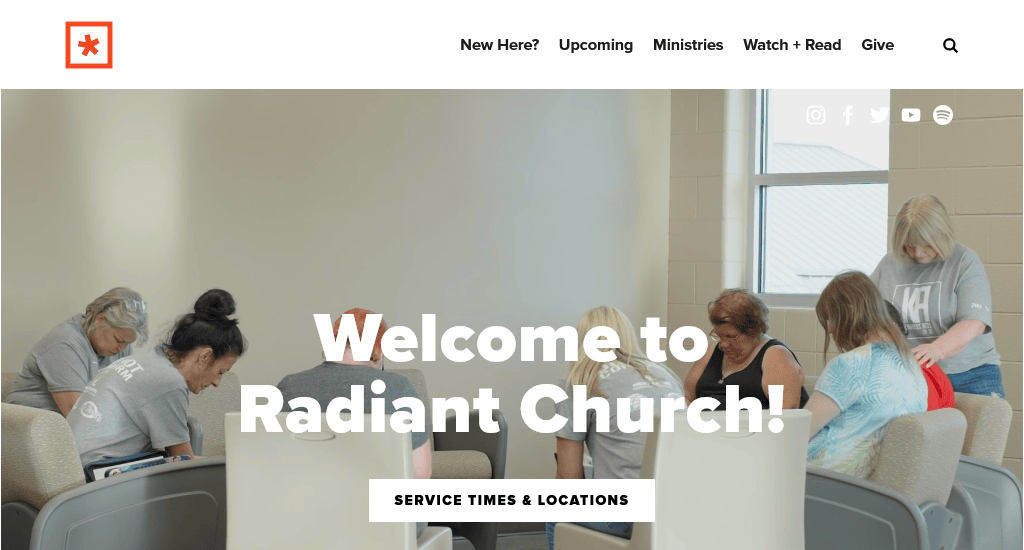
The Radiant Church website design features a full-width background video that showcases the activities and culture of the church, making any visitor feel welcome.
They use a navigation bar that neatly organises all site pages into subcategories. Each page makes generous use of images to denote different sections. The subtle parallax scrolling effect blends nicely with the overall design. The site has a complete archive of the latest sermons, which is a nice addition.
What’s Next?
If you liked any of the church website design examples listed above, bookmark them. It’s much easier to explain a design concept to your designer if you can show them an example.
You may decide to use a church website builder or a DIY platform to make the site yourself, but unless you have professional web design experience, it will be very time-consuming.
You can easily get an affordable church website by hiring a good web design agency. Pick a few of your favourite church sites and ask the agency if they can make you one with your desired features.
You read a lot. We like that
Want to take your online business to the next level? Get the tips and insights that matter.

