How to Select Proper Colours for Your Shopify Website
Colours stand out as a paramount facet in any website design; it evoke meaning and emotion.
When around 93% of consumers consider visual appearance, including colours, to make a purchase decision, it goes without saying that you have to get your Shopify website colour scheme right.
The selection of colour in website design comes down to more than just aesthetics. Deciding on the right colours often proves to be a puzzling and time-consuming undertaking unless equipped with a solid grasp of colour theory.
So, embarking on your journey with a grasp of essential colour theory would be a wise beginning.
What is colour theory?

Colour theory is a set of fundamental principles that encompasses the ideas, principles and applications of colours. Designers use it to communicate with users through harmonious colour schemes in visual interfaces.
It surpasses mare visual analysis, delving into the scientific principles that govern these enchanting colour combinations. From the visual effect of how colours mix, match and contrast with each other to how humans perceive colour, colour theory explains everything.
Why consider colour theory in your Shopify web design?
So why should you pay attention to colour theory? Is it not sufficient to choose a yellow and red hue and consider it done? After all, the approach worked for McDonald’s, right?
Let’s get straight to the point. Your Shopify website design is all about branding, marketing and, of course, sales. And it is the right colour combination in web design that helps users understand and navigate the site.
So, by understanding the fundamentals of colour theory, you can make effective branding decisions. Think about the colours in your logo and the foundational palette for your brand’s visual identity. Reflect on the emotional responses that each colour evokes from your customers.
This will guide customers through their journey, motivating them to make a purchase. Above all, these thoughtfully selected colours leave a lasting imprint, ensuring that your brand stays firmly in their memory.
Colour theory terms you should know
Since colour theory is a set of fundamental principles that govern how to create colour combinations, understanding the principles is a necessary first step in creating colour palettes for websites.
Colour wheel
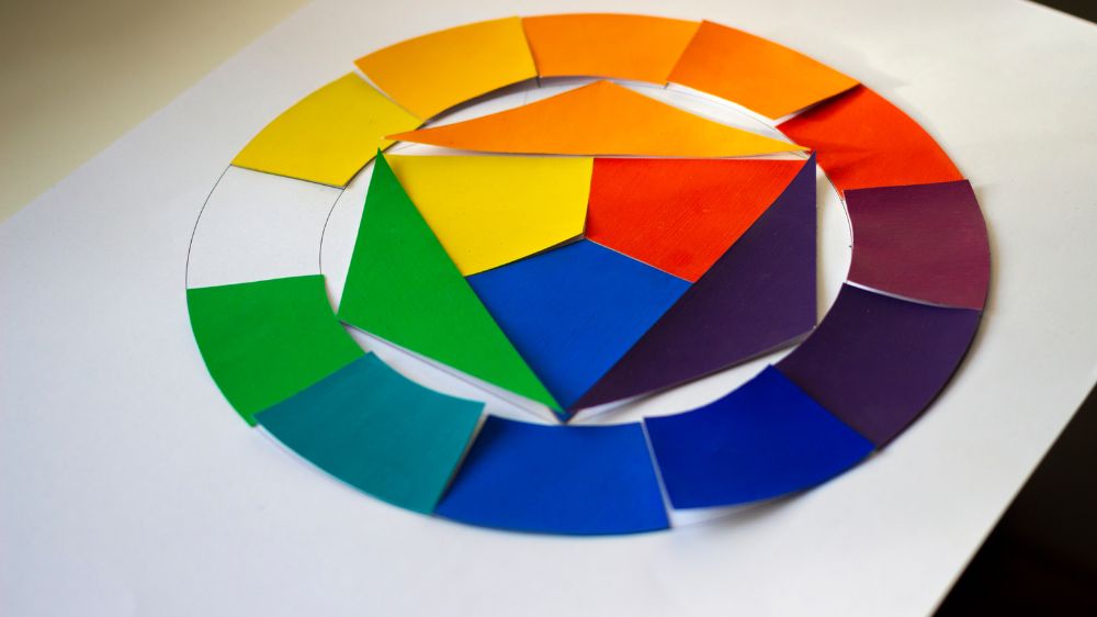
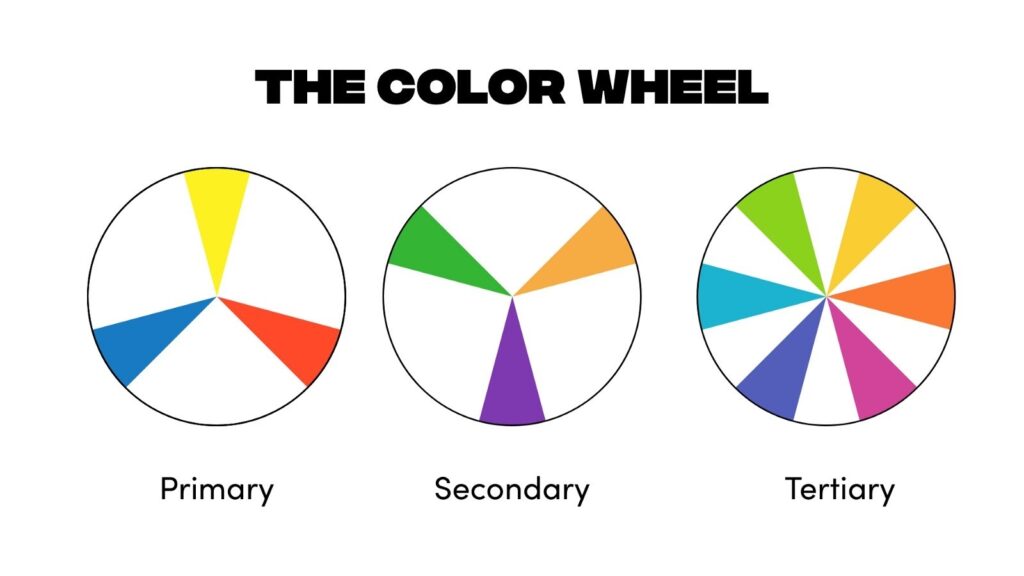
The colour wheel is the first thing to understand about colour theory. It is an organised visual representation of colours across the spectrum. The colour wheel is a collection of 12 colours, which includes three primary, three secondary and six tertiary colours.
Having a basic understanding of the colour wheel and knowing how these colours work together serves as a guide for selecting colour schemes that are delightful and pleasing to the eyes.

The wheel features primary colours: red, yellow, and blue. Mixing these creates secondary colours like orange, green, and violet. By combining primary and secondary colours, we get tertiary hues: red-orange, yellow-orange, yellow-green, blue-green, blue-violet, and red-violet.
As the traditional colour wheel only shows pure colours (known as hues), next comes shades, tins and tones. These are variations of colour wheels. Tints add white to colours for a lighter look. Shades incorporate black for depth, while tones result from blending black, white, and colours.
Colour harmony
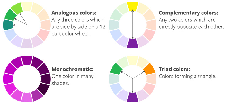
Once you pick a colour, you need to create a scheme. Here’s where you need to know about colour harmony theory. It refers to the arrangement of colours within a design. The easiest way to choose colour combinations is by using the colour wheel and applying principles like analogous, complementary, monochromatic, and triad colour harmonies.

Colour temperature
Colours often fall into two categories: warm and cool. Warm colours like red, orange, and yellow exude vibrancy, while blue, violet, purple, and green is the hallmark of cool tones. Warm colours evoke energy, heat, and activity, contrasting with cooler tones as the cool colours are often seen as calming and less active.
Neutrals such as grey and various shades of white can take on warmth or coolness based on undertones. Neutral colours seamlessly blend with any colour scheme for a harmonious balance.
Colour contrast
Another colour theory principle concerns the use of contrast. The greater the contrast, the more the two colours stand out from one another. When assessing contrast, it’s essential to consider not just the colours themselves (like blue and green) but also how light or dark they appear.
Two different colours with similar lightness or darkness don’t create a strong contrast. When it is the colour contrast that makes certain important elements stand out visually, too much of it can wear out the eyes.
How to choose a colour for your website?
Now that you understand the theory behind colour picking, the successful colour palate is the next task. There’s no objective consensus on the best colour for a Shopify website; it depends on several aspects, like your brand’s identity or the audience you want to reach.
Keep it simple
When choosing your website colour scheme, try to avoid vibrating colours. Think about simplicity so that viewers can grasp the content as it unfolds. While the objective revolves around establishing visual contrast, there are certain colour pairings that can be too harsh for sensitive eyes.
For instance, think about the striking combination of blue and pink or the juxtaposition of orange and green. What you can do is try toning them down a bit to prevent excessive harshness and intense contrast. Excessive use of colours also results in greater user confusion.
Consider colour psychology
When crafting your website design, it is imperative to possess a comprehensive grasp of the psychological impacts that different colours can evoke. Colour psychology explores how colours deeply affect emotions, feelings, and actions.
While subjective, using colour psychology can subtly impact visitors to your website, fostering meaningful connections and engagement.
Here are some of the popular associations:
- Blue evokes a sense of peace, competence, logic, security
- Purple shows royalty, wisdom, luxury, creativity
- White is the colour of clarity, cleanliness, purity
- Orange shows excitement, friendliness, cheapness
- Yellow represents the sun, openness, activity
- Black is associated with power, stability, intelligence, sophistication
Know your audience
Selecting the website colour goes beyond aesthetics; it should contain the emotion your brand aims to communicate. This involves a deep understanding of your target demographics and conducting thorough research to uncover invaluable insights into the hues and shades that resonate most profoundly with your intended audience.
For instance, the use of pink and purple throughout history has been closely associated with targeting a female audience. Conversely, for educational websites for children, opting for a healthy green or an energetic yellow could be a more fitting choice.
Check out the competition
When it comes to choosing colours, always keep an eye on what your competition does. Not to mimic the brands but to make sure you are in step with current trends that are working in your industry. Later, you can infuse your website with a contemporary essence that resonates with your audience. You can even check the Shopify theme store for design and colour inspiration.
Integrate your branding
Think about how your branding fits with your colour scheme. Your brand likely has its own colours. So, use these existing colours for your website’s colour scheme. Taking KFC as an example, they embraced their red and white brand colour across their website and advertisement. Another colour in their palette is black, which is used for text and background. Make sure the colour you use reflects the overall theme, mission and perspective of the brand.
So here we have covered the basics of colour theory and its principles. Also, we have seen how they are used to create impactful colour palettes in website design.
Since you have all this new knowledge now, remember colour in ecommerce goes beyond a one-size-fits-all approach. Whether you’re crafting a store or designing a unique storefront, the application of colour possesses a remarkable capacity to shape perception.
Yet, the ultimate focus remains on what follows—the incredible product you offer.
You read a lot. We like that
Want to take your online business to the next level? Get the tips and insights that matter.

