12 Steps to Optimise Your Ecommerce Checkout Process
Imagine you are the owner of a small physical shop. Sitting at the counter. A customer entered and picked up 8/10 items. When he came to your counter, You smiled and gave some extra offers, seeing his curt. Then suddenly he left your shop without purchasing anything.
Isn’t it a painful story as an owner?
Exactly this happens often with your online shop if you are not offering an easy checkout process.
According to a recent report, in 2023, the average shopping cart abandonment rate globally is 71.68%.
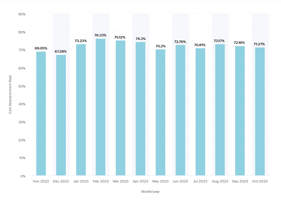
However, some of them are visiting to compare the prices, saving for later, and exploring gift options. These are mostly unavoidable cart abandonment. But the rest of the abandonment can be reduced by taking some good initiatives on your cart page.
If you want to improve the shopping experience in your online store but are not sure why your customers are leaving their carts filled without buying anything, this article may help you gather some tips.
12 best ways to enhance your ecommerce checkout process
Please consider all these points that can help to reduce user frustration during the whole process, but in the end, your checkout flow should be based on your user’s pattern.
1. Keep your website clean and show the right grading
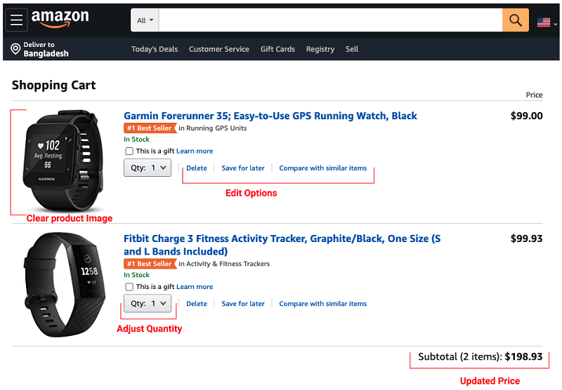
If your customer has already arrived on the checkout page, that means he/she decided to make the purchase (in most cases, to be honest). So, your shopping cart area should be clean. You must show the following options in a clean and organised way.
- Product photo with the title
- Product quantity (with options to change it)
- About the delivery times
- All other possible options
Your customer should be able to see all those options as well as edit them with no complexity. Show the right grading so that your users can see what they are buying and give them full control over all the actions.
Also, make sure to show any obscured expenses, such as taxes, service fees, and shipping charges, right from the start of the checkout process or even within the shopping cart itself to reduce the likelihood of customers dropping off. And for God’s sake!
Let’s not use GIF animation on the checkout page to show New Year or Christmas offers! They only divert your customers.
2. Have a guest checkout option
Most of the customers come to your shop with a single intent. They search for the product. Take it to the checkout and purchase the item. It is very frustrating for them to see a popup or a signup form at this point.
You can either provide customers with the option to finalise their purchase using just their email address or allow them to log in using their social media accounts, like Facebook or Instagram, to complete their purchase with no extra work involved.
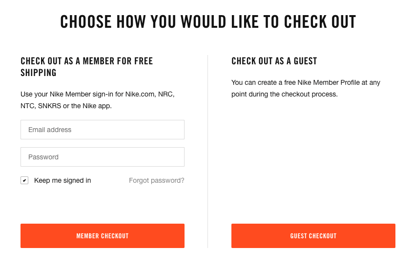
Nike checkout page
Overall, if you allow guest checkout, for some people, the process will be simpler and help them get what they’re looking to purchase faster. As you can see, 25% of abandonments in 2023 happened because of not having a guest checkout option.
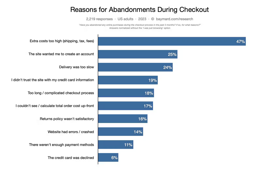
Source: Baymard Institute
3. Show progress bars to your customer
During the checkout process, people often assume they have a long way to go and give up the process after one or two steps. Here, the progress bar helps them to understand how close they are to completing the order.
For example, here in this picture, the progress bar works as a visual roadmap, informing the customer that the next step after filling in customer information will involve selecting shipping options, followed by a final confirmation page.

The key things to note
- It has to indicate where the user is and how much there is to do to complete a purchase.
- Make it clearly noticeable.
- It must indicate their completion levels.
4. Keep the form files clean
Do not ask for unnecessary information during the checkout. This design of your form will impact the full checkout process. A well-designed form can show your users that your brand is helpful, professional and enjoyable.
So, keep your form straightforward. Of course, some fields are mandatory, like email and address. But ask yourself, do you really need his date of birth to purchase dog food?
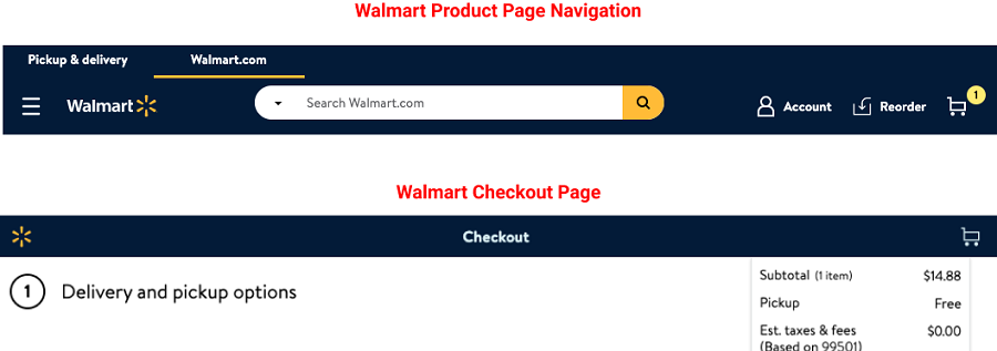
5. Hide layered navigation during the checkout process
The main purpose of layered navigation is to help customers in searching and locating products. However, it can distract the customer during the checkout process.
If you hide the layered navigation in the checkout, it will also keep the checkout page clean and hold the customers’ focus on their selected products, it’s pricing, and moving forward to the final step.
6. Fully functional “Back” button
Sometimes, people press the back button to get back to the product page or to add a new one. If the Back button is not functional, it means the site may throw an error message.
This affects shopper’s experience negatively. It can even become frustrating if the user has to fill up the form again. Saving the user’s data can solve this issue. This means anytime they come back, they will see the form as they left earlier.
7. Provide a summary of purchasing items
Showing the ordered items in a summary helps them to double-check if they are purchasing the right items and the right quantity. Should also show the delivery and total price.
This is very important to show every step of the checkout process.
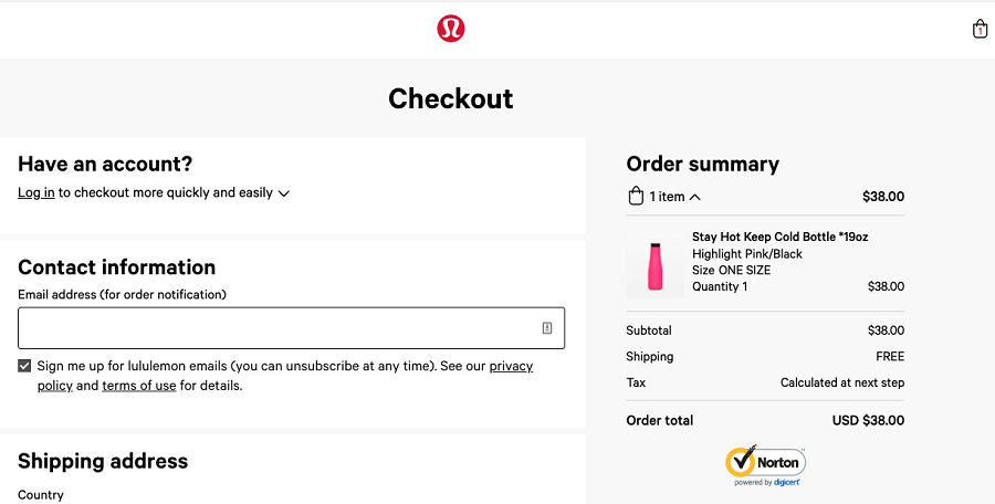
Shopping Cart: Lululemon
8. Be transparent about charges. Let them know upfront
Showing shipping charges, taxes, or other charges on the last page can be very distracting. This makes your customer have a second thought and causes cart abandonment.
We should understand customer expectations that they want to know upfront how much things will cost them and what is the delivery time.
Show the payment option available at a very early stage. Some sites are putting it all the time in the footer of every page. It helps the customer to decide in early stage how he can clear the payment.
9. Display trust signals
Trust signals assure customers that your business can be trusted with sensitive information. You can display payment trust badges indicating the accepted payment modes to offer the customer peace of mind. Because when people see a recognisable brand, they feel more confident to proceed with the checkout process.
Or you can just add positive customer reviews or offer a money-back guarantee to reassure your potential customers about your brand. You can also use HTTPS certificates and shipping and return policies throughout an online checkout.
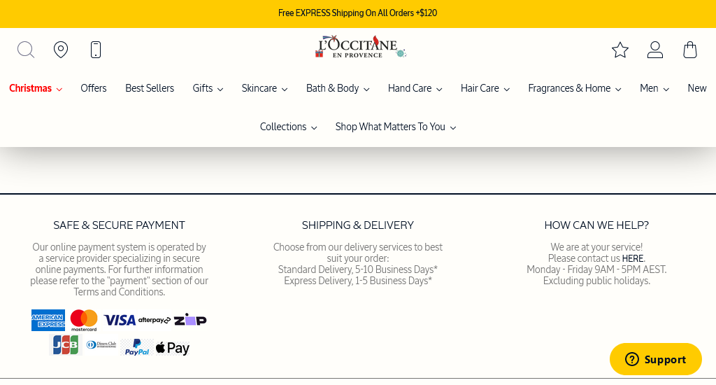
Image source: Loccitane
10. Allow language change options
International customers often abandon their shopping carts since they can’t find a personalised experience on ecommerce websites. So, offering the option to change the language can make a significant difference. This simple adjustment can help you keep more international visitors on your site, ultimately lowering cart abandonment rates.
11. Autofill shipping and billing address
As the checkout journey extends, customers have more time to second-guess their selections. So, employ autofill and intelligent prompts to automatically fill in shipping and billing details, enabling users to save time and decrease the likelihood of input errors, resulting in an improved user experience.
12. Make the process mobile-friendly
As per Statista’s Market Insights, mobile e-commerce sales reached $2.2 trillion in 2023.

So, when a huge percentage of internet users are using their mobile devices to make a purchase each week, a mobile-friendly checkout will definitely encourage the shoppers to complete the transaction.
However, mobile customers are prone to abandoning their shopping carts due to factors such as slow loading times, difficulties with the mobile checkout process, and checkout pages that aren’t mobile-friendly. So, offer a responsive checkout that’s optimised across mobile, desktop, and tablet.
Why do shoppers leave the checkout page?
Depending on the industry or niche market, customers abandon checkout for different reasons. So, try to track the relevant metrics and measure analytics to figure out where customers leave and why. However, if we list down the top 5 common reasons for cart abandonment that often end up impacting the ecommerce business in some way, it includes
- Too long and complicated checkout process
- Security concerns
- Account creation is required to move forward in the purchasing progress
- Hidden/extra cost
- Website glitch or other errors
To conclude
I hope this article will help you to pick some ideas that can boost your conversion and lead to higher sales. Ecommerce business highly depends on how smoothly your customer can complete their checkout.
However, keep in mind that context is very important when you are designing a checkout experience. Do proper user research, gather information, and then decide based on your context. Do not forget to do user testing. It’s always worth it for the ecommerce checkout process.
For example,
- Do you really need a Multi-page checkout? Or Single Page Checkout can get the job done?
- Does your user need a subscription offer?
- How will you place the coupon or promo code?
Did I discuss these questions’ answers? Not really, because mostly these depend on your research outcome.
So by preventing all barriers, let’s provide our customers simple and convenient experience as we all want our customers to be happy with their shopping experience.
You read a lot. We like that
Want to take your online business to the next level? Get the tips and insights that matter.


