
How to Improve Your Website: 10 Ways to Fix Your Site Immediately
When someone tells you that you have to improve certain aspects of your website in order for it to convert better, this can sound like an absolute nightmare. After all, you’ve already invested a sizable portion of your time and money to have it designed and developed in the first place!
Though your anxiety is understandable, you should accept that your website will need improvements from time to time to adapt to and benefit from current trends as well as provide a better service.
And that is what we are going to discuss today; 10 ways of immediately improving your website.
1. Add a unique value proposition that makes people curious about your business
A value proposition for your business tells your intended audience 3 things:
- What problem your product/service solves
- How your customers will benefit from your solution
- What sets you apart from your rivals
Now comes the tricky part.
The crucial information above has to be conveyed via simple, thought-provoking text. There is your opportunity for creativity and UX intelligence.
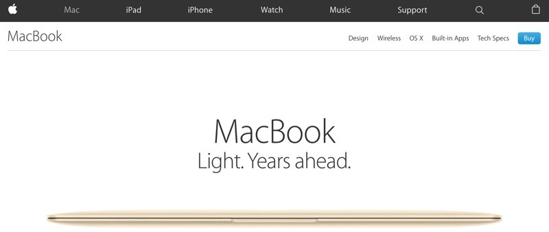
Have a look at the USP of the Apple MacBook.
As you can see, the text cries simplicity. It simultaneously conveys the idea of the MacBook being a lightweight device which is far more advanced than its competitors on the market.
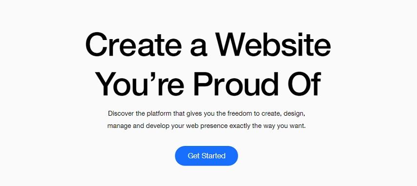
Let’s now have a look at a USP that is NOT as effective as that of MacBook.
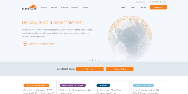
It’s not clear exactly how this company aims to build a “better internet”. Nor does it tell you the precise benefit you would receive from this “better internet”. On top of that, the image does not augment or define the company’s service in an easily comprehensible manner.
At this point, you are most likely wondering how you can craft a unique value proposition for your business.
It’s no exact science, but we have put together a few tips that you can implement right away:
- Keep your UVP text simple and easy for your desired audience to understand.
- Avoid hype like “never seen before” or “best in the world” along with any business/tech jargon.
- Tell people exactly how you are better than your competitors.
- Ensure it takes no more than 5 seconds to read and understand.
- Be sure to put more text in your UVP than your rivals. Research conducted by CXL Institute shows that users locate the UVP more quickly when there is more text.

2. CTA Button text and colours
CTA buttons are the medium through which you direct your website visitors to take your desired actions. This action could be signing up, downloading a piece of content you produced, registering for your event and so on.
It is very important for you to keep in mind that the text, colour and even shape of the CTA buttons on your website make users feel a certain way. You may have noticed this while browsing through a website yourself.
Since you want your site visitors to feel encouraged, or even compelled, to take your desired action, aspects of your CTA button must reflect these feelings.
So which colours trigger emotion and associations in our minds? Here is what we’ve found out:
- Red—Passion, love, power, anger, danger
- Blue—Calm, peace, trust
- Green—Fresh, growth, health, life
- Yellow—Happiness, bright, cheerful, youthful, warm, creative, earthly, sunshine
- Purple—Royal, elegant, cool, fun, vibrant, luxury
- Orange— creative, warm, fruity, sunset
- Pink— Feminine, soft, pretty, sweet
- Teal— Peaceful, calm, fun, ocean
When choosing colours for your logo, it’s imperative that you keep your brand persona in mind.
Let’s talk about the CTA button text.
How many people read your site CTA copy?
Unbounce has found that 9 out of every 10 people who read your site headline will read it, so there is no way you can leave this as an afterthought.
Unlike text and colours, there is no exact rule or data on which CTA shapes convert most.

The current trend is a rectangular shape with smoothed out corners (as shown above). We recommend this as a good place to start.
Here are some tips you can follow when designing your site CTAs:
- Keep the button copy relevant to the text/content surrounding it.
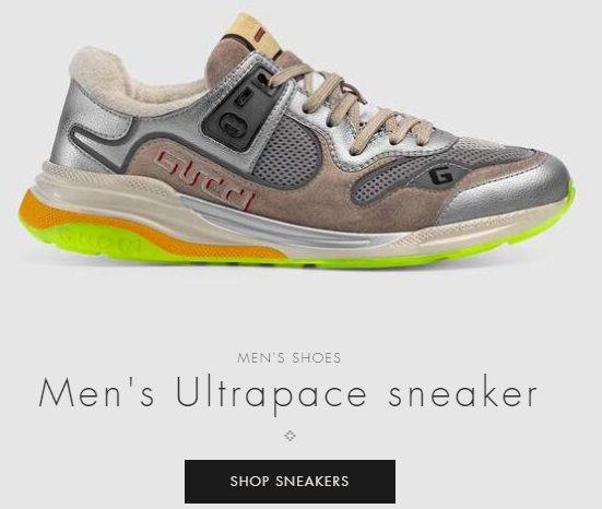
- Place only one CTA at any specific place of your website. This way, your visitors won’t have to decide which action they should take.
- If you do need to place more than 1 CTA in close proximity, then be sure to maintain the visual hierarchy.

The blue button – because of its brighter colour – garners more attention from site visitors than the “Login” button.
- Try adding a line of text (about 10 words max) close to your CTA to emphasise the importance/benefit of the action.
- Animate your CTA buttons.
The motion should be used in moderation and in accordance with your brand persona. For example, if your site falls into a youthful fashion niche, you can use a slightly faster pace of vibration, however.
Alternatively, if your brand focuses on formal clothing or spirituality, a subtle form of vibration would better reflect the brand persona.
- Your CTA button colour should stand out from its surroundings.
- The button should be large enough to be noticeable, but not take up excessive real estate on your website.
- You can add an element such an arrow pointing to the CTA close to the button to direct maximum user focus. This should not be overused, however.

- The button should be placed on the top-right corner, at the end of a sub-heading or in the middle of the region under a sentence that describes your product/service in vivid detail.
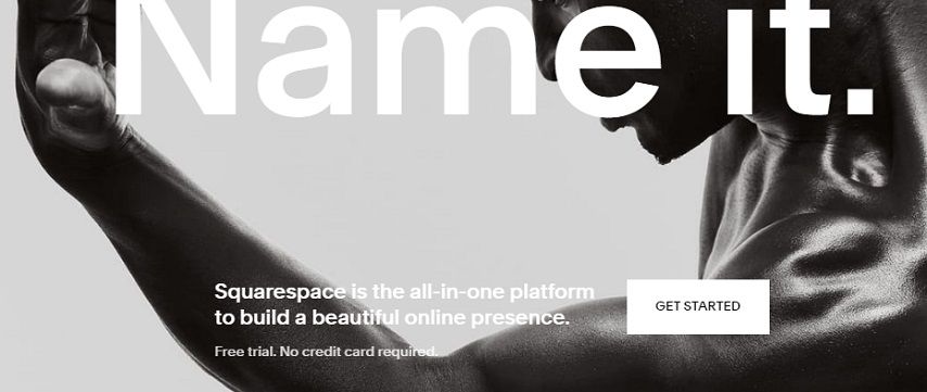
3. Internal linking
The purpose of internal linking is to give your visitors the option to go to a relevant piece of content or another page within your website. This not only adds value for the user but also screams professionalism.
Moreover, this lends your business trustworthiness while delivering smooth, pleasant user experience. These are some of the many values of internal linking, but don’t be fooled into thinking that’s everything!
Internal linking helps:
- Search engine crawlers navigate your site more thoroughly. This improves the chances that your site will rank highly in SERP and attract more organic traffic.
- Show the authority your site holds in the industry all over the website.
- Define your site architecture.
4. Use white space
White space, also known as empty or negative space, makes a huge difference in the way that text-intensive website content is perceived. Too little of it and your visitors will feel overwhelmed. Too much and the individual pieces feel isolated.
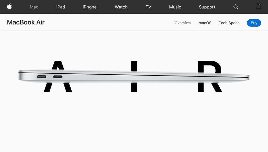
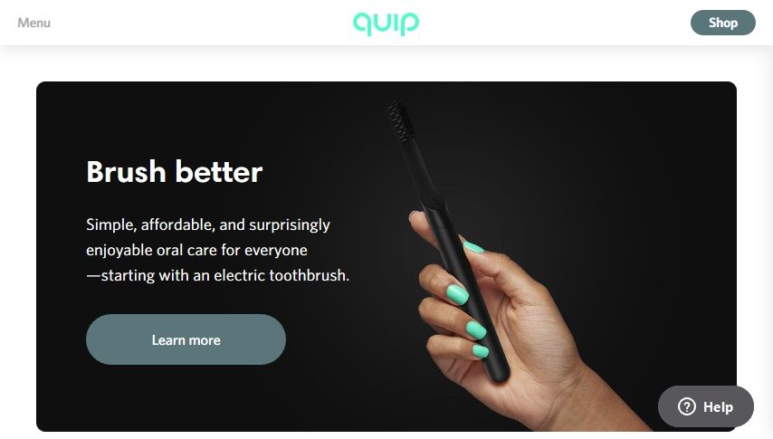
As you can see above, Apple and Quip are two of the many brands that have made optimal use of white space. This has helped them deliver a crisp, professional look which visitors definitely find pleasing. Most importantly white space on their sites helps direct maximum user attention to their products and CTA buttons.
5. Optimise your page speed
According to this study, a 1-second delay in your website load time decreases customer satisfaction by 16%. Sixteen percent! When combined with our diminishing attention spans, this leads to a significant chunk of visitors leaving your site! As you have already guessed, this means lost leads and revenue; a business owner’s worst nightmare.
But how do you improve your site speed? You need to know which elements are slowing your site down. Only then you can handle them. One of the most widely used tools for this purpose is GTmetrix.
Using this tool, you’ll be able to find out exactly what is causing your site to load slowly. Armed with that knowledge you can do some digging and resolve your site speed issues yourself, as lots of resources are available online. Alternatively, you can hire a website design expert to do it for you.
Here are some simple steps that you can take to improve website loading speed:
- Compress all images on your website.
- Minify all JavaScript codes.
- Implement lazy-loading on your site.
- Remove unnecessary images and redundant elements.
- Keep homepage slides to 2 or 3, instead of 5.
6. Use hyperlink differentiation
Hyperlinks in your website’s text body which aren’t distinguishable won’t be clicked on by your users.
What does that mean for your website? You won’t be able to direct enough traffic volume to your intended pages.

As you can see in the screenshots, the blue and orange coloured hyperlinks will drive users to click on them, or at least let them know that more resources are available to check out.
Easily visible hyperlinks help your site to project the demeanour of a content-rich website. This convinces people that you know what you are saying and that you have put in extensive work. As a site owner, that impression is invaluable!
When differentiating hyperlinks on your website, we recommend you follow these tips:
- The anchor text (the piece of text that visitors will be able to click on) should incite curiosity. It should not be randomly selected.
- No text body should be stuffed with hyperlinks. This will distract and irritate the user.
- The placement of these hyperlinks should be strategic. In the screenshot below, you can see that there is no hyperlink in the first paragraph. Since it contains important statistical data, a hyperlink would only cause distractions.
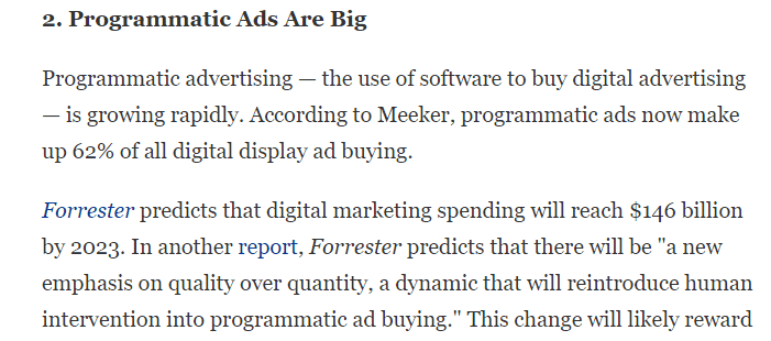
If you want your visitors to read a piece fully, then it’s better not to place any hyperlinks there.
7. Get your own images
This is the era of stock images. We’re seeing them everywhere.
While stock images are convenient, they also give the impression that you’re not fully committed to your website, and your visitors may end up not take you seriously. The consequence? They will bounce faster than they arrived.
Our recommendation is to invest some time and money and take actual photographs of your products and services. Originality is always fresh and highly effective in engaging people.

Harrington Movers, based in New Jersey and New York City, have introduced actual pictures of their movers instead of stock photos. This led to a hike in conversions. The same can happen for you!
8. Headlines should be user-focused
Headlines are the very first thing site visitors see and read. Search engine crawlers also place greater weight on them, so it’s imperative that you put a significant amount of thought into your site headlines.
Crafting headlines that your users find relatable and engaging requires:
- Keyword research.
Find out which keywords people use to search for your products or services. When these keywords are placed in the headlines, visitors will know exactly what is being offered.
- Consistency of language, typeface and tone
Your headline text, format and tone must synch with the rest of your content. This consistency delivers a seamless experience to your visitors.
9. 404 pages should be usable
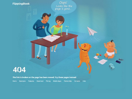
You may have put your website’s 404 pages on the backburner, but these can be made surprisingly usable for your visitors. Instead of the common “This page is not found”, you can introduce a more creative, humane touch to these pages as shown below.

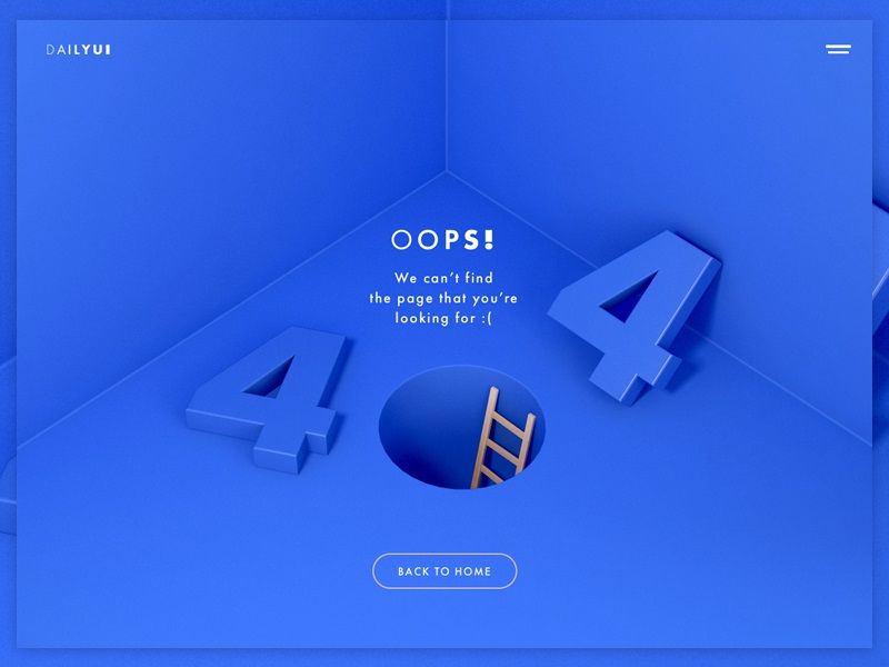
As you can see, the colours, font and text on these 404 pages sync perfectly with the respective brand persona. This tells visitors that they are still on your site!
Another technique to push usability a level higher is placing links to content your site visitors may be interested in. This also helps ensure that visitors stay on your site longer and feel positive about it!
10. Review site analytics to find areas of improvement
Your website analytics is a goldmine of insights that you can use to improve your website, both in the short and long term. Your site analytics give you a bird’s eye view of your entire site.
Which pages are performing well? Which is facing a high bounce rate? Which CTA is being clicked on by users of what demographics? These are just a few examples of the information that analytics hold!
There are several tools available to provide analytics for your site. Google Analytics is a robust (and free) tool, which is also pretty easy to set up. We recommend that you go over the data provided by GA regularly and, if needed, consult an expert.
Once more
Let us go over all the points we have discussed.
- Add a value proposition
- CTA text and colours
- Internal linking
- Use of white space
- Optimize your page speed
- Use hyperlink differentiation
- Use images wisely
- Headlines should be user-focused
- 404s should be usable too
- Go through analytics to find possible areas of improvement and set goals
Worthy Mentions
A great improvement you can make for your site’s perception is to place your logo anywhere and everywhere that it is relevant. This includes your checkout pages, email copy and subscription forms.
Even your social media posts should highlight the colours in your logo. This way, people will form a mental connection with your brand at the subconscious level. This will amp up your brand trustworthiness and promote loyalty in the long run.
Your journey to a better site begins…
Over time, your site will run into many roadblocks, which means you will need to stay updated on newer, more effective ways of improving your site in the long run. If you treat each roadblock as an opportunity, however, you will be on the road to better usability and an enhanced conversion rate!
One final suggestion: implement as many of the tips mentioned above as possible. But don’t let these stop you from exploring further improvements.
You read a lot. We like that
Want to take your online business to the next level? Get the tips and insights that matter.

