5 Ways to Boost Your Website’s Usability
In a blog article posted in May, we had a look at website usability and why it has become the most important consideration for website owners and managers.
To refresh, a user-friendly, responsive and well put-together website will not only have a direct benefit to visitors and increase their time on the website, but it provides a host of indirect benefits including higher visibility in search engines and lead generation.
In this article, we’ll be looking at some of the finer details; the design features, characteristics and important features often seen in successful websites with high usability.
1. Put information where visitors are looking
Research shows that website visitors will spend the large majority of time looking above the page fold (top of the website) and the left side of the page. You should capitalise on this and use these spaces to display the main points and pages that make up the website.
More specifically, best result can be reaped when an effective use of well-mapped navigation and/or drop-down menus, compelling headline and well-crafted call to action are implemented.
If someone is looking for a specific service that you offer, you want them to find it as quickly as possible, so having a link to the page in one of these areas makes sense.
Most modern websites these days are organised in this way, and there is potentially a chicken-egg type situation in effect here; website users have become accustomed to scanning a page according to where the information is.
Because so many websites have the information in these places, people’s eyes are instinctively drawn here when they visit new sites. Regardless, it’s important that your website conforms on some level to this trend and cater to visitors’ expectations.
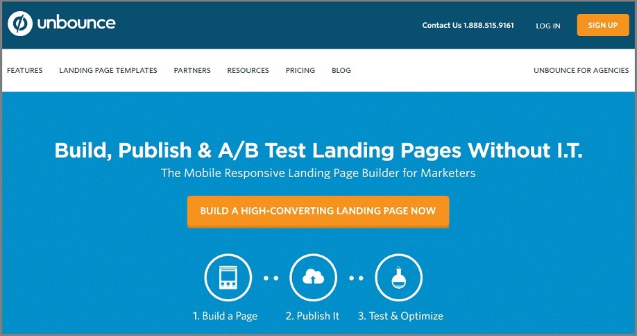
Unbounce serves as a good example of nicely displaying their key information, services and call to action without requiring to scroll.
2. Use simple, concise language
Writing for websites nowadays is about catering to visitors that skim content and don’t necessarily read in a linear manner (from top to bottom or left to right). This being the case, there is little room for ‘fluff’ and over-the-top advertisement-like writing on your website.
If you can, try to make the content easy-to-follow and at the same time informative, such that a quick scan can give a visitor a good idea of the business/service/product or whatever the page is about.
This is not necessarily easy to do, though it helps to put yourself in the shoes of someone visiting the site for the first time whose knowledge of your service is limited. You should also try to keep the word count low if possible and use headings or dot-points to break up longer content pages.
Related article: A Definitive Guide To Website Usability
3. Empty white space is important
Have you ever visited an overly crowded website that was so stuffed with information that you didn’t know where to look? Chances are it made you feel a little uncomfortable and you probably didn’t hang around long.
The idea that you should use up all the available space to promote your service is misinformed. It’s important to allow for ample of space around just about every piece of content on your website, from paragraphs of text to images, headings and call to action buttons. This makes it much easier to take in and absorb.
CSS – the code that determines the size of the fonts, margins, word-spacing, etc. – has a lot to do with this but the design is arguably more important. A user-friendly website will generally be big, comfortable and spacious.
4. Call to actions should be eye-catching
In a way, this goes without saying, but you’d be surprised how unattractive some call-to-action buttons are these days, which reduces their likelihood of being clicked. Their success is often determined less by the language used and more about the design and the colour scheme.
Obviously, you shouldn’t get too carried away with colours if it doesn’t suit the feel of your website, but light, happy tones will give you the best chance of getting a click from a prospective customer. Bold, large and simple fonts are the way to go here.
5. Load times should be quick
One of the quickest ways you can lose a visitor who has come into your website is with slow page speed.
Research shows that the large majority of users will leave a website if the page doesn’t load within 2 seconds.
In much the same way, a stalling video is the cause of much frustration and 80% of users will click away if they come across one. In other words, a slow-running website is already playing catch-up.
Regularly check the page speed of your website using this Google’s Tool and make sure it’s up to standard from various devices.
There are a host of things you need to consider when it comes to optimising the usability of your website and we’ve just listed a few of the most important ones in this article. A lot of the time, you simply need to think about how you yourself engage with websites and identify what makes a website work when you’re browsing.
Keep an eye on the blog as we’ll be writing a great deal more on this topic in the coming weeks – there’s plenty more to discuss!
You read a lot. We like that
Want to take your online business to the next level? Get the tips and insights that matter.


