15 Examples of One-Page Website Design Inspiration
Have you ever considered a single-page website but skipped the idea, thinking about how a brand fits all of its info onto just a single page?
Or, did you ever go on the fence to decide whether a single-page website will work for your business or not?
Remember, a single-page website brings a lot to the table.
If you are a freelance professional, an artist or a small business with a singular focus or just want a straightforward, compact and user-friendly website for your physical store or outlet, trust us, a one-page website will definitely be a good idea.
What’s a one-page website?
In one sentence, one-page websites are simple and concise websites that feature only one HTML page, skipping other web pages like contact us, about us or service pages.
Unlike traditional websites, in a one-page website, all the information is embedded in a single page. So, there will be no menu buttons, no dedicated contact form and no different URLs for each page. Higher engagement, faster load speed, easier maintenance, simplified layout, and cost-effective branding are some of the key benefits a standard single-page application offers.
No wonder a single-page website has become a contemporary design trend mostly embraced by individuals, entrepreneurs, and businesses of varying sizes for showcasing a diverse array of content, including projects, portfolios, events, products, and more.
Now, explore with us as we delve into standout one-page website examples and see what we can pick up from them.
15 one-page website examples:
1. Dolox
Visit Website: https://dolox.com/
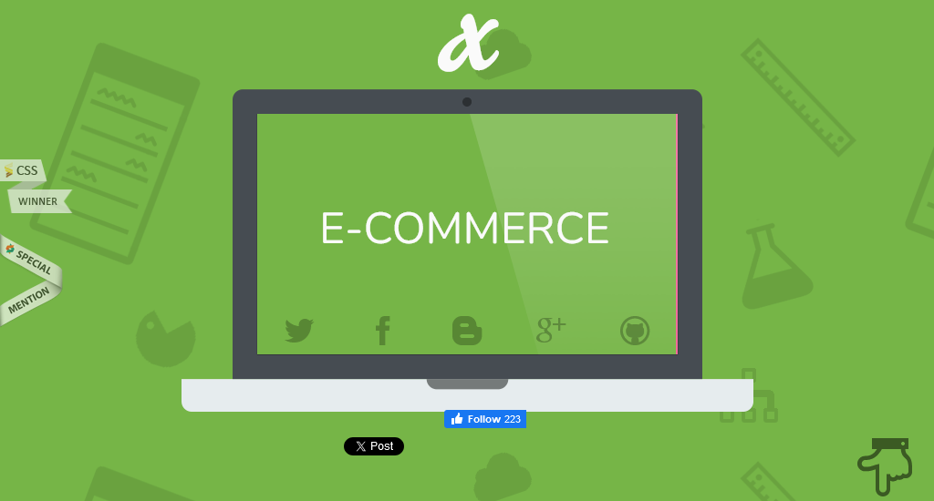
Dolox, Inc. is a software design and development company. All of the information, including a brief discussion, contact information, and development process, is showcased on its one-page website.
Key design elements
- A dynamic slideshow positioned at the page’s forefront provides insightful details about the company.
- The use of animation as you scroll through creates an interactive user experience. Also, as the information is revealed gradually, it prevents the user from feeling overwhelmed with too much content at once.
- Elements such as the illustration of the project development process make the complex information more digestible.
- The right-bottom pointing emoji makes it more convenient to navigate between sections without having to scroll.
2. Plant22
Visit Website: https://plant22.co/
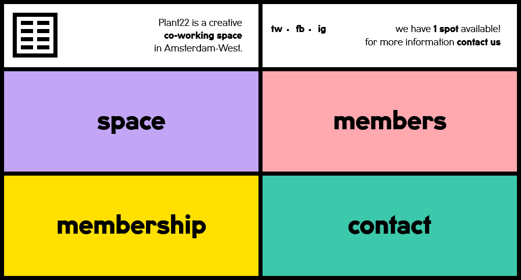
Plant22’s one-page website contributes to a fast-loading, minimalistic, and user-friendly experience, avoiding unnecessary clutter and visual noise. The unconventional design of the colour-coded boxes and pop-up overlays makes the website visually interesting but also engages users with an innovative and memorable browsing experience.
Key design elements
- The four colour-coded boxes serve as the main navigation elements on the page. Each colour helps users associate specific content or actions with each box.
- When you click on each colour-coded box, it triggers a pop-up overlay, preventing the need to navigate to a new page or open a new tab.
- The information is presented in a layered manner. And that users can explore different sections without disruptions.
- Hovering the mouse over each section and content brings an animated effect that attracts the eye to important messages or CTAs.
3. Oovra
Visit Website: https://www.oovra.io/
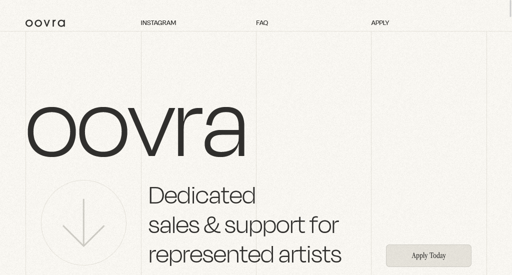
OOVRA is a platform or service dedicated to providing sales and support for represented artists. The Oovra website template skilfully employs images and distinct sections while embracing a clean and minimalist one-page design. This strategic approach seamlessly directs the user’s attention in the right direction.
Key design elements
- Clean and minimalistic navigation with links to key sections (Instagram, FAQ, Apply).
- There is a consistent visual style throughout the one-pager. The colour palette and the use of clear, readable fonts for content and eye-catching fonts for the heading resonate with the artistic theme.
- Showcase services using a grid layout with concise descriptions.
- Include a section with frequently asked questions and answers in an accordion format.
4. Upscale Laundromat
Visit Website: https://www.upstatelaundromat.com/
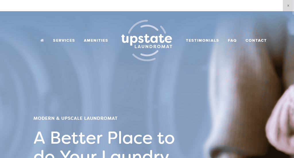
The website employs a clean design, focusing on simplicity and ease of navigation. It strategically incorporates elements like dropdown toggle buttons for information presentation and a toggle display for FAQs to enhance the overall user experience on a single-page layout.
Key design elements
- The header features a menu with descriptive links, such as services, amenities, FAQs, contacts and testimonials. This ensures that users can quickly find the information they are looking for without unnecessary clicks.
- The FAQ section uses a toggle display, allowing users to expand or collapse answers as needed. This not only saves space but also enhances user engagement.
- Testimonials are included in an engaging way, indicating a focus on building trust and credibility.
5. The Rafael
Visit Website: https://thejulianbk.com/
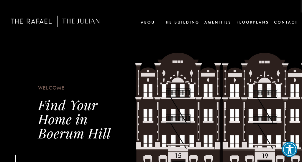
Rafael is another example of a business website that embraces interactive features, seamless scrolling, and visually appealing design to deliver an engaging and effective user experience.
Key design elements
- The top of the page features a visually appealing illustration of the building, providing an immediate and engaging visual experience for users.
- A creative touch is added with an interactive hover effect that injects a playful element into the user experience. When users hover their cursor over the building illustration, every window lights up.
- The menu located at the top of the screen allows you to navigate through the various sections of the page effortlessly.
- A parallax effect is incorporated in the middle of the page, where foreground images move at different speeds, adding depth for a dynamic property site experience.
6. Café Frida
Visit Website: https://cafefrida.ca/
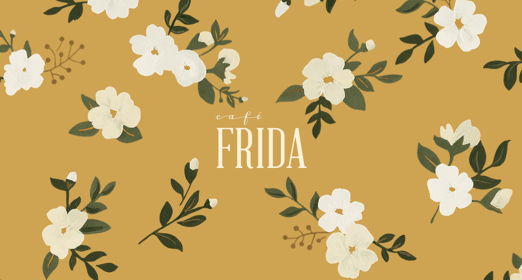
If you value simplicity yet chicness in a website design, this one is a great example to inspire you. The design of the French Cafe Frida’s one-page website incorporates several elements that contribute to its chic and stylish appearance.
Key design elements
- The colour palette is likely to be composed of sophisticated and muted tones. The colours, such as soft pastels, cream, and gold accents, create an elegant and refined atmosphere.
- The website design prioritises easy access to the menu, formula, contact information, and other information. This could be achieved through the hamburger menu button placed at the top right section.
- The subtle and not-so-overwhelming flower animation adds a dynamic and playful touch to the website, contributing to the overall chic vibe.
- High-quality, professionally shot images of the cafe’s interior and dishes evoke a sense of luxury and sophistication.
7. Davide Baratta
Visit Website: https://www.davidebaratta.com/
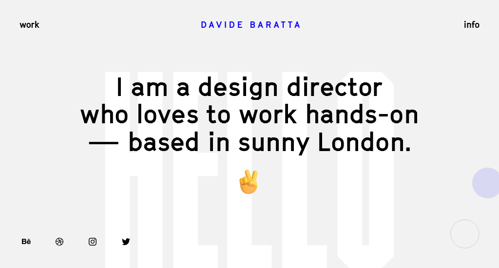
Davide Baratta’s portfolio website features subtle micro-interactions, elevating its depth and adding a distinctive character. The one-page website provides a pleasing user experience as visitors navigate through the content.
Key design elements
- These are subtle animations or effects that respond to user actions. For example, when hovering over a navigation link or a button, you will see a slight colour change or a smooth transition.
- The clean and well-organised layout, with proper use of whitespace, enhances overall readability and allows users to focus on the content.
- The well-thought-out choice of fonts and colours contributes to the overall aesthetics of the website.
8. Béhen Bhai Book Club
Visit Website: https://behenbhaibookclub.mshehzad.com/
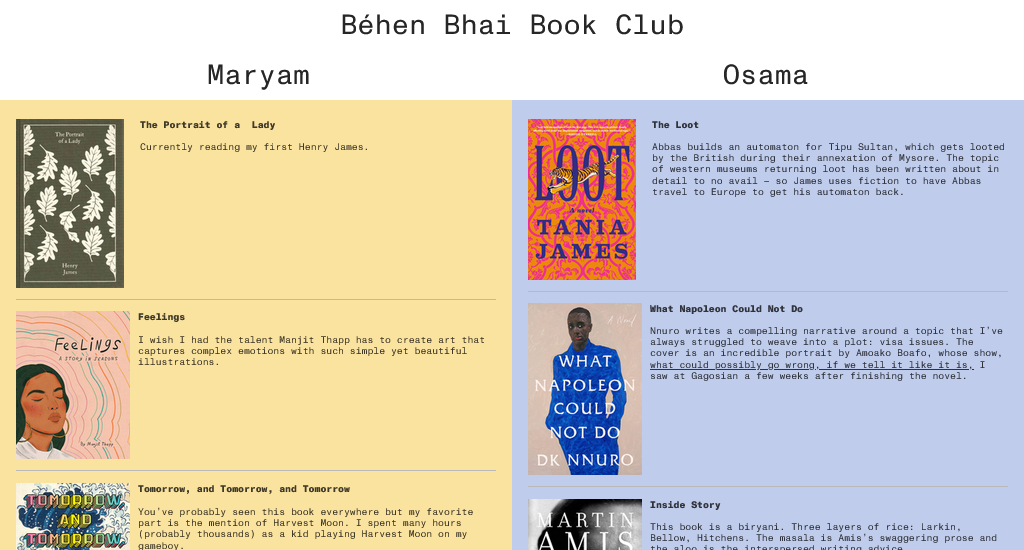
The website showcases the books read by Maryam Shehzad and her brother Osama, highlighting their distinct literary tastes. As you scroll through the page, you will be drawn in by the visuals and content that include the book covers, title and Maryam and Osama’s personal comments.
Key design elements
- The divided layout is certainly the hero feature. Clearly separates their reading preferences, making it easy for visitors to distinguish between the two.
- The central division ensures visual contrast provides a narrative structure that invites users to explore the different paths each individual has taken in their reading adventures.
- The colour scheme also complements the overall design and reflects the personalities of Maryam and Osama.
- The smooth scrolling keeps the navigation smooth between sections.
9. We Ain’t Plastic
Visit Website: https://weaintplastic.com/
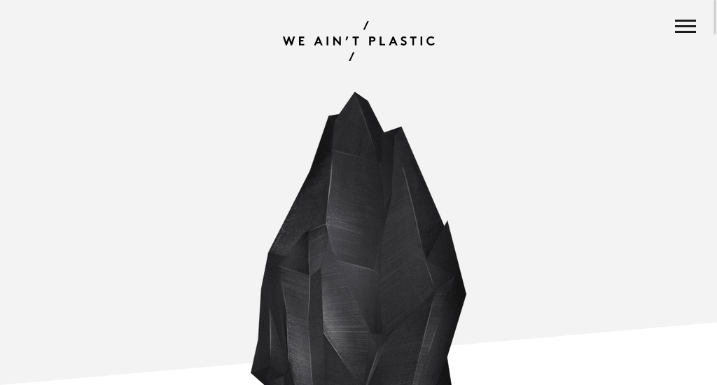
The single-page website has a sleek and minimalist design, focusing on simplicity and clarity. It manages to share a lot of information without overwhelming the reader. The design cleverly tackles the task of presenting substantial content while keeping the interface clean and visually attractive.
Key design elements
- The menu provides easy navigation to different sections of the page, including the work, profile, letter, contact and more.
- The portfolio section is a key component, allowing users to explore various examples of their work. Each project is represented by a brief description, encouraging users to click for more details. This design choice prevents clutter on the main page.
- There’s likely a consistent use of branding elements such as colour schemes, typography, and imagery throughout the page that create a cohesive look.
- The content is presented in a linear fashion, making it easy for users to navigate, especially on smaller screens.
10. Ribalta
Visit Website: https://www.ribalta.pt/
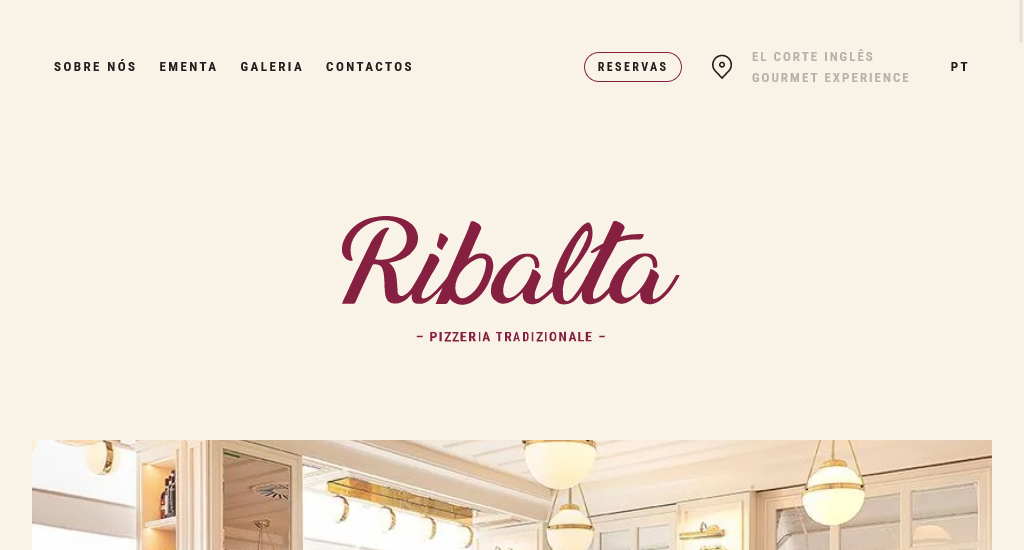
Curious about the approach restaurant websites employ for bookings on a single page? Look to Ribalta for insights on streamlining the reservation process without the need for multiple pages.
Key design elements
- High-quality and visually pleasing photos are showcased on the website, likely featuring the restaurant’s dishes, ambience, or other relevant aspects.
- The sticky navigation bar makes it easier to access important sections like About Us, Menu, gallery, and Contacts.
- This one-page site includes a reservation CTA, possibly in the form of a button. Clicking on the reservation CTA, a form smoothly drops down from the top of the page.
11. Figma camp
Visit Website: https://figmacamp.framer.website/
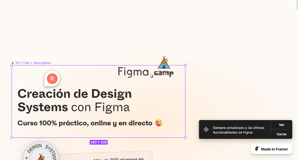
This one-page website, Figma Camp, designed by Raúl Marín, has many playful and engaging visual elements.
Key design elements
- A mascot character is incorporated into the design, adding a personalized and possibly friendly touch to the website.
- The website features a long-scrolling design, where users can scroll down to explore different sections of content.
- The FAQ section is designed in an accordion style, which can be expanded or collapsed for ease of navigation.
- The website supports the Spanish language, indicating localization for a specific audience.
12. JRR Tolkien

Visit Website: https://tolkienstory.tilda.ws/
This website pays tribute to JRR Tolkien by adding visual elements such as images, quotes, or references to Tolkien’s works. As the design elements align with the storytelling theme and contribute to a cohesive user experience, it is considered a good one-page website.
Key design elements
- The tear storytelling techniques have been used by adding pages and images that appear torn or ripped to create a unique and dynamic visual effect.
- The super-long page provides a continuous scrolling experience. And there are animated transitions between sections.
- The website incorporated textured background, sepia tones, and other design elements reminiscent of a specific historical period to create a vintage or tactile feel.
13. Adiem Law
Visit Website: https://adiem.law/
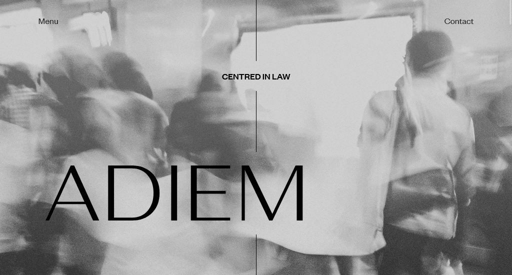
The Adiem Law one-page website is envisioned to be a visually appealing, user-friendly platform with a focus on clean design, professionalism, and efficient navigation while effectively showcasing the firm’s expertise in Human Resources (HR) and Law.
Key design elements
- This website has a layout that is divided into two central sections, creating a balanced and symmetrical design.
- The website utilized a long-scrolling design, where visitors navigate through the content by scrolling down the page.
- The clean, minimal design involves the use of ample whitespace that creates a sense of simplicity and clarity. This eventually enhances the overall readability and visual appeal of the site.
- The choice of fonts is simple and remains consistent throughout the website.
14. The art of texture
Visit Website: https://www.theartoftexture.com/
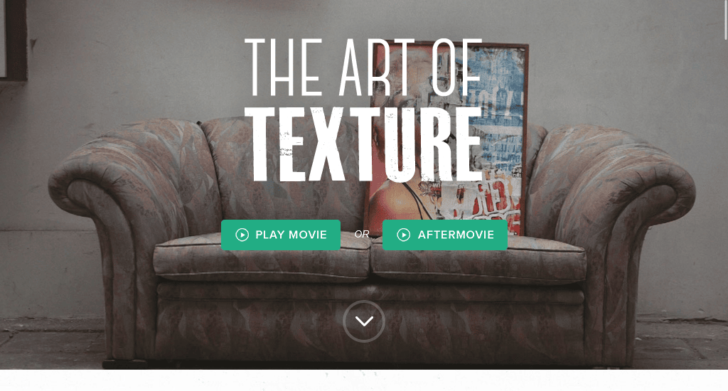
If you want to showcase a documentary or film, consider creating a concise one-page website like this.
Key design elements
- A noticeable Play Movie button allows users to click to watch the documentary directly on the page. This triggers a video player overlay or takes users to a dedicated section.
- There is a dedicated section showcasing information about the documentary. Also, the interactive image gallery displays artworks that are available for sale.
- The colour scheme and imagery used reflect the theme of collage art and the documentary, creating a visually cohesive and engaging experience.
15. Type + Pixel
Visit Website: https://www.typeandpixel.com.au/
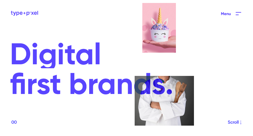
The Type + Pixel website is a single-page website that is a good example for creative agencies because it effectively combines bold design elements, clear navigation, and creative content presentation to showcase their skills.
Key design elements
- The use of bold typography on the website makes a statement and conveys a sense of creativity and confidence.
- High-quality and visually striking images are employed on the website.
- Incorporating a beautiful scrolling effect adds an interactive and dynamic element to the website. This contributes to a more engaging user experience and makes the website memorable.
- Using creative ways to present content, such as well-designed pop-ups or reveal-on-hover animations, adds an element of surprise and keeps the user engaged.
Final words
So, if the allure of these one-pagers has sparked your creativity and you desire to embark on creating your own website, feel free to proceed. Building a one-page website is easy as long as you have access to the right tool.
Just avoid excessive use of features and ensure you give careful consideration to the colours, typography, and fundamental values that define your brand. Take the right move-your site might just earn a spot on a list like this someday.
You read a lot. We like that
Want to take your online business to the next level? Get the tips and insights that matter.

