
16 Best School Website Design Examples in 2023
School websites are crucial for creating a good first impression. Before sending their children to a school, most parents are likely to take a look at the school’s website, so the primary goal of the site would be to convince these visitors. Not just the parents, from prospective students to current enrollees to educators, a diverse range of users visit any school website for multiple purposes.
That being said, investing in a dedicated school website is crucial, be it to convince the parents of the potential students, attract new students or keep the current students informed.
Essential features to include on your school website
Web design extends far beyond just appealing aesthetics. It includes everything from captivating visual elements to delightful user experiences. So, if we go over the must-include features that are essential building blocks for a school website, it will include
- Contact form
- Welcoming pictures and videos
- Detailed menu
- Diverse range of call-to-actions
- Advanced search option
- Transparent and sticky navigation bar
- An About Us page with the history of the school and campus
- A calendar, notice board or news section
- Easy-to-follow layout
- Self-manageable backend for easy modification
Remember that being informative is essential, but having an aesthetic design is equally important. To help you make up your mind, here are 16 school websites for your design inspiration.
1. Little Sprouts
Website: https://www.littlesprouts.co/
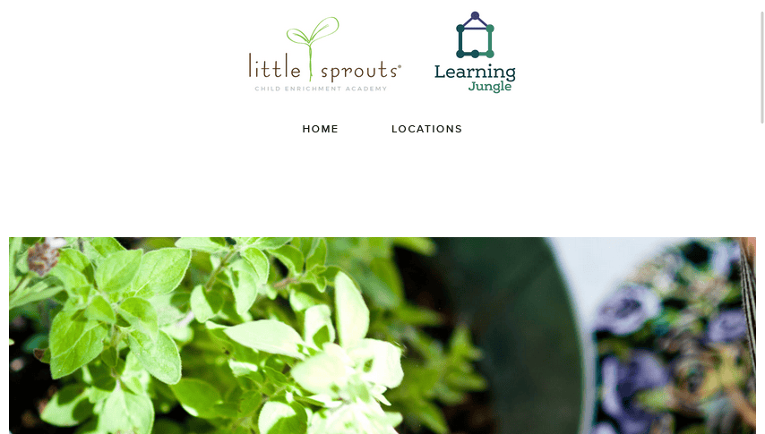
Little Sprouts is a childcare centre plus preschool that focuses on creating a playful learning environment.
What makes their site outstanding:
- Images have been wisely chosen and placed in the right spots. The site has a lot of visual elements. The atmosphere of the school is perfectly shown through numerous pictures.
- Drop down bars for Home and Locations are available in the main navigation section, which is perfect for making the site more user-friendly. Their whole website is neat and has an excellent structure.
- The website works perfectly fine when viewed on mobile devices while keeping its elegant look intact.
2. Abbotsleigh
Website: https://www.abbotsleigh.nsw.edu.au/
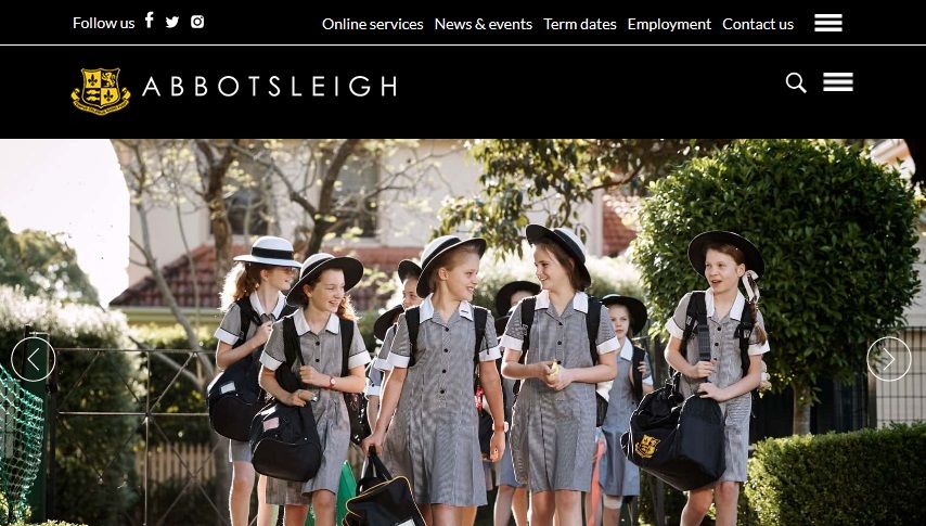
Abbotsleigh welcomes girls living in Wahroonga, Australia, to come and join their day and boarding school. The 133-year-old school has a very well-designed website, which goes perfectly with their long-running heritage.
What makes their site outstanding:
- The header uses a combination of a user-friendly navigation bar and a hamburger menu. There’s a Search box at the top right corner and a drop-down navigation menu that includes plenty of links to pages.
- The different school sections are organised right below the homepage image carousel using rectangular tiles linked to respective pages. Hovering the mouse pointer on these tiles shows relevant images.
- The site is well organised with a modern look. They have used the combination of black and yellow throughout the website, which is identical to the colour of their logo.
- The artistic display of visuals representing the campus, co-curricular activities, tour, prospectus and registrar are perfect for drawing viewer’s attention.
- The site works perfectly along different resolutions and on mobile devices. In mobile view enrolment, student life, community, giving, old girls and boarding go under a nice responsive drop-down bar.
3. Pipster Prep
Website: https://www.pipsterprep.com/
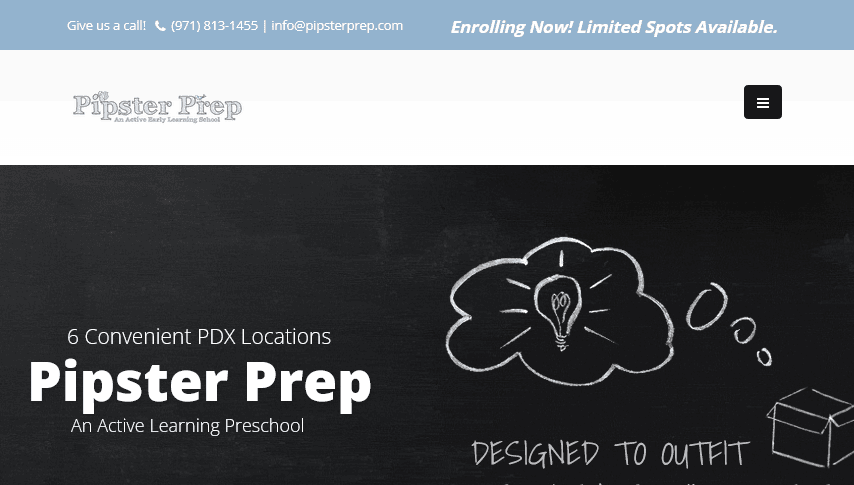
Pipster Prep works towards building up skills that will lead a child to success.
What makes their site outstanding:
- The homepage slider is simple, yet the design and animation give it a stylish look.
- As an active early learning school, Pipster Prep has given an explicit scheme of their tuitions and rates. Testimonials of parents and students have been provided with beautiful quotations.
- In mobile view, the navigation bar turns into a hamburger menu with subcategories.
4. Little Dolphins
Website: http://littledolphins.org/
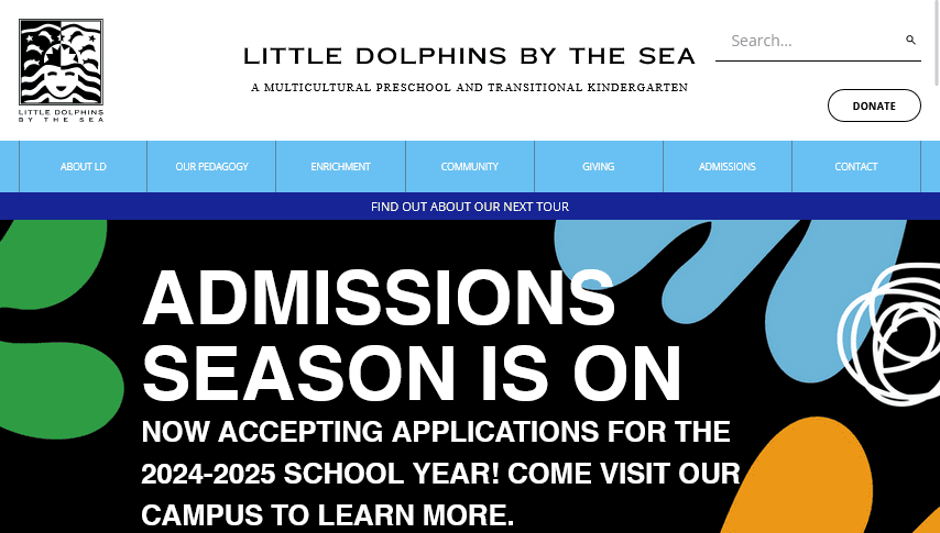
Little Dolphins provides their students with a great learning environment focusing on practical projects and activities. The site uses vibrant colours and images to express their teaching philosophy.
What makes their site outstanding:
- What makes this website stand apart from all the others is the fabulous choice of colourful images. The whole site is structured and neat. They have also added a video tour on the homepage.
- The navigation bar consists of drop-down menus. This sticky nav-bar makes it even more user-friendly. The call to action buttons – Donate, Schedule a tour, Inquire, Download, Learn More are displayed in boxes with perfect visual presentation.
- This site looks equally beautiful on mobile devices. The footer contains links to their social media accounts.
5. Trinity Grammar School
Website: https://www.trinity.nsw.edu.au/
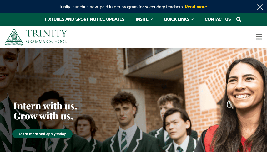
Trinity Grammar School provides an opportunity for boys to grow and develop their inner potential.
What makes their site outstanding:
- The site has a dropdown navigation bar with a detailed Menu that expands when clicked.
- The colour and picture combination gives the site neat and modern look. The green and white blend matches the logo.
- Their motto Intern with us. Grow with us is the first thing that grabs others attention and lets the visitors know what they are offering.
- The website is completely mobile responsive and fits properly on all screen sizes.
6. Lausanne Collegiate School
Website: https://www.lausanneschool.com/
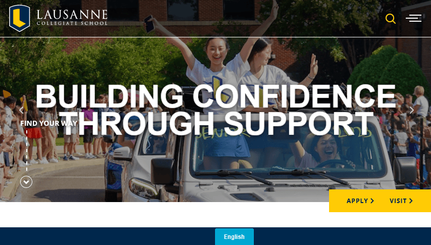
Lausanne provides a platform for its student where they can learn to express themselves, become compassionate, find interest, learn to lead a team and explore.
What makes their site outstanding:
- The full-screen slideshow of images showcasing the academics and activities of the school is really well-made and will grab the attention of any visitor.
- The navigation bar has nicely organised drop-down lists with an interactive tweak. The call to actions like Inquire, News, Login, Contact us etc. are also highlighted in the header section.
- Important facts such as the college acceptance rate, class size, proportion of international students, teacher to student ratio, etc. are clearly mentioned on their website. A world map has been used to show the different countries their students are from.
- Overall, the website has a neat and modern look. It also works perfectly on mobile devices.
7. Stuartholme School
Website: https://stuartholme.com/
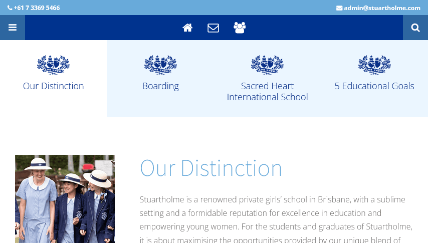
Stuartholme School provides the perfect boarding school environment for 7 to 12-year-old girls.
What makes their site outstanding:
- The homepage showcases a lively image of a student. The menu bar acts as a sticky nav that slides along the page as you scroll up or down.
- The side menu includes call-to-action buttons, which makes it easy to find information.
- The footer of the website includes the social media links along with the “Enrol Now” call to action button.
- The site has a perfect combination of texts and visuals. And it looks great on small screens too.
8. Cedar Hills
Website: https://www.cedarhillskp.org/
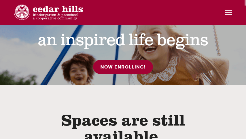
Cedar Hills works towards forming a cooperative learning community for all their students.
What makes their site outstanding:
- The navigation bar is short but well organised with drop-down menus. The call to action buttons – “Enroll” and “Now Enrolling” are prominently displayed on the header.
- The site visuals and design elements are just perfect for a kindergarten and preschool.
- Overall the site design is very user-friendly. For example, their contact form has Google Maps right beside it.
9. Mentone Girls’ Grammar
Website: https://www.mentonegirls.vic.edu.au/
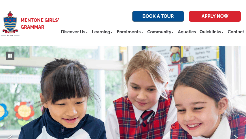
Mentone Girls’ Grammar school aims to nurture and provide their students with the foundation for growth.
What makes their site outstanding:
- The Discover Us, Learning, Enrolments, Community, Quicklinks and Contacts drops down further options when the mouse hovers over them. Different call-to-action buttons are present which can lead a visitor along the right path.
- The full-screen video highlighting the schools’ academics and activities is incredibly captivating. The footer holds links to various social accounts and has a vast set of languages from which any user can choose. Login into Alumni or mConnect account is easily accessible from the navigation menu.
- In mobile view, the user-friendliness of the site is kept intact. The About, Admission and other portions are placed here under a Hamburger menu.
10. Strathallan
Website: https://www.strathallan.co.uk/

Strathallan helps students to see that there are endless possibilities.
What makes their site outstanding:
- Strathallan is a simple website but is user-friendly. An impressive promotional content is placed in a form of fill-in-the-blanks where students can add their name, favourite subject, favourite sport, hobby and interest to personalise their experience.
- Anybody can access the information from the menu at the top, which is in 2 lines. The search and contact details are also easily accessible.
- The website classifies the different factors that make it best suited for a student. Both images and videos have been perfectly placed following user-friendly principles.
- The homepage contains an overview of the activities that they perform in a simple way. Such simplicity makes it more appealing.
11. Our House Preschools
Website: http://www.ourhousepreschool.com/

Our House Preschool focuses on providing education to the children in a playful environment.
What makes their site outstanding:
- The site had lively visuals and parallax scrolling effect. Overall, the site is nice to look at.
- The navigation bar is transparent and moves when scrolling. The site is simple yet has an elegant touch to it. The homepage prominently displays several parents’ reviews as social proof.
- The site is perfectly responsive. In mobile view the menu bar from horizontal converts into a vertical hamburger menu.
12. Albuquerque Academy
Website: https://www.aa.edu/
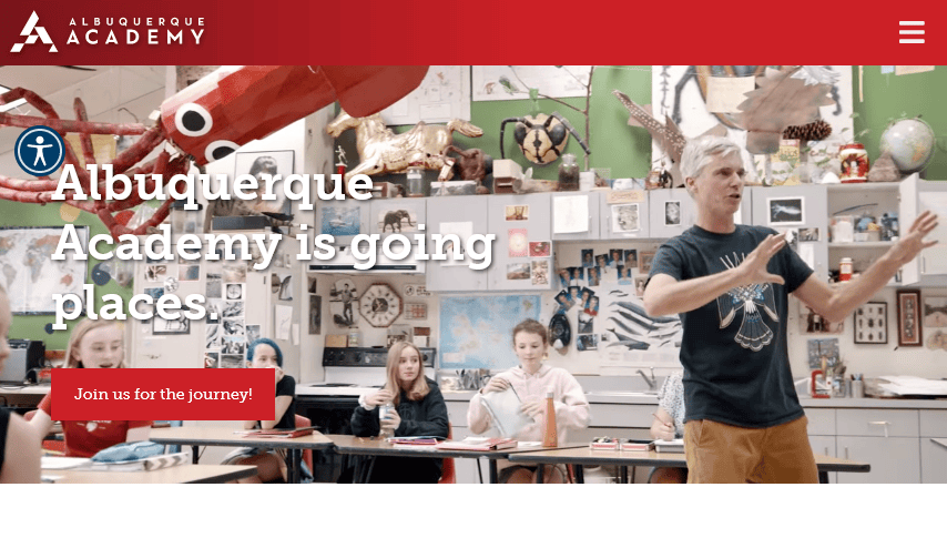
Albuquerque Academy is a coeducational institution for those studying in their middle and high school.
What makes their site outstanding:
- The information structure of this website is simple and neat. What they do, their facilities and the latest news and events all are presented in a very well-organised manner.
- The navigation bar has three parts which list all the important pages. The welcoming video has high production quality.
- The site includes a list of universities the students join after finishing school. This is a great social proof which will definitely encourage potential students to enrol.
13. The New School
Website: https://www.thenewschool.org/
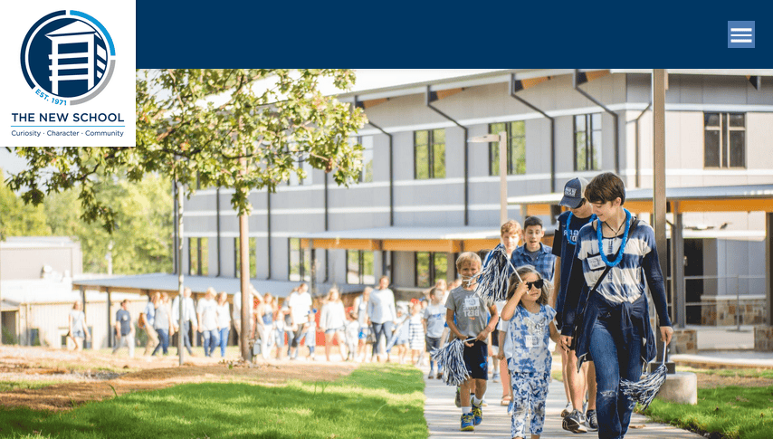
The New School motivates students to excel in the fields of academics, arts and athletics.
What makes their site outstanding:
- The website is well structured, and all the information is easy to spot. With the drop-down menu in the navigation bar, anyone can quickly reach essential pages.
- Many call to action buttons are present; the homepage mentions several positive stats related to student-teacher ratio, diversity, tuition, faculty qualification etc. to convince visitors.
- The website is completely responsive and works well on devices of any screen size.
14. Riverstone International School
Website: https://riverstoneschool.org/
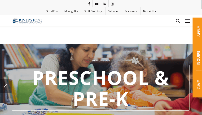
Riverstone International School has set out with a goal to prepare the student for future success.
What makes their site outstanding:
- The navigation bar moves when we scroll up or down. In the navigation bar, the name and logo, drop-down menu and social media links are present.
- The homepage banner has a slideshow of quality images describing the school.
- The separate representation of Preschool + Pre-K, Elementary, Middle and High school through figures and clickable links makes them easily noticeable by readers.
- Statistical information like the acceptance rate, tuition rate etc. are found at the bottom of the page.
15. Gilman
Website: https://www.gilman.edu/
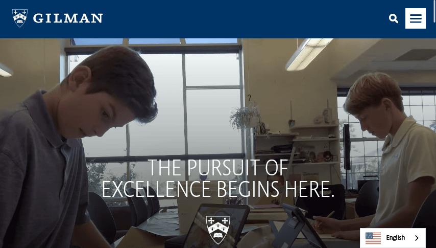
Gilman aims to unlock greatness in every student through its rich and comprehensive program.
What makes their site outstanding:
- The website has a modern look with pictures and embedded videos. All the information is placed in a neat and clean way which makes it easy to find.
- The recent news and events section is a nice addition. There’s also a detailed calendar.
- On the homepage, the navigation bar comes with a hamburger menu and a search option placed on the top right of the website.
16. Capitol Hill Day School
Website: https://www.chds.org/
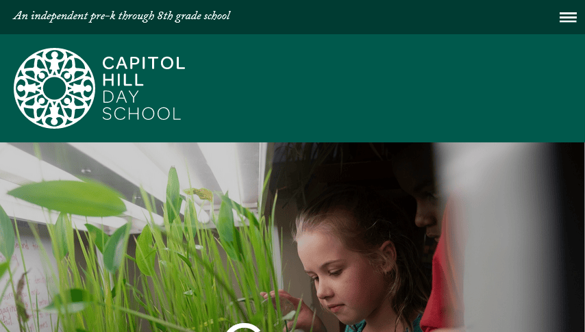
It is a progressive school for children that offers an unparalleled Field Education Program for students from prekindergarten through eighth grades.
What makes their site outstanding:
- The navigation menu offers well-organised drop-down options and gives quick links to important pages.
- The website design is amazing, with a visual hierarchy. The slideshow of images depicts the academic, athletic and artistic lives of joyous students.
- The hero scene is the search option where users can browse using keywords or categories. Scrolling down brings visitors to the programs it offers.
Conclusion
Your website largely defines the brand image of your school. A good looking site is sure to increase your number of visitors and subsequently your enrollment. Regardless of the size or age of your school, a well-designed site can help your school grow. Feel free to use the samples given above as design inspiration for your website.
You read a lot. We like that
Want to take your online business to the next level? Get the tips and insights that matter.

