9 Signs Your Website Might Need a Redesign
Research suggests that 75% of people will judge the quality of your brand based solely on their experience of your website. If you are relying on it to drum up a percentage of your new business, it is wise to ensure that it is the best it can be. After all, the website is representing your business and is the first point of contact for many potential customers.
It’s important to recognise that in the online world, nothing lasts forever. Design features get old quite quickly. Therefore, clinging to an old website because it worked in the past isn’t a good strategy.
Poorly designed sites can impact every aspect of your online success from its visibility in search engines to how many conversions you’re getting.
Related article: 30 Reasons Why People Don’t Buy From Your Website
Let’s take a look at a few of the tell-tale signs indicating it might be time to think about a website redesign.
1. Mobile users aren’t engaging with the website
Until recently, having a mobile website may have been considered something of a luxury. Oh, how things have changed!
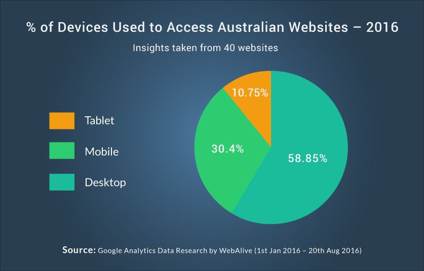
Nowadays, almost half of your total visitors are accessing your website from a tablet or smartphone, and you just can’t afford to ignore them. If your website isn’t mobile-friendly or mobile responsive, it’s simply not a website you can rely on long-term.
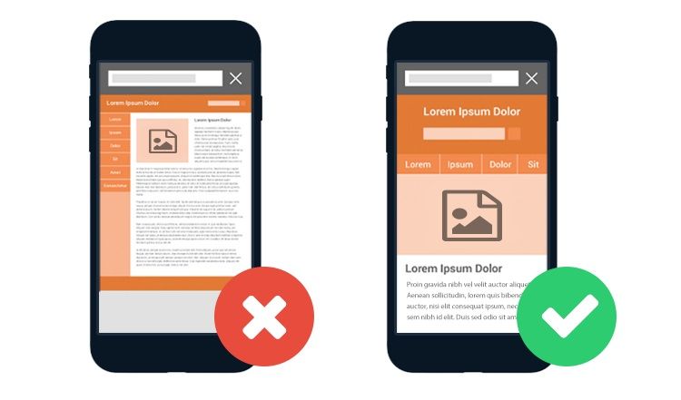
Test your website yourself from a number of devices and put yourself in your customer’s shoes. If you can’t see the text or access the information properly from your phone, there are no ways around it – you should be thinking about a website redesign.
More often than not, the analytics for a website will tell you the same story. Are you noticing a much higher bounce rate for non-desktop users? Are you noticing fewer visitors accessing the website from mobiles or tablets as time goes on? If so, going with a fresh responsive design may be what’s needed to turn this around.
2. Numbers are slowly falling across the board
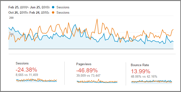
When it comes to the traffic, definitive keywords ranks and conversions of a particular website, things generally move quite slowly. You’re not necessarily going to see the big picture of where the website is failing by comparing the numbers of successive months.
But if you’re seeing things generally trending down over 6 or more months after being successful for a significant amount of time, it might be a sign that your website is simply out-of-date design wise.
If there is a particular problem with a page that is turning visitors away, keywords that aren’t properly targeted, or a new AdWords strategy that isn’t getting the job done, you’re going to find clues of this specific problem of mediocre conversion by thoroughly checking Analytics. You can then resolve this issue of declining conversion based on your findings from analytics analysis and adapting strategy accordingly.
But when you’re looking at a general but consistent downward shift in website traffic, monthly or weekly visitor amount, with no single thing really sticking out, it might be time to speak to your designer for a website redesign.
3. Your website has Flash Animation
There was a time when Flash was the preeminent website design tool. It was frequently used in banner images to display all type of flying text and animations that were actually pretty neat at the time.
However, technology has changed and a lot of the things that could only be built in Flash then can be written in an HTML format today.
Flash is essentially obsolete as it doesn’t show up properly on most mobile and tablet devices and isn’t recognised by Google either. If you’re still rocking a Flash banner, it might be time to part ways with it.
4. Your website has a dated, narrow layout
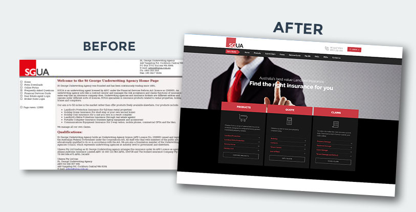
In the past, it was trendy to use smaller text and images with a narrow design, where each page would fit, in its entirety, on screen. The idea was that website users weren’t into scrolling, so having all the information in a single frame was more convenient.
This design style went out for a reason; it made it very difficult for users to skim pages and get information quickly. Those using smartphones would have needed to zoom in to access information and then zoom out again to navigate through the pages; this can be a frustrating experience.
Today big text and images with longer pages are all the rage; not only are they optimised for use on modern devices but also they make it easy for today’s average user, who is looking to access information as quickly as possible with minimal effort.
5. Your brand or service has changed
A large proportion of website redesigns take place simply because the business has outgrown the website. It may be because of a dramatic change in the direction of the brand, a decision to extend the marketing budget or recognition that a new website can do things that simplify day-to-day processes. It might even be that the design doesn’t capture the spirit of the company and fit the tastes of your target demographic.
However, this is something that not all businesses will realise straight away, recognising that the website as something to work on when things are running smoothly. The fact is that your website is not only representing your business but – if managed well – can be the biggest seller and marketer of your brand.
Editors’s Note
So do you think it’s time for a website redesign? Contact us today to get an assessment by our expert website designers in Melbourne team and improve your online presence.
6. Your website is difficult to navigate through
With the passage of time, your website can transform into a labyrinth for the users. This has probably happened if you have added or removed pages and sections on your website over the years.
In time this addition or removal of pages and sections inevitably disrupt the once-very-sequential website, and the users find it difficult to navigate through your website and reach where they want to be. This makes them leave the site with the possibility of never returning to it in future.
7. Your website doesn’t have a blog
Unique and engaging content is an excellent means to generate exposure or attention for a business, and what could be a better way to present the content, than a well-organized blog?
If your website doesn’t have a blog then you are missing out on a huge opportunity to attract and reach a large user base and keep your users informed on your latest offers or important updates.
So, if you don’t want to squander such an effective yet simple way to familiarise your users with your business and develop a more interactive relationship with them, consider adding a blog section to your website.
8. Your website lacks call to action buttons
Your website is the doorway to gain traction and transactions for your business, and good calls to action are one of the powerful features that can lead to user interaction and conversions.
If your website lacks enticing calls to action, consider consulting a digital marketing expert or a professional web agency to get your website analysed and optimised by incorporating better lead generation strategies.
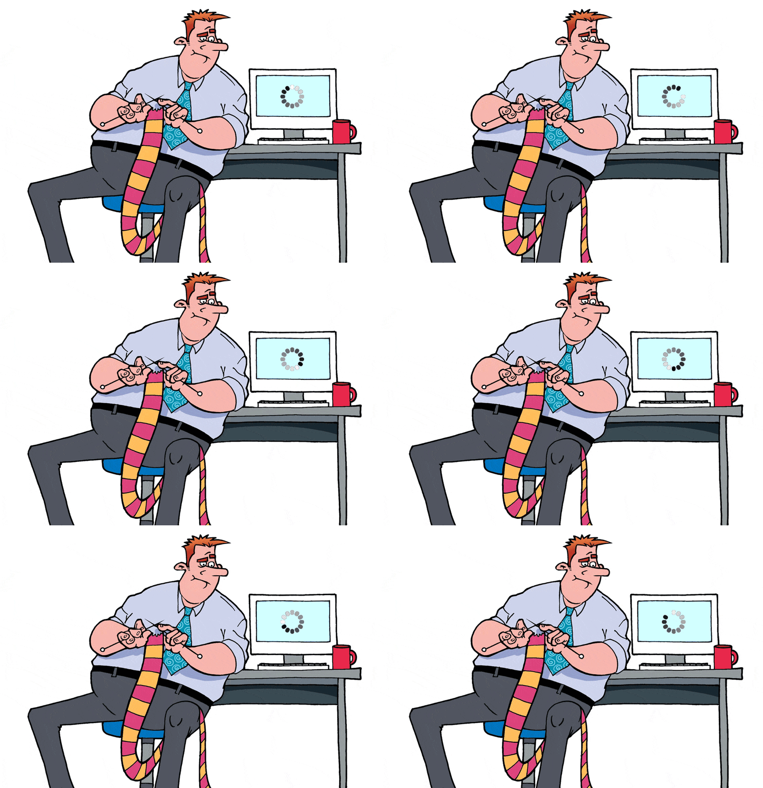
9. Your website loads very slow
As much as your business website requires being responsive design-wise, the website also should load considerably faster. This can only be done when your website is enabled not to download much information while loading. If a website is required to download buckets of images, scripts and information, it will take ages to load, to the dismay and disappointment of the users.
It’s important to make sure that your website is optimised to load within five seconds as after that time period users become disinterested and leave the site.
Your website is the virtual door for creating a lasting impression of your brand and your business. If you feel your website is not producing expected outcomes, is failing to convey your brand attributes, or if you simply want to give your website a fresh and modern look, then consider consulting an experienced and trusted digital agency.
They will help you decide on the features you’ll need to incorporate to your site, the pages to be optimised and even on the look and feel of the site that will reflect your unique brand identity and help you gain online success.
You read a lot. We like that
Want to take your online business to the next level? Get the tips and insights that matter.
