10 Stunning Corporate Website Examples to Inspire You in 2024
A corporate website is the first place potential clients go to learn about brands, products, and services. So, it is undisputed that a corporate website contributes to the business’s legitimacy, be it directly or indirectly.
From ecommerce websites to branding websites to support websites, you can choose any type depending on the type of business you have and the growth strategy you have chosen. If your goal is to sell a product or service, go for a high-performing ecommerce website.
Or, if your purpose is to familiarise your visitors with your company and to give them the confidence that your company is legitimate, make sure your branding website represents its personality while containing enough information.
So, if you are a business owner, you clearly know that to stand a chance in the market, a must need is a well-designed and functional website. And to get you started, we’ve selected the best corporate websites that you can look up to as inspiration to design your own.
1. Calendly
Visit website: https://calendly.com/
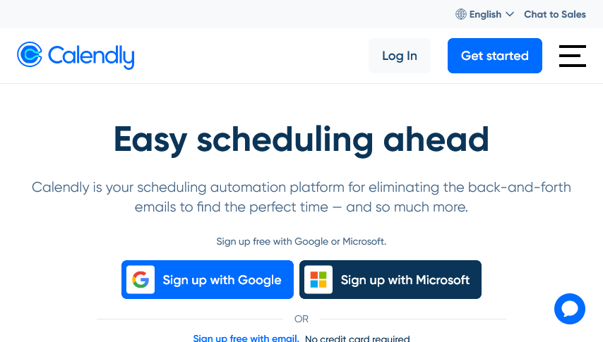
Right from the very start, the site clearly communicates the value proportion. The headline Easy scheduling ahead clearly informs visitors about what the platform is about. Also, the navigation menu at the top provides direct links to sections such as sales, marketing, customer success, education, and more.
The CTAs such as Sign up free with Google or Microsoft, Learn more, and Get a Demo are strategically placed to drive user engagement and conversions. The site also showcases many trust signals. Overall, the design features a modern aesthetic with enough white space, high-quality images, and consistent use of colour and fonts.
2. Adobe
Visit website: https://www.adobe.com/au/
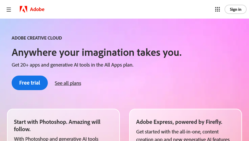
The design of the site clearly utilises a strong visual hierarchy with bold headings, subheadings and well-organised content blocks. The information about products and pricing is easily accessible through the See all plans and View all products links, as they lead to comprehensive pages that help users make informed decisions based on their needs and budgets.
Also, it caters to multiple user groups, from businesses to students to individuals, by providing specific sections like Discounts for students and teachers, Apps for iOS and Android, and Creative Cloud for business. There is a Change region option that indicates Adobe’s commitment to serving global audiences.
3. Banky
Visit website: https://www.banky.io/
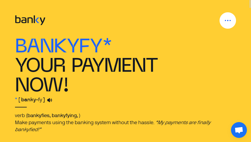
The playful use of the word bankyfy as a verb adds a unique touch and establishes brand identity right from the start. As it offers language options such as English, 日本語, Brasil, Chile, Peru, Poland, and Croatia, it increases accessibility for non-English speakers while demonstrating a commitment to serving global audiences.
The site is well-segmented into sections for Merchants and Payers, each detailing various benefits and features. What catches the most attention is the use of bright hues on different sections with ample white space and a well-organised layout.
4. ChartwelPartners

Visit website: https://chartwellpartners.com/
The firm’s website is another strong example of effective corporate website design. This website uses a clean and professional design with a sophisticated colour scheme. And it is the aesthetic that conveys a sense of reliability and expertise. Also, the navigation is pretty straightforward and allows you to easily go through sections like our firm, expertise, services, and more.
Detailed information about team members, including names, photos, and areas of expertise, builds trust and adds a more personal touch. The comprehensive footer provides needed navigation options by linking to major sections, contact information and legal disclaimers.
5. Corient Media
Visit website: https://www.corint-media.com/en/home/
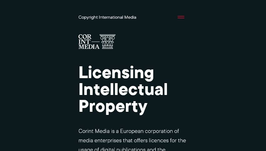
The whole design is user-centric, ensuring that information is easily accessible and showcased in a very digestible format. This includes clear headings, bullet points, and concise content, all contributing to a positive user experience.
The use of icons and images representing different industry sectors and services adds more visual interest and aids in the quick comprehension of information. The site employs a responsive design that ensures optimal viewing and interaction across various devices, from desktops to smartphones. This adaptability enhances user experience and accessibility.
6. Vaayu
Visit website: https://www.vaayu.tech/
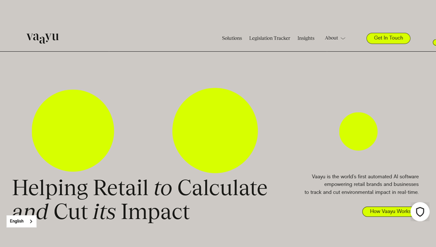
The use of different textures in the background throughout the whole page is what adds a more dynamic and visually appealing element. It features logos of well-known brands and customer testimonials from sustainability leaders, which build credibility and trust.
The whole design of this site clearly communicates Vaayu’s focus on sustainability through its strong thematic focus. It maintains a consistent colour scheme and branding, reinforcing Vaayu’s identity.
7. Citizen
Visit website: https://citizengroup.com/
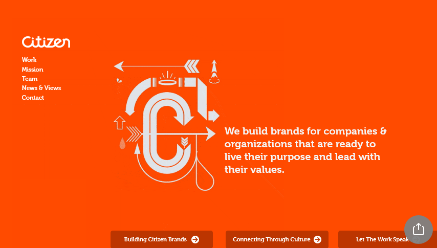
The key sections such as Work, Mission, Team, News Views and Contact are clearly listed, which makes it easy for users to find information. The minimalist layout allows the core message to stand out while avoiding clutter.
The incorporation of elements such as animation or hover effect adds more dynamics to the user experience. Also, the use of high-quality graphics boosts the overall aesthetic of the site. In addition, the easy access to contact information makes it straightforward for potential clients to get in touch.
8. JM Wilson Solicitors

Visit website: https://jmwilsonsolicitors.com/
The positive reviews showcased in the testimonials section highlight the firm’s success and client satisfaction. Also, the mention of the firm’s high-profile cases underlines its authority in immigration law.
With the right use of call-to-actions, it enhances client satisfaction and interaction. The overall design eventually seems clean and elegant, especially with the use of white space and good use of colour.
9. Orchard world
Visit website: https://www.orchardworldproduce.com/
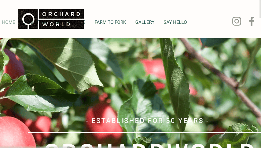
The navigation menu is easy to follow with very clear labels such as Home, About Us, Our Produce, Farm to Fork, Gallery, and Say Hello. It encompasses the whole page, and the transition makes navigating the site a very pleasurable experience.
Also, the use of high-quality images adds a visually appealing element to the website. Direct links to social media channels such as Instagram, Facebook and Twitter are easily accessible and encourage users to follow.
10. Hausman Graphics
Visit website: https://www.hausmangraphics.com/
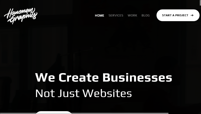
The navigation menu is very concise and user-friendly, featuring essential links like Home, Services, Work, and Blog. The site follows a minimalistic design approach that enhances readability without overwhelming the users.
The custom graphics and artwork showcase the company’s ability to create unique visual elements. The responsive website design ensures a seamless experience across devices. Most importantly, it maintains consistent branding with cohesive colour schemes, fonts and design elements.
Final words
As we all know first impression regarding your website’s appearance matter, make sure your website looks aesthetically pleasing while performing well. Focus on consistent branding, usability and site maintenance to delight your target audiences and get the maximum eyes on your corporate website.
And if you’re unsure where to start or need assistance, consider hiring a professional website designer who can bring expertise in design principles, technical implementation, and ongoing maintenance.
You read a lot. We like that
Want to take your online business to the next level? Get the tips and insights that matter.
