10 Things You’re Doing Wrong With Infographics
There’s a ridiculous amount of noise on the internet every day. It’s pretty hard to wrap your head around 250 million photos uploaded to Facebook, 2 million blog posts published, and approximately 864,000 hours of videos uploaded on YouTube (Source: digitalbuzzblog.com). No wonder the competition for user attention is so high.
These days, content producers have had to come up with some pretty creative ways to effectively deliver messages to their audiences. Hence, the explosion in the use of visual content. This comes as no surprise as our brains process visual media a whole lot better and faster than text.
One of the more prominent visual content types making waves worldwide is infographics, a form of visual content that makes complex data easy to understand through the use of illustrations and graphic design. Infographics have become increasingly popular in content marketing, and there has been a proliferation of their use over the last decade.
With the rapid growth of infographics online, the chances of one going unnoticed are pretty high. Generic and second rate infographics are simply not good enough to gain traction with your audience anymore. People have shorter attention spans and higher standards of quality, which marketers have to address.
Reasons Why Your Infographic Stinks
Below are just some of the most common mistakes that people make with infographics.
1. Wrong topic or wrong market
The first step in making an infographic is coming up with an appropriate topic for your target audience. You need a compelling topic that is relevant and timely. If you’re targeting white-collar professionals over 40 for example, you wouldn’t want to create an infographic about “The Best Strategy for Pokemon Go” because most of your audience wouldn’t be able to relate to it.
The more you know about your audience, the more accurately you can research them and find out exactly what they want to know. Consider their pain points and what information you can provide to help solve their problems or answer their most pressing questions.
Remember that no one knows more about your target audience than they do themselves, so it’s imperative that you listen to what they have to say.
2. No originality
Once you have an idea on a topic, you should definitely figure out if someone has already made an infographic on a similar topic. If you’re the first one to work on it, then you’re in luck!
Considering the massive amount of infographics that already exist, there’s a decent chance that one of them already covers your topic area. If you’re not offering original content, you’re not going to be able to engage many users because your ideas won’t be innovative. The solution to this is to find another angle to work on to make your topic interesting.
You can create a mood board and learn from other infographics, but don’t copy data and designs. Use them as inspiration to help you develop some of your own ideas.
3. Lack of research
One very important thing to remember is that the core of your infographic is research. Unfortunately, this process is the most tedious and time-consuming part of infographic building but without it, your infographic will fail.
Statistics, facts, and other information used for infographics should be accurate and authentic. Use resources that are credible and verifiable. Only include reputable, authoritative sources so you can be sure that your data is based on proper research.
The fact is, infographics are basically visualisations of data. So without quality data, your content will essentially fail at being an infographic. Gizmodo listed some great examples of what not to do in this context.
4. Inferior story and/or structure
An excellent infographic doesn’t just contain numbers and statistics, it tells a compelling story. However, a good infographic shouldn’t have too much textual content. The majority of your infographic’s content should be visual (graphs, charts, illustrations, images) so it’s easier to digest and can be interpreted faster.
Infographics should show traces of a plot and a logical structure so your audiences are encouraged to read them from start to finish. For instance, this infographic about UK Road Accidents utilises a straightforward structure and logical flow to inform readers about facts related to road accidents as well as how to reduce their risk.
5. Boring or irrelevant headline
The majority of readers scan over headlines to decide if a particular article is worth reading. As most people are busy and tend to get distracted easily, a compelling headline can mean the difference between reading a post and ignoring it. You might have the best infographic in the world but no one’s going to see it if you aren’t convincing them to “click on the link”.
Keep your headlines short and snappy—a target of around 70 characters is ideal. Make sure that your headline informs readers exactly what to expect from the content in your infographic. Aside from being attention-grabbing, the best headlines are also thought-provoking. Eliciting a cognitive or emotional response from your audience will definitely increase engagement rates.
6. Too long
The “Too Long; Didn’t Read” phenomenon is impossible to ignore. As a matter of fact, humans have shorter attention spans than a goldfish. So if your infographic is too long, expect many of your readers to leave without finishing it.
The best practice is to limit your infographic to under 10,000 pixels in length and divide it into subsections to make it easier to understand. The standard width for infographics is around 600 pixels, leaving enough room for a websites side columns.
You should also try to limit the size of your infographic to under 2 MB. If it takes more than a few short moments to load, you risk losing the attention of many impatient users.
7. Using too many colours
Infographics should be visually captivating and aesthetically pleasing. They should look like a single coherent piece and not a mix and match of colours. Overuse of colours would make your content cluttered, distracting and difficult to read.
Define the tone of your infographic by choosing a specific colour scheme and being consistent with it. Kissmetrics wrote a great article on how marketers can use color psychology to increase conversions.
8. Bad or no description
Every infographic needs an appropriate description (300< words) to be included with the published post. Search engines can’t crawl images, so if you don’t tell them what it’s about, they’re not going to index your page effectively, making it harder for people to find.
This is your chance to make use of keywords and improve your page SEO. Keep in mind that every time you republish your infographic on another website, it needs to have its own UNIQUE description to make the page optimised and avoid duplicate content penalties.
9. Making it too busy
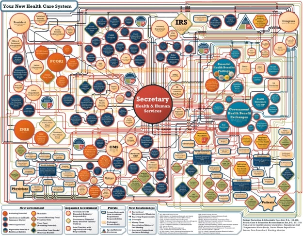
Don’t be afraid of blank spaces on your infographic. Any good graphic designer will tell you that white space is incredibly important for readability. Your goal is to make your readers understand this information easily, so don’t make it difficult. Overwhelming your readers with a mass of data will only serve to chase them away.
Avoid cramming your infographic with too much text, inappropriate fonts, and excessive graphics. Visual balance is necessary to keep your infographic easy to understand and effective.
10. You failed to promote effectively
Your infographic won’t go viral on its own. The purpose of your infographic will be forfeited if it does not reach your target audience. Remember that just because you built it doesn’t mean people will come.
Promote your infographic by sharing it on social media sites such as Facebook, Pinterest, and Twitter. Add an easily shareable embed code when you publish it on your site. You should also add relevant keywords to your article description so that your readers can easily find it when using search engines.
Leverage the audiences of industry influencers by reaching out to and asking them to check out your infographic. Sometimes, a great sharing opportunity is just an email or direct message away.
Make use of infographic directories and content curation sites like Visual.ly and Daily Infographic. The more you republish your infographic, the more exposure it will have.
Conclusion
If you’ve been able to relate to one or more of the points listed above, it’s time to reassess the way you create your infographics. They’re great tools for digital marketing but if not addressed correctly, they can be expensive mistakes. Infographics are difficult to produce and require plenty of resources in their research, development, design and creation.
You read a lot. We like that
Want to take your online business to the next level? Get the tips and insights that matter.


