How To Use Visuals In Ecommerce
The Australian e-commerce market is worth $32 billion and is among the top ten in the world. This also makes the industry extremely competitive.
According to one study, the average conversion rate of a site is around 2.45% whereas online stores in the top 10% have conversion rates of over 11%. Quite clearly, the conversion rate on your site can play a big role in the success of your business.
Visuals play a big role in conversion rates. In this article, we take a look at some examples of how you could make use of visuals to trigger higher conversion rates.
The four stages of buying journey
The typical customer goes through four distinct stages in their buying journey.
Awareness
The prospective buyer realizes they have a “problem” that needs fixing. For example, they could realize that they don’t have enough work clothes and so need to shop for business casuals online. Or, they could realize that their vacation is around the corner and they need a backpack.
Interest
Once the prospective buyer is aware of their “problem”, they start hunting for solutions. A buyer looking for work clothes may start browsing their popular online stores for their latest collection.
Desire
This is the stage where a prospective buyer starts liking certain products and tends to shortlist them. However, a desire to buy a product may not always result in a conversion. The transaction may still fail if the buyer encounters hurdles (like high shipping costs or bad sales support) or develops cold feet.
Action
A customer who is interested in a product needs to be convinced that this is a good buy. Effective call-to-action (CTA) messages help nudge the buyer towards conversion.
Related article: 30 Reasons Why People Don’t Buy From Your Website
Visuals in ecommerce
So how do exactly do Visuals play a vital role in each of these different stages. Let us take a look.
Creating Awareness
In a typical customer journey, a buyer would already be aware of their problem before they start seeking solutions. That does not, however, hold true always. In many cases, businesses can create a demand through online marketing. This is especially true in cases of impulse purchases where the customer does not realize a need until they find a solution.
For example, have you ever realized how pouring wine into a glass is an unnecessary step between opening a bottle of wine and drinking it? Guzzle Buddy is a product that lets you drink directly from a bottle of wine. You may have never realized this was a “problem” until you actually saw this in action.
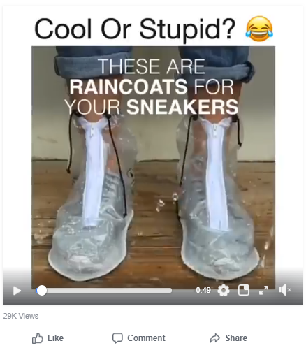
Or, take the example of Dry Steppers, the “raincoat” for your sneakers. Prospective buyers do not realize that shoes getting dirty is a “problem” until they come across a solution as this. Marketing these solutions through social media or other ‘discovery’ platforms help create awareness for the product you are selling online.
Generating Interest
The examples provided above are unique in the sense that they are product categories with little to no competition. This is not the case with most other industries. To stand out from competition, it is important to showcase high-quality visuals that generate an interest among prospective buyers.
One of the biggest advantages brick and mortar stores have over online stores is the ability for a sales rep to offer you a complete demo of a product. As an online buyer, there is only so much a product photo can reveal.
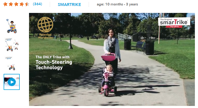
But SmarTrike, a company that makes what they call “smart” trike, have an exhaustive video demonstrating the product features on their product page. This serves as a worthy substitute for a real-life demo and succeeds in generating interest among target customers.
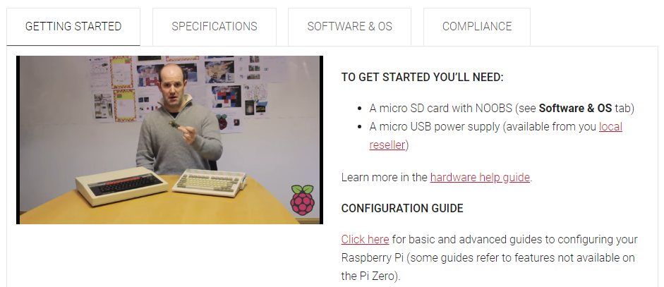
The objective of these videos is not necessarily to make the product visually appealing. Companies like Raspberry Pi use visuals to educate the buyer about their product. Raspberry Pi is a company that makes “single board computers” that students can tinker with to learn and build stuff.
The company sells several models of single board computers and every product page contains a video introducing the viewer to the product and its capabilities. From a target buyer’s perspective, such visual interaction can help create interest to a far greater extent than standard images.
If video demonstrations are not practical for your product, you could also substitute them with high-quality images. According to Rachel Jobs, the head of content at Pixc, online stores should capture up to 12 images for each product giving the viewer a 360-degree view. This provides them with a complete view of what is on offer and is vital in building interest.
Building Desire
Visual demonstrations as shown above not only help generate interest, but they can also be enough to build a desire to buy. But that is not always true.
There is a fine line separating the kind of visuals a seller uses to generate interest and those they use to build desire. In short, visuals used to demonstrate capabilities help generate interest while those that demonstrate the ‘solution’ build desire.
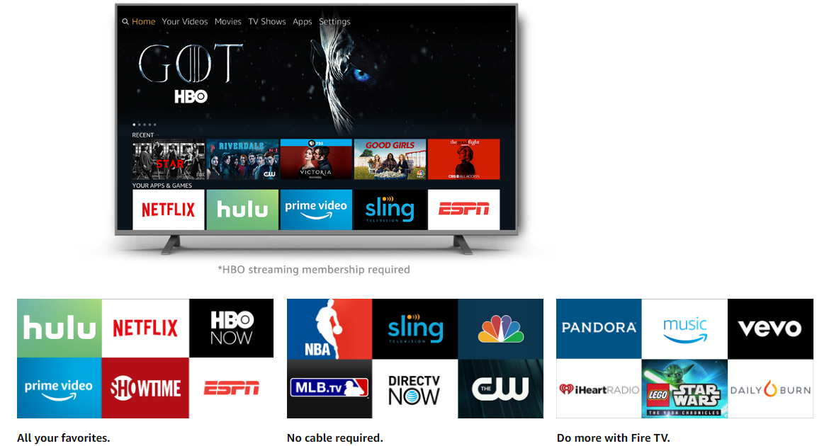
Take Amazon’s product page for Fire TV. The site has attractive visuals and content to demonstrate the site’s capabilities. But as a consumer, your concerns are if this is a good substitute for cable television.
Amazon achieves this through the following visual that tells a consumer everything that they needed to know – the visual lists all the streaming services that a Fire TV can connect to. By spelling out the solution, they help build desire.
Triggering Action
The final step in the buying journey is to convince the visitor that they are making the right decision by buying your product. Customer reviews and testimonials play a major role in this process and help influence the buyer’s decision. Visuals can hugely complement this phase of the buying decision.
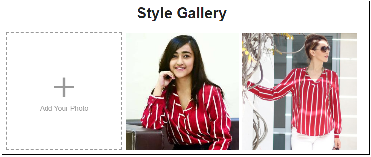
SheIn is a Chinese seller of women’s apparel. In addition to letting customers rate and review their purchases, the company also allows them to share photos of them wearing these clothes. This serves as a “visual review” and convinces a buyer on the fence about the purchase.
Conclusion
There is no debating the fact that visual appeal is critical to online selling. While most ecommerce website owners to invest in good, high-quality product photos, that may alone not be enough to attract prospective buyers and converting them. The strategies showcased above target each stage of the buying process and use the power of visuals to push the customer one step towards the sale.
You read a lot. We like that
Want to take your online business to the next level? Get the tips and insights that matter.
