10 Web Design Trends for 2019
Web design has changed a lot since its early days and has gone through multiple phases. In 2019, the web will continue to move towards new directions with the rise of new technologies. While website designers won’t face any radical shift in terms of design techniques, some new trends will continue to gain popularity this year.
In this article, we have identified those trends which will definitely make a difference in 2019. Stick around and have a look.
1. Three-dimensional elements
After a quick rise to popularity, the flat design style used on the web is going to incorporate some 3D effects this year. You can already see this trend in replacing sharp box corners with rounder ones and the return of subtle shadows.
People are going to use three-dimensional effects to add more depth to their websites to make it appear more realistic. To stay ahead of the competition, people can simply choose a template that already incorporates different styles and shapes. As an example, the Newspaper theme has plenty of demos to start from, with attractive visuals.
The idea is to reduce the distinction between the physical and digital worlds. Three-dimensional effects help to make a user comfortable with the digital elements and make the interactions on a website feel more natural.
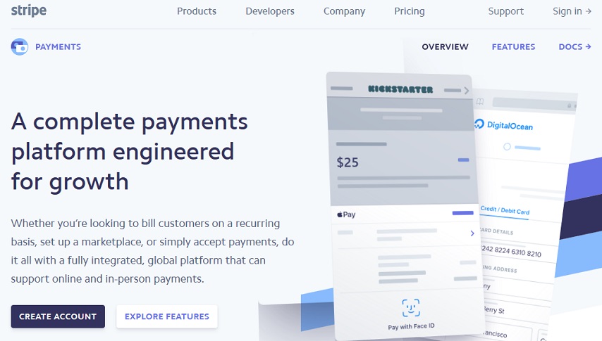
Notice how Stripe’s payment page subtly uses three-dimensional buttons, visual elements, and menus. Their buttons look more prominent using these effects, and the visual style creates a sense of depth.
2. Black and white palettes
When your goal is to capture visitors and control their mood you must focus on the colour of your website. Colours can make your interface more user-friendly while making your brand unified and powerful. Many believe that black and white palettes are going to gain more popularity in 2019.
You might be wondering what’s so special about black and white. Black and white are the opposite of each other. On the one hand, white gives a clean and simple vibe. Whereas, black suggests a strong and assertive appearance. The combination of these brings out a unique look.
The black and white palette makes us look at things differently. It makes the shapes and textures of a website more prominent. Adding a third colour to this palette will help to guide the visitor’s attention to the important areas of a page.
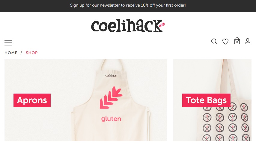
Coelihack’s website can give you an idea of what we are talking about. The site uses pink to highlight the important clickable elements, the breadcrumbs, and the newsletter form.
3. Micro-interactions
If you have used Facebook, then you are familiar with the notification and message icons at the top which displays alerts when something new happens. This notification is what we call micro-interaction.
The importance and usefulness of micro-interactions are growing as sites are becoming larger and more complex. In 2019, websites will be more heavily packed with different micro-interactions like hover effects, chimes, scrolling animation, and many more. The more you make your website interactive, the more it feels smarter and gets your audience involved.
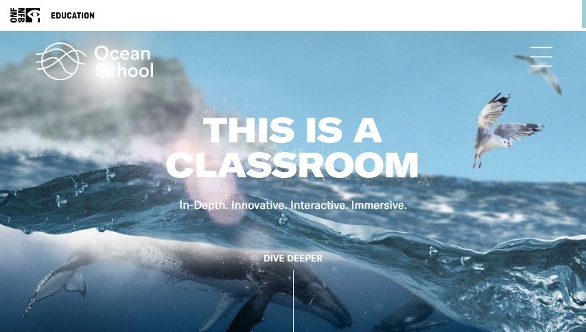
However, that never means you should overdo this. Just use the right amount of interactivity, and that will be enough to make you stand out from the rest. The Ocean School has integrated micro-interaction and animations to build up the perfect site that is bound to grab anyone’s attention.
4. Natural, fluid organic shapes
Geometrically symmetric structures as square, triangles and rectangles have been widely used until now. However, the people’s choice is changing. Visitors are beginning to be more attracted to asymmetric and organic shapes.
Natural shapes have proved to offer more depth to your website and will make it more lively. They work to create an illusion of movement and can help to make the site come alive.
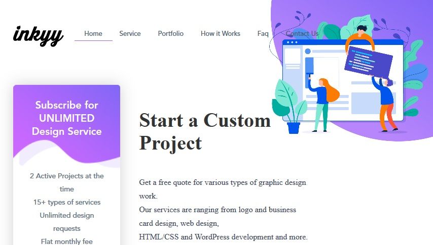
Let’s take the inkyy’s website as an example. Don’t you think the natural and organic touch attracts you more than the plain geometric shapes?
5. Thumb-friendly navigation
Development in technology has changed the way we use mobile phones. We browse more websites and do a lot of online shopping through mobile devices. So web design trends of 2019 will move towards making the sites even more mobile friendly, beyond responsive design.
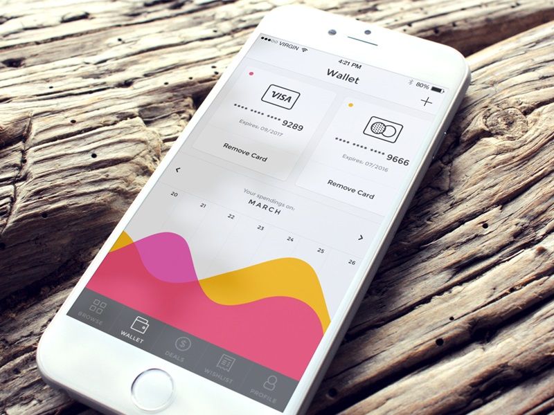
And that’s where thumb-friendly navigation comes in. As mobile users often operate the phone using one hand, thumb-friendly navigation has become a crucial UI feature. Let’s have a look at this “Wallet” designed by Ionut Zamfir. The UI has kept all the navigation options at the bottom of the screen which makes it perfect for mobile users to navigate using their thumbs.
6. Glitch arts
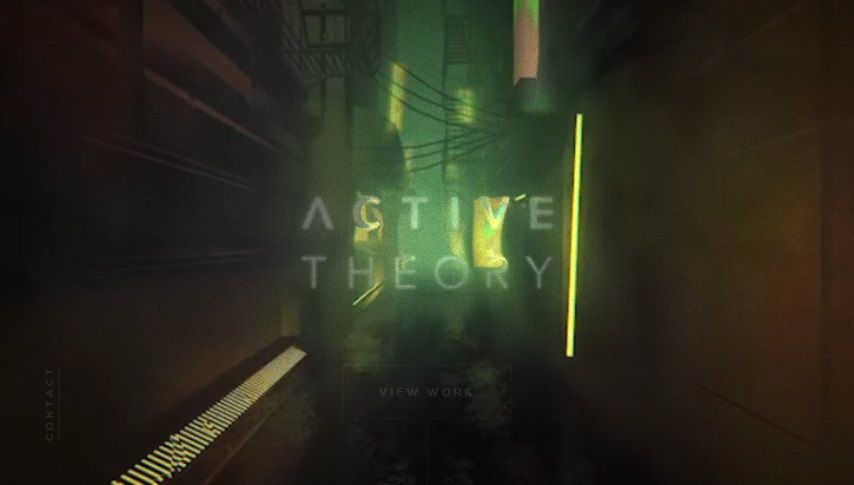
In this competitive area, you need to have an appealing subject matter for your website. The art of glitch can be such a concept in 2019. Remember the crinkled films or the distorted images; we can use these to our design advantage.
As done by Active Theory, glitch environment has been created to give their website a unique look. Clicking on their website shows the magic of the glitch effect.
7. Security-focused design
User data safety is of great importance in 2019. Multiple events related to the breach of customer data has ended up causing a lack of trust among website visitors. For web designers, the primary challenge would be to create a sense of security for the users. Different design elements can play a vital role in this regard.
For example, 2019 will see a change in how the check out process is designed. The goal will be to make the process not only simple looking but also visually secure. New ways to ensure potential customers about the security of their account information or transactions will be an essential task for designers.
8. Introduction of chatbots
Chatbots already have gained much popularity in 2018, and in 2019 they will probably become an essential part of many websites. Such advancement has been possible due to the evolution and progress in artificial intelligence and machine learning.
Compared to 2018, the new bots will have a higher level of customisation. They will be more inviting and can have an integration of face which represents the brand. There will be chatbots which will be able to integrate themselves with Facebook, Skype, Slack and many more.
Duolingo has made the use of chatbots to create a tutoring platform for different languages. The idea of conversing with bots interests many as there is no fear of embarrassment. While this may not be directly related to the design elements of a site, designers will need to be aware of how users will interact with the chatbots and design the site keeping that in mind.
9. Increase of visual elements
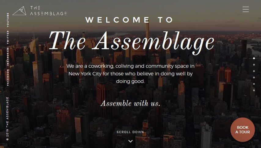
The visual elements in websites have been ever increasing, and this trend will still have an impact in 2019. It is widely accepted that people are more attracted to visual content than plain text. Designs that have the edge to edge video content in the background, interactive elements or visual icons to present possible user actions are becoming more popular than sites with regular designs.
Have a look at The Assemblage website as an example of how you can use the visuals to design a dynamic and engaging website.
10. Rise of minimalism
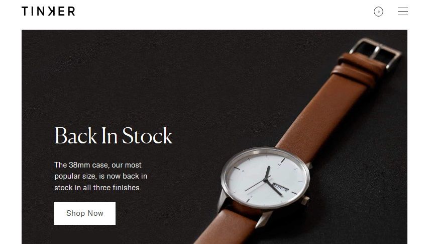
Minimalism is one of the classic and timeless website design trends that will continue to remain popular in 2019. Minimalism will go beyond whitespace and flat elements this year. Monochromatic colour, text-based design and grid layouts are some of the rising minimalistic trends which will dominate the industry.
Here’s an example where minimalism is beautifully applied to an ecommerce site.
Unless AR/VR gets big and moves to the web, there isn’t going to be any radical change in the web design trends of 2019. We’ll mostly see the continuation of last year’s design styles and perhaps a drive towards cleaner, simpler user interfaces.
There can still be many surprises, as web design is a rapidly evolving field. So, you should always keep your eyes open in order to remain competitive in the industry.
You read a lot. We like that
Want to take your online business to the next level? Get the tips and insights that matter.
