Website Usability: The Basics
There are many different aspects of a website and its marketing that can determine how successful it is, but it’s arguable that none are so directly involved in the website’s usability.
Today’s online browser is not the patient type; if a website doesn’t immediately jump out and give them the information they’re after or show them the product/service they are looking for, they’ll simply move onto the next website.
The reality is that in order to compete, business owners and online marketers need to ensure that their website is as user-friendly and easy to use as possible.
What is Website Usability?
When we talk about the usability of a website, we are generally talking about the first-hand experience for visitors, or how easy the website is to use.
From the appearance and design itself to the navigation set-up, speed and how the information/products are displayed, the way your potential customer engages with the website should be of great concern to you.
In a sense, the website is the first – and in some cases the only – point of contact with a potential customer. The website represents your business and poor usability is essentially an example of bad service from the customer’s perspective.
It’s easy to say that a website needs to be user-friendly and give visitors what they want quickly, but practically speaking, what specifically makes for a user-friendly website?
Related article: 5 Ways to Boost Your Website’s Usability
Let’s consider the questions you need to ask yourself:
What Is The Function Of Your Website?
The first thing any website owner should establish is what the website means to achieve. This will depend greatly on the industry you’re operating in, the service you provide and various other factors.
It may be that your website will be used by visitors to interact with each other, it may be for visitors to buy tickets to an event, to purchase products or its purpose may be to simply provide information about your business.
Put in another way, for any website the visitor needs to interact with it in some way, and establishing the nature of this interaction is the key to the puzzle.
Is The Design Up To Date?
The most fundamental and simple requirement for a visitor is that they can actually see the information and content that is being shown. If the website is dated it may be cumbersome for visitors to get the information that they’re after, especially if accessing from certain devices.
With the emergence of different sized desktop monitors, laptops, smartphones and tablets that can be used to access the internet, there any number of a screen that your website will need to show up nicely on.
No website browsers want to the scrolling, zooming and tapping tiny menu items on their phones to find what they’re after. If this is the case, you’ve lost them before the game has even begun!
Responsive design, which enables the website to resize and reshape itself to fit whatever screen it shows up on, is becoming a near-must for competitive websites these days and is crucial to ensure a quality user experience.
How Easily Can Information Be Found?
In the online marketing world, there are a number of general beliefs about how a website should be, many of which are starting to be debunked. This is particularly the case in modern times where the behaviour of online browsers is changing very quickly.
For example, in the mid-to-late 2000s, websites that required the browser to scroll were considered to be not user-friendly at all. In contrast, after 2010 long-single page scrolling websites were all the rage and seen to be what would draw customers in.
Another arguably outdated view is that all of a website’s pages should be reachable within three clicks, making it as easy to navigate as possible. However again, ideas have changed in regard to this; arguably the fact that websites have significantly more content nowadays has a lot to do with this.
Frankly, if you are stuffing all the information in a smaller number of pages or by adding more and more subcategories, the visitor’s job navigating through this maze is all the more difficult.
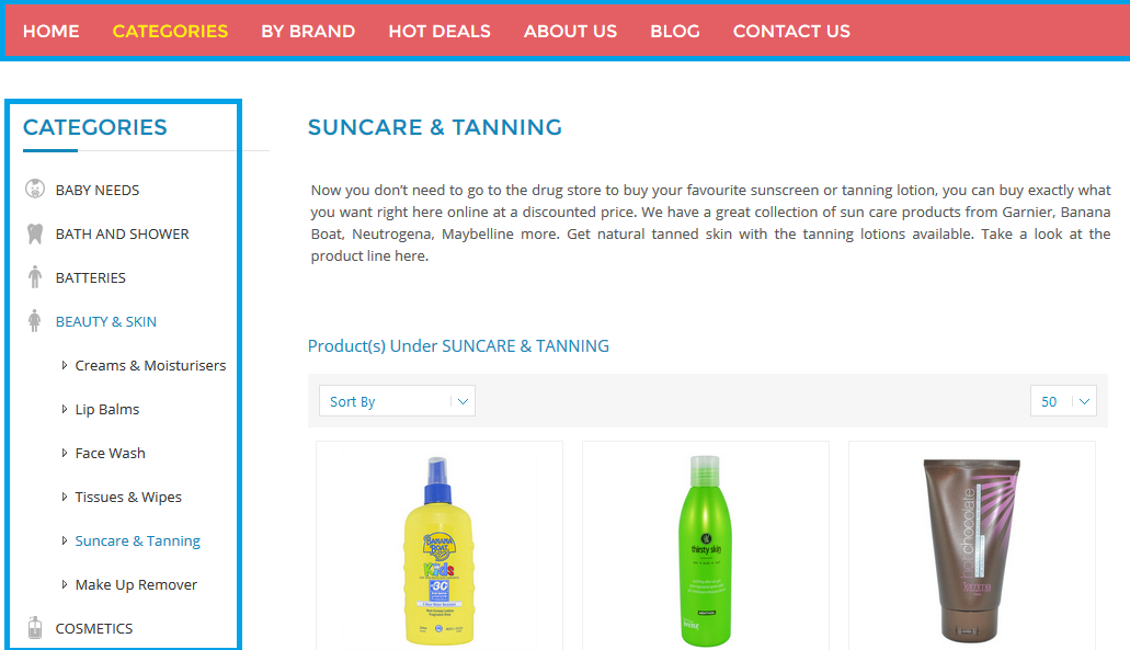
The trick to navigation is not the number of pages, but the way in which they are organised and categorised. This needs to be set up in such a way that the visitor intuitively has some idea about what subcategories are found under the main categories.
Order and Save did a wonderful job in effectively displaying the navigation items.
It can be quite frustrating looking for a page you know is on the website somewhere, but not being able to figure out in which of the categories it should be.
This article has discussed just a couple of the basic considerations that should be taken when thinking about website usability. In the coming weeks, we will explore the concepts in great detail, including testing for website usability and more key features of successful, user-friendly websites. Stay tuned!
You read a lot. We like that
Want to take your online business to the next level? Get the tips and insights that matter.


