A Definitive Guide To Website Usability
Usability, which refers to a website’s ease of use, is an integral part of a good website. Nowadays, websites are becoming more feature packed and interactive, thereby being more intricate. Consequently, an indispensable component of a successful website that is often overlooked is its usability.
According to Jakob Nielsen, a leading expert on web usability, it consists of five components as shown in the following diagram:
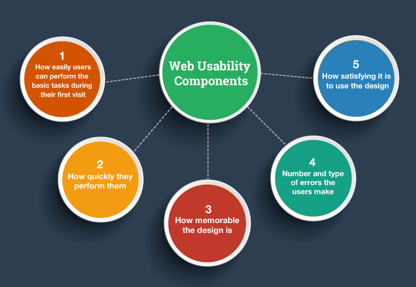
Combining the outcomes of more than 500 research findings, the U.S. Department of Health and Human Services (HHS) and U.S. General Services Administration developed an exhaustive guideline containing more than two hundred factors that influence website usability.
Based on the guideline, we’ve developed a concise checklist for your convenience, which is as follows.
Structuration
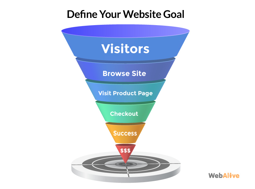
1. Define the goals
The first thing any website owner should establish is the primary goals of the website or what the website means to achieve. This will depend greatly on the industry you’re operating in and the service you provide, which in turn will determine your site’s content, structure, and the look and feel.
Related article: The Essential Guide to Conversion Rate Optimisation
2. Provide useful content
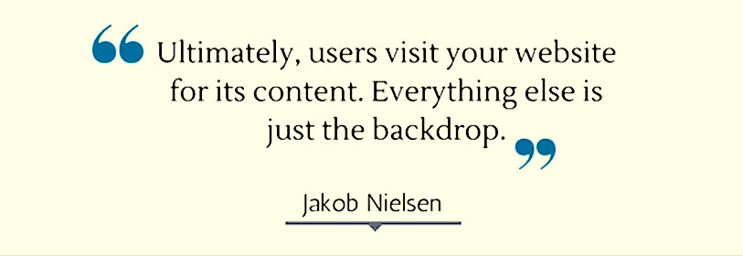
Content is the most important element of a website. So provide appropriate content that is easy to read, useful for the users and answers the questions that your target audience will have.
3. Understanding users’ expectation
Research shows that the usability of a site highly depends on how organised, easy to use, and straightforward it is to accomplish a certain task. Make sure that the website is highly intuitive and well structured so that the users can accomplish their intended tasks easily and efficiently.
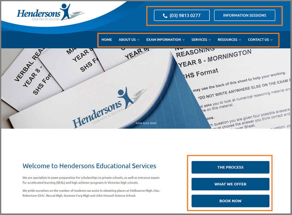
The Hendersons Educational Services website meets user expectations by displaying all the important features and information in an organised manner.
4. Make information easy to find
If the website has all the information that visitors need but it is difficult to find, having the information becomes useless. It’s important to ensure that all the necessary information is easy to find. The more effectively a site helps the audience find the required information, the more usable it is.
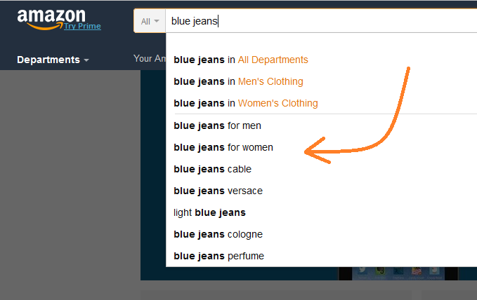
There are many ways you can make your website information easy to find. For example, if you have a website with thousands of products and many categories, consider having an advanced search option like Amazon does.
5. Design a compelling and interactive homepage
Your homepage is one of the most important pages; it’s essentially your means to create a good impression and encourage the visitors to engage further with your website. It should therefore clearly outline your purpose and what you offer.
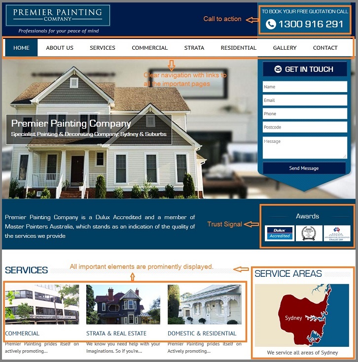
The beautifully arranged homepage of Premier Painting helps users comprehend and find the desired information with ease.
Optimisation
6. Ensure effective human-computer interaction
Websites should facilitate efficient human-computer interactions by leveraging the computer’s capabilities. Remembering user IDs, calculating required payments, and computing or converting displayed data into other units are examples of this. Maintaining consistency throughout the site will reduce friction and enable the users to perform their tasks in a straightforward way.
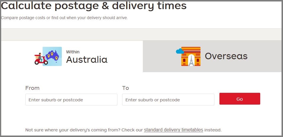
The automatic postage and delivery calculation system of AU Post, for example, gets the job done with minimum human contact.
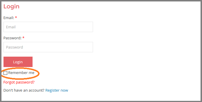
Order and Save prompt their users to check the “Remember Me” box for a quicker login in the future.
7. Establish credibility
Some methods of enhancing credibility are: ensuring the design is up to date if required providing a set of frequently asked questions and answers, citation of the resources, and linking the site to other credible sources.
8. Don’t take a memory test
All pages should independently contain the necessary information to enable the users to perform the required tasks. Research shows that users can remember a limited amount of information, even in the short term. If performing a task requires the comparison of two sets of information, for instance, the items should be displayed alongside so that the users don’t have to remember information from other pages.
9. Minimise waiting period
The site should not take more than a few seconds to load. Research suggests that 47% of users expect a web page to load in less than 2 seconds. If a page is designed to time-out, let the users know and warn them before the session expires. If they have to wait for a certain task to be completed, provide them with sufficient information.
10. Use a functional format
Information on the site should be displayed in a useful and usable format, which is printable and readable online. Provide links to print or save the downloadable documents that you provide, if applicable.
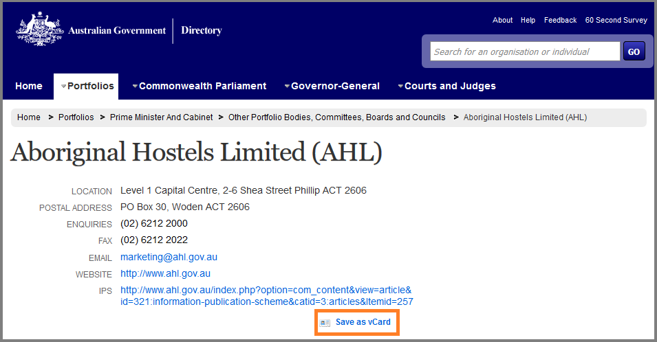
The Australia Government Directory website has interactive contents so that users can access and use information more conveniently.
11. Take various operating systems, browsers and screen sizes into account
Ensure that the website is optimised across the most commonly used browsers, most popular operating systems, and different sized devices ranging from desktop monitors to smartphones.
Organisation
12. Place information according to the relative importance
Layout useful information in an organised way, so that it’s easy for the users to take in the contents. Ideally, you’ll place the most important information in the place that the users are looking, which tends to be to the left of the page and to the header. Put the navigation tabs consistently in the same locations throughout the site.
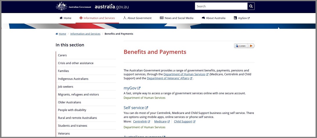
In the Australia Government website, the primary navigation tabs containing all important information have been consistently and conveniently placed at the top of each page, making the navigation experience smooth and straightforward.
13. Use white space appropriately
It’s good practice to use white space in a design, but it can be overdone too. Using too much can mean users will need to scroll too much, whereas too little make the pages look crowded and make people uncomfortable. Using too much white space before or after a section can also make users think they have reached the bottom of the page, meaning they stop scrolling and miss out on important information.
14. Choose proper display density
Don’t overwhelm visitors with too much information, as it will make pages look cluttered and make it difficult for visitors to find what they’re looking for. Research shows that users prefer to visit the sparse areas of a page as opposed to the dense, highly populated areas.
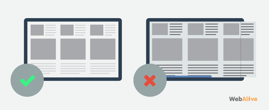
15. Use appropriate page layout to eliminate horizontal scrolling
You don’t want your visitors having to scroll horizontally the see the whole page. This is inconvenient and can be annoying, meaning you’re likely to lose a greater proportion of users more quickly.
Navigation
16. Do not direct users to a dead-end page
Sometimes a website might contain links that open new browser windows that have their back buttons disabled. This can be frustrating to users unless it is called for. It’s important to ensure that users are provided with navigational options for all pages of the website.
17. Group similar navigational elements together
Differentiate navigational elements, group the similar ones together and place them consistently throughout the site. This will enable users to easily locate navigational elements and get a sense of what to expect on the destination page.
18. Provide a list of contents on long pages
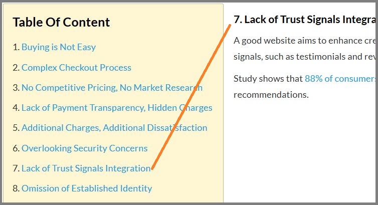
Provide a clickable list of contents for long pages containing a number of distinct sections. This will allow the users to quickly find the desired information without having to scan through the whole page.
Here is an example of a long page with a content list.
19. Let the users know where they are
Provide users with information on where they are on the website so that they can easily proceed or go back. For example, this may mean providing clear URLs indicating the user’s location, changing the colour of a link that has been visited or providing visual indications on the section being used at that time.
20. Provide descriptive tab labels and sequential menus
Providing descriptive tab labels gives users a good understanding of their destination and enables them to quickly find their desired information. Using sequential menus and sub-menus help the users reach pages with ease and saves time.
Graphics and Multimedia
21. Use graphics and images appropriately
Use graphics/ images for communicating your message to the users rather than beautifying the site. Decorative graphics tend to distract the users and delay the process of finding information. Conversely, when used appropriately, images can enhance faster learning by eliminating the need to read a lot of text.
Here we can see how illustrations are used Intelligently in the Queensland Government’s website to facilitate effective and faster learning.
22. Graphics and images should not affect page load time
Make sure that graphics/ images do not slow page download times. When viewing full-size images isn’t crucial, using thumbnail versions of large images enable the users to see the preview image without having to download them. To ensure effective use of thumbnails, you can use a relevance-enhanced image reduction method, as suggested by Jakob Nielsen.
23. Do not use complex images as backgrounds
Using images as the entire background of a page tends to slow down page loading and makes it inconvenient for users to read the text. Therefore, if a page has a considerable amount of text it’s better not to use any image as background.
24. Place your organisation’s logo in a prominent location
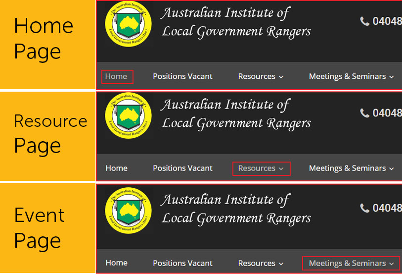
Place your organisation’s name and logo in a highly noticeable part of the page. Place it in the same location on every page and link it to the homepage.
Nswranger.org.au has their logo prominently placed in a consistent place on every page.
25. Use multimedia meaningfully
Use video, audio or animation if it’s necessary to help convey the website’s message or content. Wise use of multimedia can effectively communicate the useful information of a site. On the other hand, unnecessary use of it can distract the users from more important items and can affect the page load time.
A website’s usability is closely linked to its success. In the fast-paced online world, if a website doesn’t immediately jump out and give visitors the information they’re after, they’ll simply move onto the next website.
On the other hand, if your website provides a straightforward, enjoyable experience for the users, they’ll spend more time on your site and get to know your business. Therefore, it can be said that ensuring good usability is the prerequisite for achieving online success and business goals.
Let us help you create a high converting website with superb performance and great usability.
You read a lot. We like that
Want to take your online business to the next level? Get the tips and insights that matter.
