What Is Responsive Web Design | Everything You Need to Know
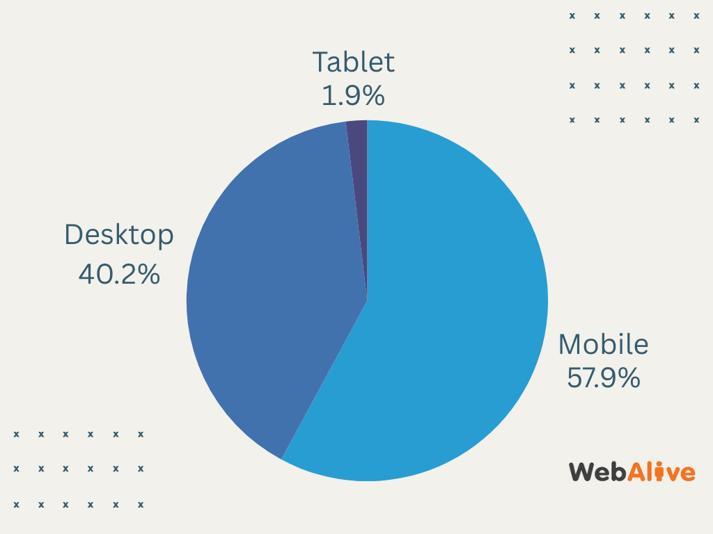
The use of mobile devices like tablets and smartphones to browse the internet has exploded over the last ten years, with people in the know now predicting that the amount of mobile internet traffic will overtake desktop traffic. Because of this, there has been a huge shift in the way websites are used and displayed.
In the past, sites were simply optimised with desktop computers in mind, but now designers have to build with a mobile-first approach to capture a user experience design.
Website users are now expecting a responsive mobile site design by default, and if they find a website that is not optimised for mobile browsing, they may be less inclined to engage with you. No wonder why, today, an estimated 1.71 billion websites are responsive, which accounts for 90% of all websites.
In order to decide if moving to a responsive design is right for you, it’s worth first understanding the basics of responsive web design.
The definition of responsive web design
A responsive website responds to the device it is viewed on. Ideally, this means that you will get the best user experience whether you look at the site on a smartphone, tablet, laptop or desktop computer. This technique usually involves using flexible grids and layouts, images, and CSS media queries to adapt the website’s appearance dynamically.
As an example of responsive mobile friendly website in action, we can consider the design of the website of The New York Times. Whether you’re catching up on the latest headlines on your tablet during your commute or reading an in-depth article on your desktop at home, the site provides an optimal reading experience by automatically adjusting the layout, images, and texts.
All these make sure that the navigation menu, text columns and embedded media such as responsive images are easy to interact with regardless of the device you are using.
How did it start?
The idea of needing a mobile responsive site is quite recent, the term only being widely used in the last many years. It is important to note that ‘mobile friendly’ sites have been around for a little longer, and are actually a very different concept, which can get confusing for people who are not in the industry. By 2012, it was already trending in web development industry.
And on April, 2015, Google came up with a new ranking algorithm that will take into account a site’s mobile friendliness while displaying results to a user. That’s how developers started thinking about building websites that could work great on any screen sizes.
For a while now there has been the option to create a site that is mobile friendly – which really just means it doesn’t look terrible when you look at it on smaller screens. Mobile friendly versions of sites would often necessitate the purchasing and use of a second domain which, after the rise of search engines and their increasingly sophisticated algorithms, adversely affected both SEO and user experience.
Why is responsive so popular?
Put simply, people like responsive sites because they are easy to use. And according to a report, 57% of internet users won’t recommend businesses with poorly designed mobile websites. So, whether you’re shopping online or trying to find business information, having a site that looks great and is easy to navigate on your phone means you will engage with more people.
Because of the huge amount of choice out there, it is easy for clients and customers to pick and choose between sites to find the one they like the most so user experience is one major factor in setting businesses apart from their competitors.
This progression has led to many designers adopting a mobile-first approach to designing and developing sites, meaning that the site is made assuming that it will be used primarily on smartphones and tablets rather than on desktops.
What makes it different
Only a couple of years ago websites were based on fixed widths so the layout would appear with the same proportions no matter how big or small the screen was you were using to view the site.
Responsive sites operate on a fluid layout structure, which means that depending on how big the screen is, the site will adjust to its measurements. You can try this out by resizing your browser window to see if the site expands or shrinks when its elements get too small or big.
The other important element to responsive design is called a media query. Media queries are set questions your responsive website will ask a browser or device to determine how it should adjust. These help the site appear optimal and give it queues as to how the design appears on your screen.
Advantages of responsive web design
- Increase sales and conversion rates
- Increase your visibility in search engines
- Save time and cost on mobile development
- Save time and cost on-site management
- No more worrying about duplicate content
- Easier link management
- An arguably better user experience
- Google recommends it
We offer beautiful, customised responsive web design solutions for individuals and businesses both large and small. If you’re interested in upgrading to a modern, responsive site with a flexible and easy-to-use CMS back end, contact us today.
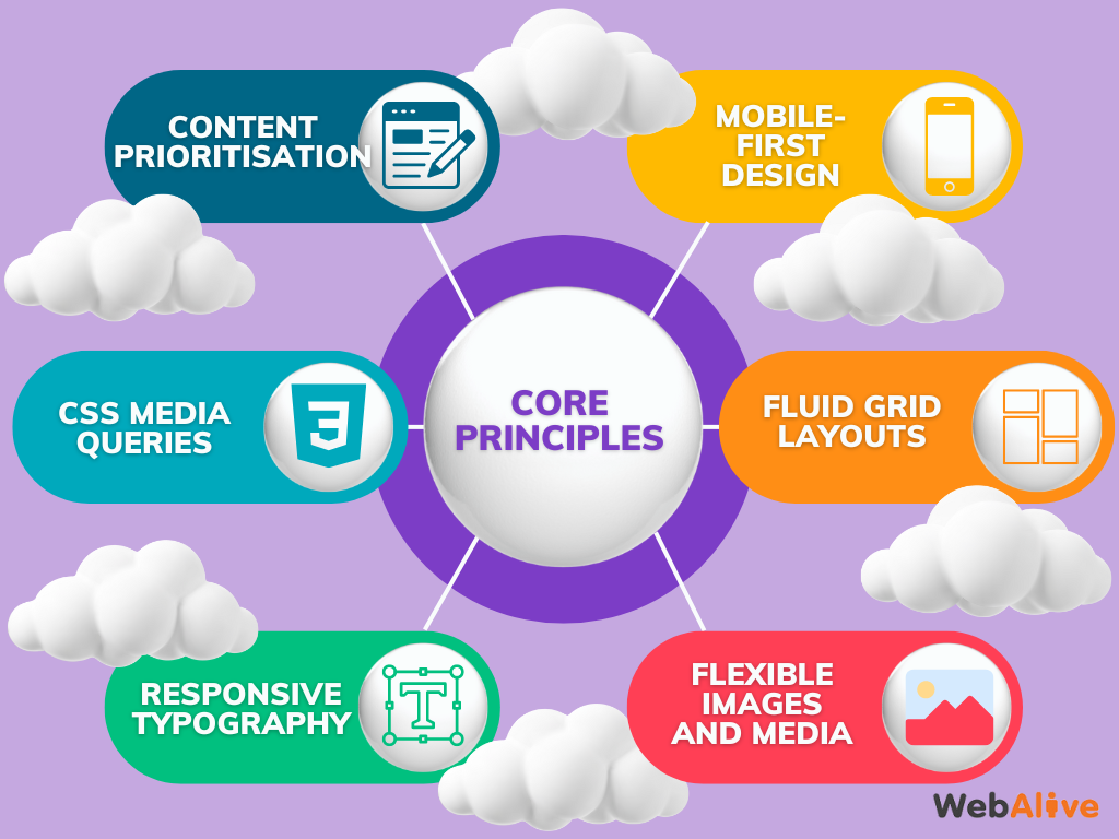
6 Core principles of responsive web design
Focusing on the core principles of responsive web design allows designers and developers to create sites that are not only visually appealing but also highly functional and accessible. Here are the fundamental principles that establish the backbone of effective, responsive web design:
Mobile-first design
With this approach, the design process starts with the smallest screen size in mind and then extend the layout for larger screens size. This ensures that the site will work full functional on all devices.
Fluid grid layouts
Fluid grids use relative units instead of fixed-width layouts that allow page elements to scale proportionally. This makes sure the content on your site remains adaptable to various screen sizes.
Flexible images and media
Based on the screen dimensions, images and other media elements are also scaled in size. This will enable users to access the media without compromising their experience.
Responsive typography
Using scalable fonts, adjusting line heights and using responsive units ensure readability and aesthetic consistency across different screen sizes.
CSS Media Queries
Media queries are a fundamental part of responsive design. Based on the characteristics of the device, apply various CSS rules, such as its width, height, orientation, and resolution. This allows designers to tailor the appearance and layout of a website to suit different screen sizes and devices.
Content prioritisation
Maintain the hierarchy of content to ensure the most important information is easily accessible on smaller screens alongside computer screens. This might include placing or hiding less important content down the page to put the focus on the key elements.
What is involved in developing a mobile responsive web design
Cost
Building a responsive site takes a lot more work than building a regular website. Several complete designs have to be created in order to cater to the different screen sizes the site might be viewed on. Developing these different options requires more time and expertise, and the cost can often come as a bit of a shock.
As technology continues to move at such a rapid pace, it’s important to remember that websites are now an indispensable element of engagement for any business, and over 58% of Google searches are made on a mobile device.
Testing
You will need to set aside a certain amount of time and money to make sure your site responds to different screen sizes appropriately. Testing needs to be performed not only on several different types of browsers but also on different devices and different operating systems.
The amount of time this will take will also depend on how complex your site is and the kind of elements that are integrated into your site. This part of the process is one of the most important as it is vital to identify any issues before the site goes live.
Limitations
As with any design, there will always be limitations. While a lot more flexible than standard web design, it is always important to fully map out your expectations and requirements of your site. For example, if you use a lot of banner ads, your site would be almost impossible to optimise for smaller screen sizes, or if you wanted to embed elements in iframes, like YouTube videos or calendar applications.
What does it mean for the future?
Responsive design is here to stay so as we move forward we are bound to see the fluid, scalable sites become more universal. They will be fast to load and easy to navigate and we are likely to see more vertical scrolling single page sites because these are particularly easy to make scalable for different size screens.
Media queries will be used for most sites, so the device dictates the way the site will display. This happens behind the scenes but is big element designers have to incorporate in order to make responsive designs display correctly.
We’ll also see the use of touch screen friendly elements of design like larger sized buttons and navigation menus, and popups and banner ads will become less popular because they are highly impractical on smaller screen sizes. We’re also likely to see tables become less common because many aren’t fluid in design.
If your site is more than two or three years old, it might be time to think about offering your web visitors an easier interface on which to connect with you. Whether you have an ecommerce store, a site that provides vital information, or even if you just want to reach more potential clients by giving them a number to call for your services, responsive design can help you reach your audience.
Conclusion
With the right design, you will not only find your clients and customers staying longer because of your great new design, they will find getting in contact with you or purchasing from you easier than ever. It is also very important to mention that with Google’s latest algorithm changes, having a responsive site will put you ahead of any competitors who don’t have one yet in the search engine’s rankings.
Sometimes it can be difficult to work out where exactly your site stands on the responsive scale. You can use Google’s mobile-friendly assessment tool here to see if your design is up to scratch.
You read a lot. We like that
Want to take your online business to the next level? Get the tips and insights that matter.


