
33 Reasons Why People Don’t Buy From Your Website
If you’re wondering why your ecommerce website is not producing the sales you had expected or why you are not getting the response you had anticipated, there are a whole range of steps you can take to improve your conversion rate.
Making changes that seem small or unnoticeable to you may help potential customers engage better with your site. Often we unknowingly make mistakes that create unnecessary barriers for the potential customers, leaving us bewildered by the lack of sales.
When people are shopping online they are not necessarily looking for you in particular, it’s more likely they are simply searching for a store that best fits their needs. For this reason, it is important for your website to look ‘right’ – it has to look like it will fulfil what the potential customer desires.
According to a research at the Missouri University of Science and Technology, when viewing a website users form first impressions within few milliseconds and their first impressions are highly affected by several design factors like use of colours, typeface and font size, use of images, and easy navigation.
The good news is even if your website has one or more of the below-mentioned problems it’s never too late; in fact, most of these could be rectified within a few hours!
Table Of Content
- Buying is Not Easy
- Complex Checkout Process
- No Competitive Pricing, No Market Research
- Lack of Payment Transparency, Hidden Charges
- Additional Charges, Additional Dissatisfaction
- Overlooking Security Concerns
- Lack of Trust Signals Integration
- Omission of Established Identity
- Not Social Media Presence
- No Payment Assurance
- Absence of Security Certifications and Insignia
- No Purchase Guarantee
- Excessive Security Measures
- Insufficient Product Details
- Not Visible in Search Engines
- No Persuasive Sales Copy
- Lack of Personalisation
- No Incentives to Encourage Revisit
- Product-Market Misfit
- Too Much Irrelevant Product Choices
- Unprofessional Web Design
- Dated Design Layouts
- Not Mobile Responsive
- Poor User Experience
- Website Crashing, Timeout Error
- Non-responsive Website
- Time Stands Still
- Website Needs Pest Control (Bug Fixes)
- Sudden Pop-ups
- No Top-notch Search Function
- Delivery Options and Coverage
- Logistics Credentials
- Lack of Continuous Support
Purchase Procedures
1. Buying Is Not Easy
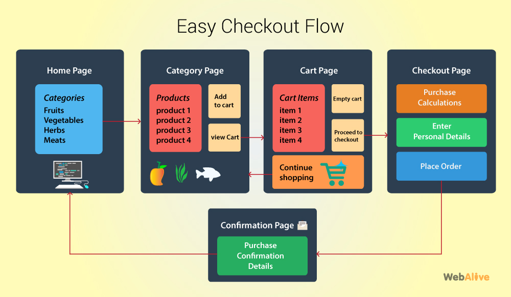
No matter how much traffic your eCommerce website receives, unless the traffic is converting all the strategies and efforts to bring the traffic in are in vain. Good ecommerce sites ensure that the process of moving through each step is intuitive and straightforward.
An emphasis should be placed on making the payment process as simple as possible, while also providing the customer with easy access to all the forms and information they need.
2. Complex Checkout Process
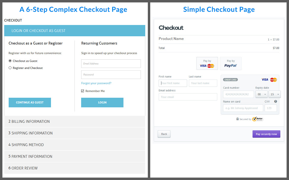
When faced with a complicated checkout process, customers will often abandon their purchase and this can affect your customer’s decision to buy from your store in the future. Complexities include forced registration, excessive information entry requirements, lengthy order forms, not having guest checkout option and automatic entry of repetitive credentials like billing or shipping address.
According to a study, 47% buyers don’t complete their buying process if the checkout process takes too long.
The best way to avoid this is to ensure the checkout process has as few steps as possible.
Pricing Complications
3. No Competitive Pricing, No Market Research
Competitive pricing is one of the most important factors determining if a customer buys from you. Owing to the availability of the internet, it’s now very easy for customers to compare prices and choose from numerous alternative retailers for a particular product.
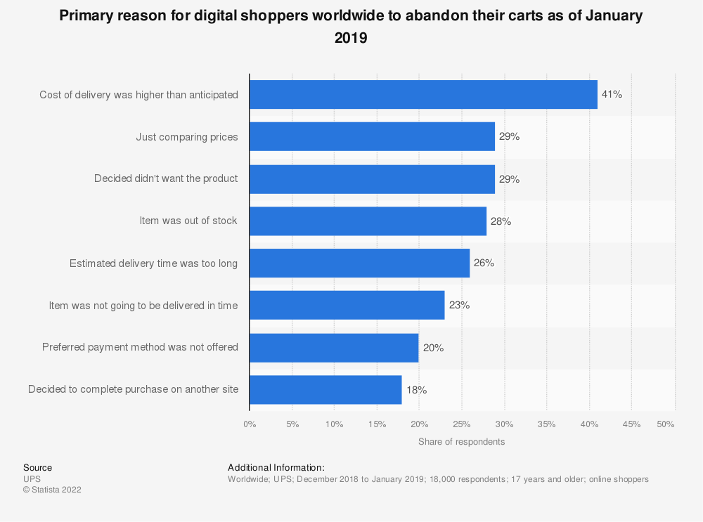
One study suggests that 29% of digital shoppers will abandon their carts or leave a site if they find the same product at a lower price after comparing prices among similar sites.
It’s important to know your competitors and do adequate research into the market to determine the demand for the products and the lowest price at which you can afford to charge for them.
4. Lack of Payment Transparency, Hidden Charges
Lack of transparency in the payment process will cause customers to bounce off the website from the checkout page. It can even leave such bad impressions in their mind that there is no potential of a sale in near future either, and possibly fewer sales overall.
One study shows that 56% of online shoppers left a website without paying because they were presented with unexpected costs, proving that ecommerce websites that don’t mention delivery expenses, shipping costs, and product purchase VAT end up losing potential customers.
5. Additional Charges, Additional Dissatisfaction
Extra fees and additional charges disgruntle customers and result in losing them without making a sale. Conversely, ecommerce sites providing discounts and offers with transparent pricing earn a positive and favourable impression from their customer base.
Factoring your shipping into your product price, then offering free shipping, is a great way to make people feel like they’re getting a good deal without losing money yourself.
System and Security
6. Overlooking Security Concerns
When you go to a physical shop, you browse through products or services, pick up what you need and pay the total at the checkout. However on ecommerce websites, the opposite is the case, the experience is not tangible, so it demands a special credential of customer trust.
Concerns like identity theft, personal information protection, and misuse of private consumer data discourage people to conduct transactions online.
It is therefore essential to assure customers that their information will not be used for other purposes by clarifying your customer privacy policy, which will ease consumer concern about their identify security.

7. Lack of Trust Signals Integration
A good website aims to enhance credibility factors for customers by incorporating trust signals, such as testimonials and reviews, seller verification and ratings, feed reviews etc.
A study shows that 88% of consumers trust online reviews as much as personal recommendations.
8. Omission of Established Identity
Online trust is one of the most critical issues that affect the success or failure of online stores. Despite the virtual form and functionality of an eCommerce website, trustworthy credentials like a physical location, contact number and email address generate trust among customers. Most ecommerce websites’ second most visited page happens to be the “About Us” page.
Therefore, it’s very important to have both “About Us” & “Contact Us” page that includes precise company details and a neat contact form with all the contact details.
9. Not Social Media Presence
Having social media accounts can also be a vital factor in enhancing an eCommerce website’s credibility, especially taking this era of social media into consideration. When an eCommerce website has no social media presence or if there is a lack of social media activities, customers don’t feel the enhanced level of trust and connectivity.
Research shows that 84% of online shoppers refer to at least one social media site for recommendations before shopping online.
10. No Payment Assurance
Whether it is physical or online, whenever people are to spend money they require trust assurance and trust elements. The case of eCommerce transactions is no different. Good eCommerce websites should provide if not all, most of the preferred and prominent payment methods for its customers.
Even if some of the methods are less used, the more choice of methods, the higher your customers’ trust in your site will be. An ecommerce site that doesn’t have a wide range of payment methods fails to maximise the customers’ degree of affinity and trust.
11. Absence of Security Certifications and Insignia
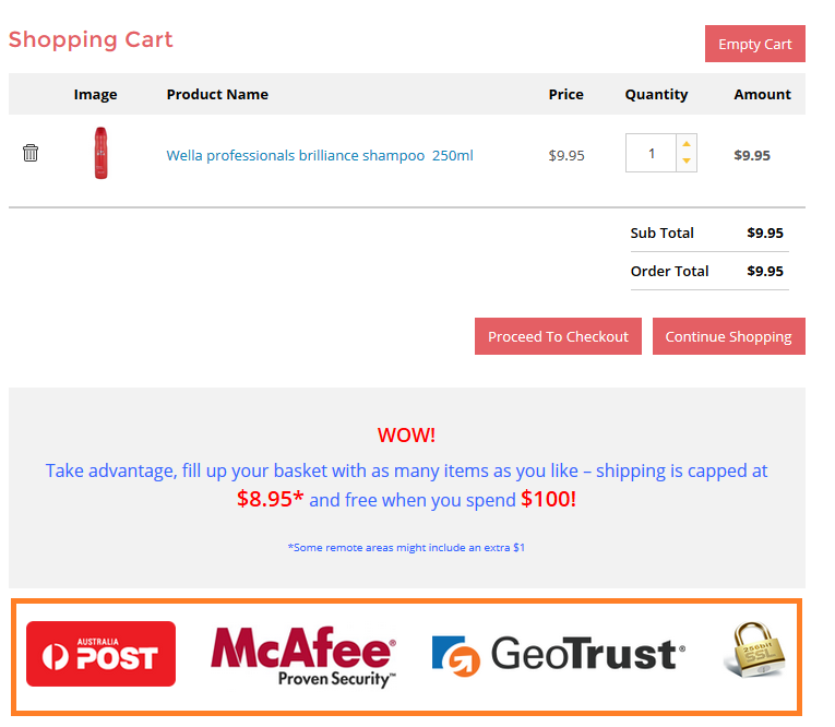
Obviously, you’ll also want to ensure you keep your SSL certificate up to date and it may be worthwhile having it active for all pages of the website.
According to a study, using SSL certificate caused a 27% increase in sales for an online business.
If you don’t have the proper encryption technology active, the customer’s browser is going to warn them and that could be a sale gone.
Presence of Security Certifications Gain Customer Trust
12. No Purchase Guarantee
Offering money-back guarantees or some sort of assurance on the products being sold can help get the customer over the line, knowing that they have this peace of mind and helping to create a good impression in their mind.

13. Excessive Security Measures
As we discussed earlier, ensuring security to give users a proper sense of safety and satisfaction is a must have for good ecommerce websites. However, when websites put an excessive effort in solidifying the security by incorporating unnecessary and redundant roadblocks like excessive payment security checks, repetitive sign-in and credential input it might get on the users’ nerves and cause them to leave the site right away.
Customer Engagement, Conversion and Retention
14. Insufficient Product Details
Studies show that insufficient product details disappoint online shoppers. What makes the purchase decision easier for an online shopper is the product details added to each product.
Customers tend to spend most of their browsing time checking product details pages, so an easy to read, informative product details page can significantly improve their shopping experience and positively influence their purchasing decisions.

A detailed product listing like Sonos makes the purchase decisions easier for users.
15. Not Visible in Search Engines
Lack of sufficient product information (and poor site content in general) can also take a toll on the discoverability of an eCommerce website. Good websites can be found easily and promptly in search engines for a variety of reasons, and failing to be found has a lot to do with the content on the website not being up to scratch. This can be a big factor that leads to poor visibility and less overall visitors.
A study shows that 60% of consumers start their research on a search engine before visiting a specific website.
Make an effort to get your website there in terms of content and make it easy for visitors to find the info they’re looking for. If you have the budget, you might also consider having an SEO provider take care of the marketing side of things, freeing you up to promote the business in other ways.
16. No Persuasive Sales Copy
The behaviour of online shoppers is greatly influenced by the sales copy present on an ecommerce website, a good ecommerce website has compelling sales copies having powerful titles, captivating product-perks descriptions and convincing calls-to-action.
17. Lack of Personalisation
Getting personalisation right is a critical factor, as today’s customers expect highly personalised interactions when shopping online and get frustrated when this does not happen. No wonder online shoppers do miss the old days of warm greetings and human conversation, and here website personalisation is a win-win.
However, getting the personalisation wrong with outdated or irrelevant data won’t help in keeping your customers coming back for more. So the process may include targeted messaging, targeted promotions, post-purchase follows up, personalised product recommendations and many more.
18. No Incentives to Encourage Revisit
Less than impressive website content, an absence of testimonials, lack of enticing offers or discounts will discourage the visitors to revisit an ecommerce website.
On the other hand, rewarding a first time customer with a voucher for 10% their next order will incentivize them to return and buy from you again.
19. Product-Market Misfit
Poor Ecommerce websites also tend to offer an ineffectual product-market fit and unobtrusive value proposition. Instead of catering to a certain market niche or customer class, these websites run wild in the business model and act volatile in the value proposition.
To avoid this, build your site and its content with your ideal customer in mind and maintain a consistent identity and voice throughout.
20. Too Much Irrelevant Product Choices
Additionally, in a frenzy to provide diverse offerings, some websites often laden the database with the surplus of irrelevant information and an uncategorised assortment of products. Putting unstructured or useless information on the website can overwhelm the visitors; reduce the usefulness and ease of use of the site.
Before even considering designing an ecommerce site, clearly map out and categorise your products so your online shop is easy to navigate.
User Experience & User Interface
21. Unprofessional Web Design
An ecommerce store having poor design layout with an unprofessional appearance, missing images, misdirected links which don’t work will immediately repel potential customers and prevent them from engaging to the site.
On the other hand, comprehensive and compact web design layout, high-quality images, conspicuous clear up-to-date information and error-free visuals give an ecommerce website a professional look which heavily influences the buying decision of the visitors.

A sleek and professional ecommerce site designed by WebAlive’s Melbourne web designers.
22. Dated Design Layouts
Amongst the long line of search engine results, an outdated website will negatively affect your sales. Because website layouts that don’t accommodate enticing features, such as a clear “Buy Now” button, subscription options, accessible FAQ and easy to fill out contact form, will adversely affect its conversion rate.
Related article: 9 Signs Your Website Might Need a Redesign
Websites that look old, aren’t mobile responsive or are simply too hard to navigate will get left behind.
23. Not Mobile Responsive
Websites that look old, aren’t mobile responsive or are simply too hard to navigate will get left behind. When 55.4% of internet users use mobile phones to buy online, there is no doubt that websites not designed with mobile in mind will weaken brand loyalty. And your potential customers with high purchase intent will more likely abandon your site and head to a competitor’s instead.
24. Poor User Experience
Making a website beautiful does not necessarily make it smooth to use. Just focusing on design perspective and ignoring the swift usability of the online store site can affect the users’ shopping experience and negatively influence their buying decision.
Clear product categories and subcategories are a must, along with a clear hierarchy of information within both content and product pages. Studies suggest that 25% of online shoppers leave the site if the navigation is complicated.
25. Website Crashing, Timeout Error
Websites which are finicky and crash every now and then also create a massive discontent in a consumer base. Research shows that 24% of the shoppers leave a site without buying because of a website crashing and 15% leave because of timeout errors.
Make sure your site is quick to load and stable to run, this is worth spending the extra money on to get right.
26. Non-responsive Website
This is an age of mobile phones, tablets and laptops of every size. Everything is already mobile or going to be mobile-fit pretty soon enough. Ecommerce sites are certainly no exception as 130 million people are poised to make purchases from mobile by the year 2016.
Mobile responsive websites are now an absolute must, as now more than ever not having one might even make you lose your business.
27. Time Stands Still
With the introduction of the high-speed internet, many people are now accustomed to lightning-quick information. A study suggests that 40% of people abandon a website that takes more than 3 seconds to load.
So, an online store that takes ages to load is of no use to users when they want websites to load faster than uttering the word – “GO”!
28. Website Needs Pest Control (Bug Fixes)
Websites need to be tested regularly to identify issues and fix them, not doing so will result in an imperfect, buggy site. Broken links, typos and punctuation mistakes for the website mean the online business is not interested in providing quality user experience and leaves doubt in the users’ mind about the quality of their product and service.
29. Sudden Pop-ups
User experience is largely dependent on the smooth and uninterrupted flow of access. If an ecommerce site fails to grasp this fact as they try to hoard user email address for business promotion objective and infest the website with email pop-ups, offer pop-ups and registration call here and there, the website will ultimately drive customers away.
30. No Top-notch Search Function
Even if they are sure what they want to purchase, online shoppers browse for products and options and like to explore products of different brands and different categories. If the online store lacks the ease of searching, the willingness of the shoppers to purchase online will be low.
Therefore, the website should make it easy for consumers to search for products and services.
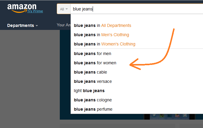
Effective search function of Amazon
Delivery, Logistics and Post-Purchase Service
31. Delivery Options and Coverage
To have the most success, you want to have as far-reaching a coverage as possible – ideally shipping to all over Australia. It may also be a smart move to offer free shipping deals, if not for every purchase then for purchases over a certain amount.
According to 77% of online shoppers, free shipping is the most important option during checkout, 60% add items to their cart to qualify for free shipping, and 61% would cancel their purchase if free shipping is not offered.
32. Logistics Credentials
Delivery timeframes, product tracking, competitive delivery rate, deliverables conditions like a refund policy after delivery are some prime factors that influence a consumer’s decision of buying from the site and their future purchase decision and help customers feel secure in their purchases.
33. Lack of Continuous Support
The lack of proper customer support while buying your products or services online can cost you to lose potential customers. Ignoring customers’ feedback, putting your customers on hold for too long, providing incompetent chat support, or insincere responses are some of the practices that make customers irritated.
If you are selling online, the best way to drive new sales and keep your business growing is to make the shopping experience of the customers as seamless as possible. Scrutinize your website against the above-mentioned factors and work hard to fix some of these crucial areas and you are sure to see results.
You read a lot. We like that
Want to take your online business to the next level? Get the tips and insights that matter.

